
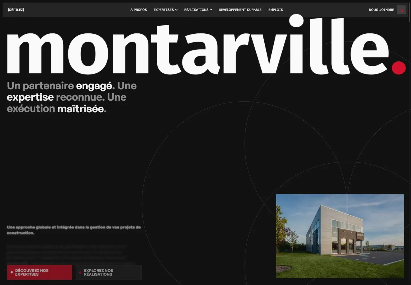
Live capture at 1440px, 2026-10-24
How it’s built
- Layout
- Within a wide black panel, tiny utility navigation spans the top and a monumental white lowercase Montarville wordmark dominates upper left, ending in a red dot. Bold gray/white construction-management statement and small paragraph sit left; a rectangular project-building photo anchors lower right. Fine oversized circular arcs cross the black field. Blurred showroom outside is gallery framing.
- Type
- Huge heavy lowercase sans identity, bold medium sans support, small body copy and tiny uppercase links; exact faces unknown.
- Color and surface
- Black panel, white/gray copy, red identity dot, fine gray arcs and natural-color building image; exterior blur is framing.
- Components
- Compact navigation, monumental wordmark, service statement/body, paired actions and offset right-side project photo.
What makes it work
- Black field with oversized white wordmark and color punctuation
- Concise left service statement
- Offset rectangular project image at right
- Paired actions and faint circular linework
On a new subjectFor a public food-bank logistics network, place a large white network name and accent mark on black, pair a distribution promise with an offset warehouse image, use faint circular lines and concise actions. Replace construction claims and exclude showroom framing.
Measured
Fonts loadedFont Awesome 6 Brands, icon-font, General Sans, Sono Proportional, Fira Sans
H136px / 600
Body text13.5px
Page background#121212
Text color#fafafa
Page height11,776px
Computed CSS at 1440px, 2026-10-24.
Live behavior
- Today
- Near-black page with an enormous white lowercase wordmark and small red terminal dot. A narrow charcoal navigation strip sits inset at the top. Beneath the wordmark, a compact semibold statement alternates gray and white emphasized words. Very fine large overlapping circles cross a broad empty field. Small dense body copy and squared red/charcoal actions sit lower left; a rectangular architecture photo anchors the lower right. A small white consent card overlaps that photo.
- Responsive
- Desktop pairs lower-left copy/actions with the right photo; tablet and phone reorder the photo above body copy under a large blank interval. Phone photo measures263.375x173.812px at16.641,376.344 and does not fill the356.719px content width. Desktop statement changes36px/39.6px to24.96px/27.456px phone, weight600; text changes14px/19.88px to14.56px/20.6752px. Desktop nav row becomes Menu with a small red plus. Giant identity remains wide across the top, but no matching visible font-size sample measures it. Narrow consent covers lower copy and the actual actions; their computed locations are not visible controls.
- Scroll
- At actual scrollY750, the narrow navigation remains at the top over blurred underlying content. A large96px/96px white heading wraps around the beginning of a three-column region with left interior photograph and two dense body-text columns. Thin overlapping circles continue behind the content. Small red rectangle introduces the section label. Consent still covers the lower-right text; fully hidden final paragraph is excluded.


