
Gallery screenshot, saved 2026-10-24
How it’s built
- Layout
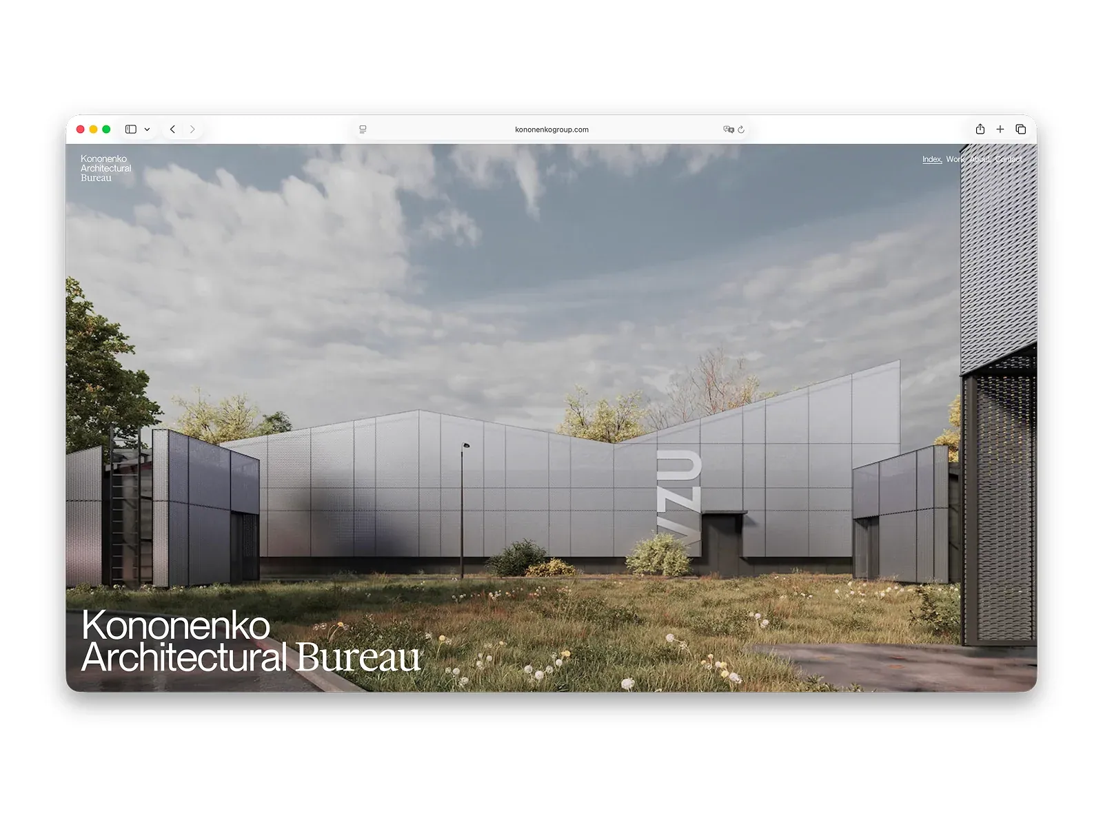
- A full-bleed architectural rendering fills a rounded browser viewport. Bureau identity and small navigation occupy the upper corners; a large two-line name overlays the lower left. Browser chrome, white margins, and shadow are gallery framing.
- Type
- Light sans-serif identity contrasts with compact sans-serif navigation; exact face and metrics unknown.
- Color and surface
- Muted gray-blue sky and facade, dark foliage, green foreground, white over-image type.
- Components
- Architectural hero image, corner identity/navigation, lower-left title; browser frame excluded.
What makes it work
- Full-bleed architecture image
- Small corner navigation/identity
- Large title over image
On a new subjectFor an unrelated public-health clinic, use one original clinic/community image as a continuous page field, keep identity/navigation small at the top, and place a clear two-line clinic name at lower left over a quiet image area. Replace architectural imagery and bureau identity.
Live behavior
- Today
- The live browser captures open on a full-viewport architectural photograph: a low, long pale metal-mesh building across a wild grass foreground, under a cloudy gray sky. A large white project name sits at the lower left, a small three-line bureau mark at the upper left and a short white navigation row at the upper right. At the separately captured scroll position, the hero gives way to a large white section with an oversized black two-line statement, two short gray copy blocks, then another full-width architectural photograph.
- Responsive
- At 1440x1000, the first hero image fills the viewport and its white title sits near the lower left. At 768x1024 the hero remains image-led with a tighter crop and smaller title; the screenshot shows the small bureau mark and navigation links. The measurement reports a 914px document width, 146px wider than the viewport, so this capture has horizontal overflow. At 390x844 the normal-mobile screenshot shows only the vertically cropped hero image, with no visible header or project title, although the measurement locates the title box at the bottom edge. The separate reduced-motion mobile screenshot shows the bureau mark, navigation links and title over the image. Separate loads and timing confound this difference. No mobile menu is shown in either phone capture. tablet: viewport 768x1024; document 914x11929; measured scrollY 0; reduced_motion false; 0 sampled animation entries; document exceeds viewport width by 146px. mobile: viewport 390x844; document 390x11098; measured scrollY 0; reduced_motion false; 1 sampled animation entries.
- Scroll
- At measured scrollY 750, the lower part of the hero remains above a white statement panel. The large black statement is followed by two small gray service descriptions, with another building photograph beginning at the lower edge. This is one sample from a 19,334px document, not a complete page sequence. desktop-scroll: viewport 1440x1000; document 1440x19334; measured scrollY 750; reduced_motion false; 0 sampled animation entries.


