
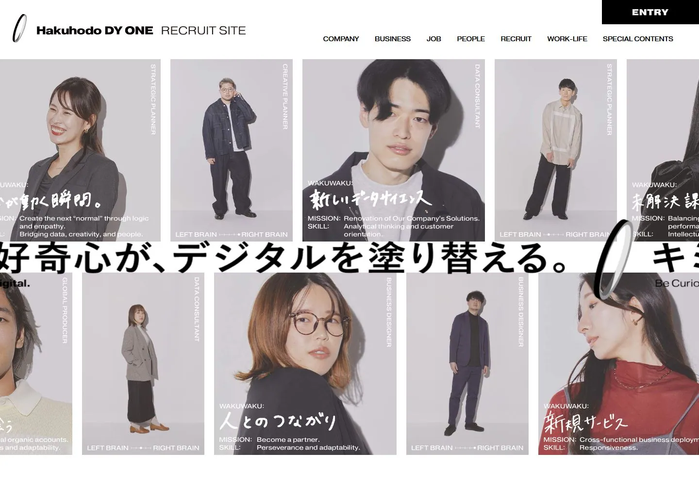
Live capture at 1440px, 2026-10-24
How it’s built
- Layout
- Pale gridded field is filled with enormous black vertical and Japanese characters, surrounded by small colorful flat figures and objects; a narrow white outlined menu sits lower right.
- Type
- Oversized heavy black characters in mixed orientations; tiny black menu labels.
- Color and surface
- Pale gray grid, black text and saturated orange, pink, blue and green illustrations.
- Components
- Oversized mixed-orientation characters, scattered colorful figures and outlined side menu.
What makes it work
- Pale grid
- huge black mixed-orientation characters
- colorful flat figures
- outlined side menu
On a new subjectFor a public science festival, surround enormous black mixed-orientation title characters on a pale grid with colorful flat scientists and instruments, plus an outlined side menu.
Measured
H114px / 400 / 0.56px
Body text14px
Page backgroundtransparent
Text color#000000
Page height5,141px
Computed CSS at 1440px, 2026-10-24.
Live behavior
- Today
- Hakuhodo DY ONE’s recruitment page opens with a white header containing an oval mark, company/recruit-site wordmark, navigation links and a black ENTRY block. Below it, a dense grid of pale portrait cards carries vertical role labels and short Japanese/English text. A very large Japanese slogan runs across a white strip through the grid, accompanied by an oversized oval mark and the English line “Be Curious, Repaint Digital.” The desktop-scroll screenshot at actual scrollY=750 shows the lower portrait grid above a broad charcoal panel with centered Japanese copy.
- Responsive
- At 1440×1000 the header spans the page and several portrait cards are visible in two rows around the large horizontal slogan strip. The 768×1024 tablet capture keeps the navigation and wide card grid, with cards and slogan cropped at the viewport edges. The 390×844 phone captures show a narrower card arrangement with the slogan strip crossing between portrait content; their sampled portrait images differ between ordinary and reduced-motion loads. Raw document heights are 5141px desktop, 4466px tablet and 3829px for both phone loads; all state measurements report document width equal to viewport width. These captures do not establish breakpoints or explain the different phone frames.
- Scroll
- At actual scrollY=750 in a 1440×5141 document, the screenshot shows the header and upper portrait cards above a large charcoal section with several centered lines of Japanese copy. This frame records the saved position; it does not establish fixed or sticky navigation.


