
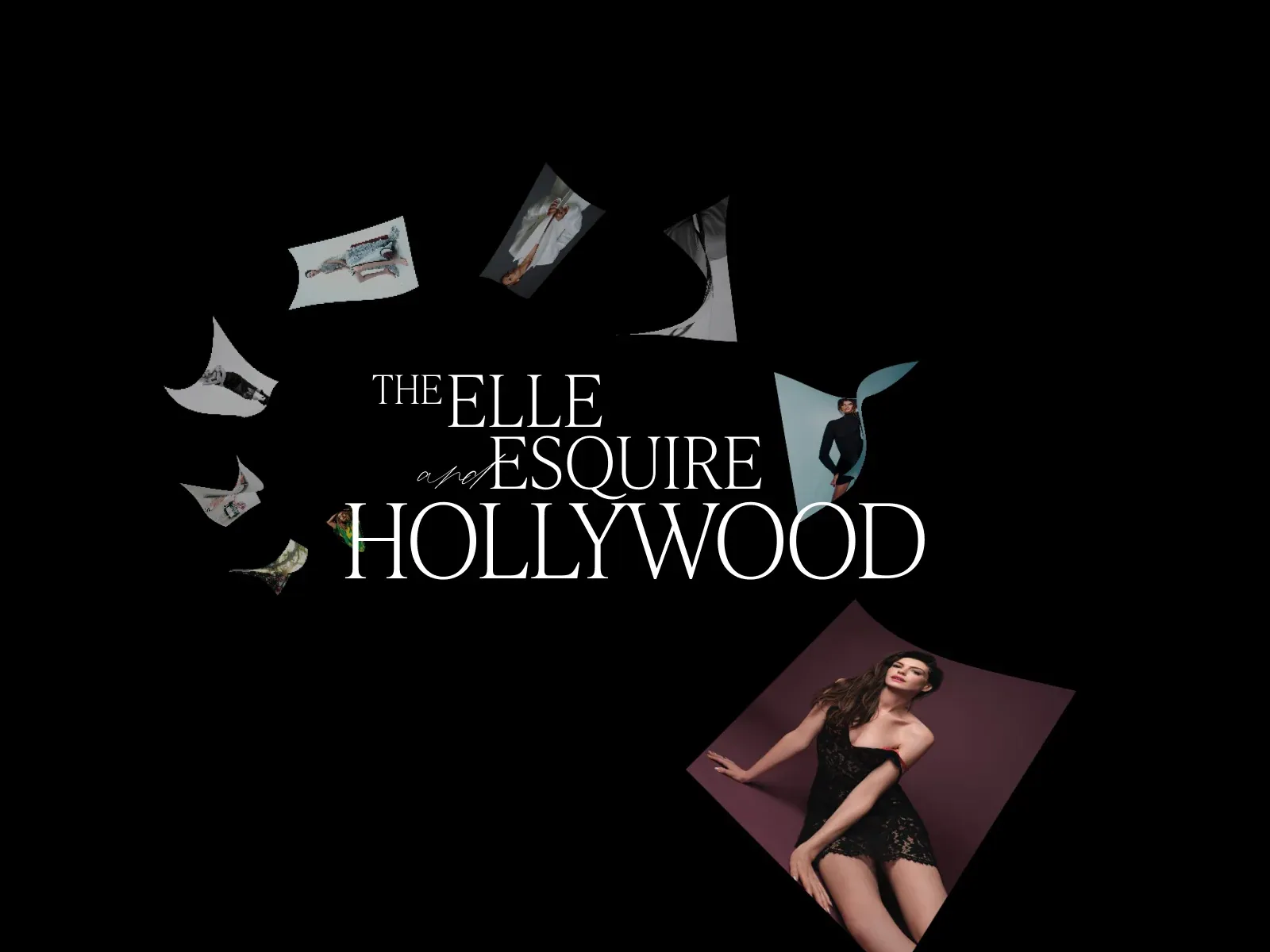
Gallery screenshot, saved 2026-10-24
How it’s built
- Layout
- The visible page is a black canvas populated by separate fashion/editorial image cutouts that appear tilted and gently warped, floating at differing sizes around a large central title. Several fragments have curved or pinched edges rather than rectangular crops. The title is centered and stacked in three lines; imagery loosely circles it but does not form a tidy ring. A much larger fashion portrait enters from the lower right at a diagonal and is clipped by the image edge. The upper half contains smaller fragments at uneven intervals, leaving large areas of pure black between them. Outer black area is consistent with the page field in this image, but submission frame cannot be independently distinguished.
- Type
- The central title uses elegant high-contrast white serif capitals with very large scale. A small script “and” interrupts the otherwise formal stacked naming. The title has compact line spacing and a broad central footprint. No other readable controls are visible. The source image does not establish specific font families or exact metrics; typography is described by visible form only.
- Color and surface
- Black dominates and provides a quiet ground for white type and light photo fragments. The photos retain muted gray, pale blue, skin, burgundy, and dark fashion tones. Their non-rectangular warped edges create paper-like or fabric-like silhouettes against the flat background. No visible outlines, shadows, or cards surround the fragments; edge shape and angle alone distinguish them.
- Components
- The central editorial identity is the anchor. Around it, roughly eight to ten separated photographic fragments act as floating collage elements. There are no obvious nav or action controls in the selected frame. The image fragments are not arranged on a grid and do not visibly overlap the title itself, though the larger lower-right image clips off canvas.
What makes it work
- prominent centered title
- multiple separate floating image fragments
- irregular angles or silhouettes
- large dark negative spaces
On a new subjectUse selected objects or portraits as separate tilted fragments around a short central identity; preserve visible gaps and let one edge crop imply continuation.
Prompts
Create a transferable visual direction for {{website_name}} in {{industry}}, for {{audience}}, presenting {{content}} and supporting {{functionality}}. Composition rule: Place one short multi-line display title near the center of a dark open canvas. Surround and partly overlap it with a few differently scaled rectangular image fragments at varied angles; keep the title readable and let negative space remain broad. Type character and hierarchy: Use a refined high-contrast serif character for the title and tiny restrained utility text; the title should lead without copying source wording. Palette and contrast: Use a dark field and high-contrast light title; image colors should be muted or chosen for the new subject. Image/component role: Use original subject-relevant imagery, illustrations or artifacts in floating crop-like frames; do not require fashion or celebrity photography. Visual estimate from this selected image, not measured CSS: Visual estimate: title about half viewport width; images 20–25% of area; broad black negative space. Treat the proportions as guidance rather than fixed geometry. Variables: choose new identity, wording, subject, imagery, palette and actions for {{website_name}}, {{industry}}, {{audience}}, {{content}} and {{functionality}}. Do not reuse source brands, exact phrases, logos, people, products, photography, artwork, or other distinctive source assets. Do not infer a named typeface, technology, CSS value, motion or untested behavior. Build any continuation from the target's actual content while preserving the stated hierarchy and contrast. Reduce title scale and image count, then arrange the fragments around rather than over the text so nothing clips or becomes unreadable.
Implement a responsive page for {{website_name}} in {{industry}} for {{audience}}, presenting {{content}} and making {{functionality}} work. Desktop layout: Place one short multi-line display title near the center of a dark open canvas. Surround and partly overlap it with a few differently scaled rectangular image fragments at varied angles; keep the title readable and let negative space remain broad. Typography: Use a refined high-contrast serif character for the title and tiny restrained utility text; the title should lead without copying source wording. Surface contrast: Use a dark field and high-contrast light title; image colors should be muted or chosen for the new subject. Media and components: Use original subject-relevant imagery, illustrations or artifacts in floating crop-like frames; do not require fashion or celebrity photography. Visual estimate from this selected image, not measured CSS: Visual estimate: title about half viewport width; images 20–25% of area; broad black negative space. Treat the proportions as guidance rather than fixed geometry. Variables: choose new identity, wording, subject, imagery, palette and actions for {{website_name}}, {{industry}}, {{audience}}, {{content}} and {{functionality}}. Do not reuse source brands, exact phrases, logos, people, products, photography, artwork, or other distinctive source assets. Do not infer a named typeface, technology, CSS value, motion or untested behavior. Build any continuation from the target's actual content while preserving the stated hierarchy and contrast. Reduce title scale and image count, then arrange the fragments around rather than over the text so nothing clips or becomes unreadable. Use semantic content, useful image descriptions, and labels linked to the correct item. Any new controls need accessible names, keyboard operation and visible focus; the reference's controls and behavior remain untested.
Live behavior
- Today
- The 2026-10-29 desktop-t0 image is a black, viewport-filling scene with curved or tilted editorial-photo fragments suspended at different sizes and depths; no readable heading is captured in that frame. At desktop-t2, the scene is mostly black with a single faint, curled cover-like fragment left of center. The separate chooser frame shows two upright magazine covers centered side by side beneath a short white prompt. A current Oct 31 screenshot shows the black gallery chooser and both cover choices.
- Responsive
- In the measured 1440x1000 chooser state, the two cover images are each 280x373px, positioned at x=400 and x=760, with a centered 18.76px prompt near y=80. At 768x1024, the chooser places the two covers in a vertical stack, each 322x428.5px at x=223; its 17.02px prompt is at y=32. At 390x844, the covers remain vertically stacked at 255x340px with x=67.5 and y=112/472; the centered prompt measures 16.04px. These are direct DOM measurements of the saved states; the Oct 29 document heights equal their viewport heights, so these frames do not establish longer-page responsive behavior.
- Scroll
- The state named desktop-scroll reports actual scrollY 0 and a 1440x1000 document for a 1440x1000 viewport. It shows the chooser screen, not a scrolled section. No scroll-driven transition or lower-page layout was established.


