
Live capture at 1440px, 2026-10-24
How it’s built
- Layout
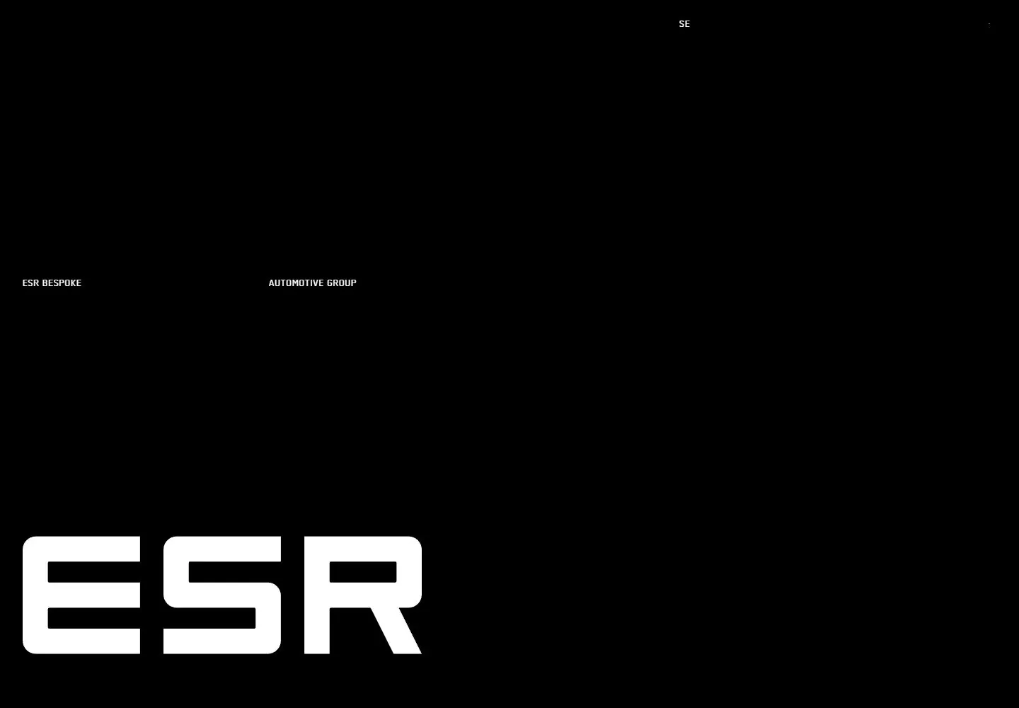
- The gallery image presents an angled desktop monitor in a pale studio scene with a tabletop. Inside the monitor is a nearly black page: an oversized white ESR identity sits left of center, several tiny utility/information groups are separated across the upper area and right side, and broad black negative space remains between them. The monitor and desk are evidence framing; a single still does not establish them as website layers.
- Type
- Within the pictured page, oversized geometric white ESR identity contrasts with tiny technical/company metadata in separated groups. The exact screen typeface cannot be identified from this raster; the physical monitor frame is presentation context.
- Color and surface
- The gallery framing has a pale gray studio and desk around a dark angled monitor. The in-screen page is a near-black field with a white identity and tiny pale metadata, separated by broad negative space. Monitor frame, stand and cast shadow belong to the depicted presentation context, not an established page surface.
- Components
- In-screen page elements: large identity mark, tiny separated utility and company/contact information groups, and broad dark negative space. The monitor, stand and tabletop are gallery presentation framing.
What makes it work
- Nearly black in-screen field
- Large simple white identity
- Tiny separated utility/information groups
- Broad negative space
On a new subjectUse a dark page with one clear identity and a few compact, spatially separated information groups; leave most of the field open. Replace all brand-specific wording and do not carry over the monitor or desk framing.
Measured
Fonts loaded__bodyFont_0f148b, __bodyFont_Fallback_0f148b, __headingFont_a39ca7
H162px / 500 / -0.62px
Body text18px
Page background#ffffff
Text color#000000
Page height8,128px
Computed CSS at 1440px, 2026-10-24.
Live behavior
- Today
- ESR Bespoke places white tightly led medium-weight grotesk hero copy over a full-viewport dark blue-gray automotive film. Small uppercase monospaced-looking utilities occupy widely separated positions: identity left, group label farther right and stacked navigation around the right two-thirds. A two-line menu cue sits upper right; smaller uppercase support aligns across from the large title, with unmute/story labels near the bottom. The following white section contrasts a small upper label and extensive whitespace with a nearly full-width large black paragraph.
- Responsive
- At768px and390px the full desktop identity/navigation arrangement becomes a compact ESR symbol left and dark rectangular Contact/menu controls right. Title decreases from62px to38px and moves to18px left/224px top. Story and support form a separate row around the middle; support occupies the right half and wraps more tightly on phone. Unmute remains near the lower left. Full-viewport film crops differently as width changes; different filming phases prevent attributing every image difference to responsiveness. Menu/contact behavior and exact breakpoint unknown.
- Scroll
- Actual scroll750px in7170px document leaves the bottom250px of the film hero visible, followed by a white section with tiny uppercase label and a large black medium-weight paragraph. Full original desktop identity/navigation is out of view while compact Contact/menu utilities remain upper right. The section uses a wide text measure with tight line-height; no later scrolling sequence or action tested.


