
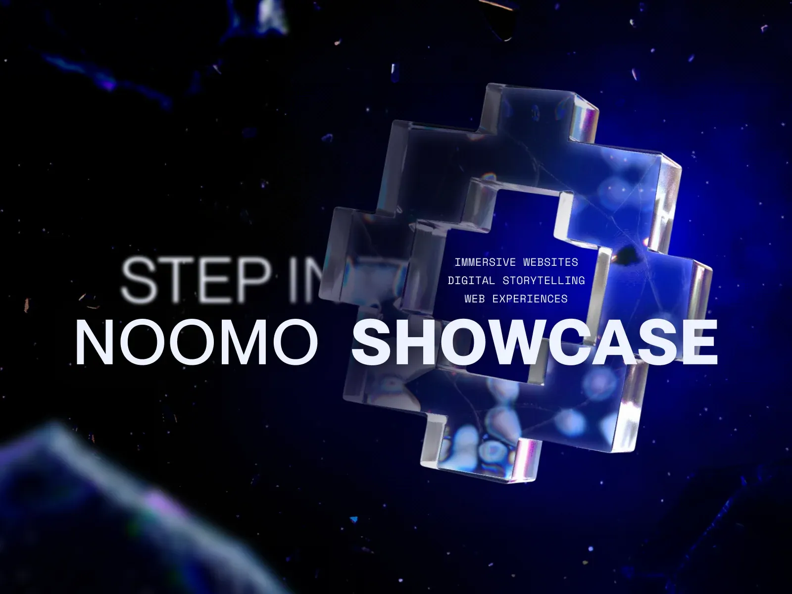
Screenshot from Awwwards, saved 2026-10-24
How it’s built
- Layout
- Near-black and deep blue starfield-like field with scattered reflective fragments. A giant translucent chrome-glass plus form dominates center-right. Large white NOOMO SHOWCASE lettering spans the lower middle, overlapping the form; softer STEP IN type sits to the left and three compact descriptor lines appear over the plus. The plus and type occupy the full canvas with no panel boundary or conventional navigation visible.
- Type
- Large bold uppercase sans title stretches across the lower middle. STEP IN is lighter/blurred at left; small condensed monospaced uppercase descriptors sit inside the central form. Exact fonts and metrics unknown.
- Color and surface
- Deep navy-to-black field, blue/violet reflective glass and white title. Small specular highlights and floating fragments imply a glossy 3D scene; color is visually estimated from this source image, not CSS.
- Components
- Oversized translucent plus object; central showcase title; blurred step-in cue; three small descriptive labels; scattered fragments.
What makes it work
- Dark atmospheric field
- Large dimensional central symbol
- Oversized title integrated across the symbol
- Small secondary descriptors
On a new subjectFor an unrelated pediatric-care information campaign, create an original dimensional emblem on a dark field, integrate a short clear care message across it, and add only a few factual descriptors nearby. Preserve the layered object-and-type hierarchy while replacing the showcase purpose, plus symbol and source claims.
Live behavior
- Today
- The later live-page frames show a saturated electric-blue hero rendered edge to edge. Large white uppercase words run across the composition and are cropped by the viewport, layered with a dark, glossy/faceted 3D-like form and bright blue highlights. A small NOOMO Showcase identity sits at upper left; Agency, Labs and Storytelling links sit across the top, with a sound control and Send email control at upper right on desktop. Tablet and phone retain the large, cropped display treatment and the lower GET STARTED action with a round arrow mark. The first two desktop captures are instead black loading frames with a large NOOMO progress graphic at the bottom.
- Responsive
- At the captured 1440×1000, 768×1024 and 390×844 widths, the measured header remains fixed at the top at 57 px high and the measured canvas exactly matches the viewport dimensions. In loaded frames the CTA text box remains 134 px wide; its measured height is 44 px on desktop and 55 px on tablet and phone. Its text box sits 22 px left of the viewport center, with the adjacent circular arrow visible in the screenshot. The document widths equal each sampled viewport width; document heights are 17000 px desktop, 17408 px tablet and 14348 px phone. These three samples do not identify breakpoint thresholds or prove behavior at unmeasured widths.
- Scroll
- Every saved state records actual scroll_y=0. In particular, the desktop-scroll label is not proof of scrolling: its paired measurement also records scroll_y=0 and its screenshot shows the later blue hero.


