
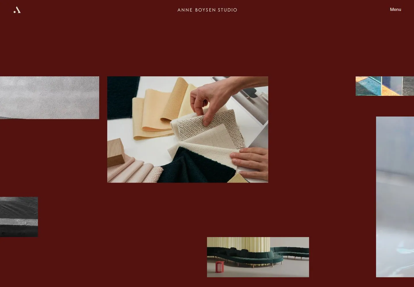
Live capture at 1440px, 2026-10-24
How it’s built
- Layout
- Unequal square-corner material, interior and object photographs float and overlap in a saturated blue field. A larger central near-square textile image is flanked by cropped side images, with a small landscape image overlapping its lower edge.
- Type
- Tiny white tracked uppercase identity centered above; small menu text and a compact corner symbol.
- Color and surface
- Flat deep saturated blue, white utilities and warm/cool material photographs without enclosing cards.
- Components
- Centered identity, corner menu/mark and scattered overlapping photographic rectangles.
What makes it work
- Unequal overlapping material photographs separated by generous saturated blue space and very small white edge utilities.
On a new subjectFor a marine geology archive, scatter unequal rock-detail and expedition photographs across saturated blue, including a large central sample image and small overlapping landscape image.
Measured
Fonts loadedScto Grotesk A
Body text14.9091px
Page background#e0ddd0
Text color#250000
Page height7,618px
Computed CSS at 1440px, 2026-10-24.
Live behavior
- Today
- The current live page is a long portfolio against a saturated blue field. A centered studio identity and Menu control remain at the top while large rectangular interior/product photographs occupy a spacious, offset image sequence. At 1440×1000, document height is 11,283px; the successful 750px scroll reveals more images and an All/Collectibles selector. At 768×1024, the header remains centered over the open image field; at 390×844, identity and Menu align across the top and image tiles continue in staggered columns. The t0 and t2 captures differ substantially in the large right-hand media: a still interior-like panel is replaced by water, indicating timed content/frame change during the interval. Hover capture resembles t2 and therefore does not establish that hovering caused that media change.
- Responsive
- Observed at 1440×1000, 768×1024, and 390×844. Desktop/tablet retain centered studio title and top-right Menu; mobile keeps identity and Menu in one horizontal top row while image sequence continues in a narrow staggered layout. These exact sampled widths only.
- Scroll
- Successful desktop scroll is at scrollY=750 in 1440×1000; image shows further product/interior photographs and an All/Collectibles selector, confirming continuation below the top. Document height is 11,283px. No control activated.


