
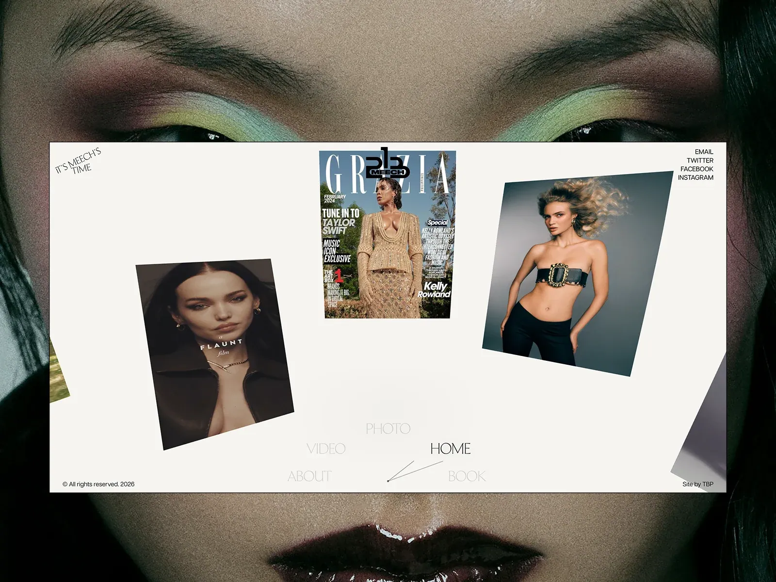
Gallery screenshot, saved 2026-10-24
How it’s built
- Layout
- Pale rectangular site plane over a close-up photographic field. Within it, one magazine cover is centered high; separate fashion portraits sit lower-left and upper-right at different scales and slight rotations. Tiny identity/nav text occupies opposing top corners, with faint oversized section links along the bottom. Large open gaps; no grid.
- Type
- Editorial high-contrast serif lettering appears inside the magazine cover; site navigation is tiny, condensed uppercase; section labels are light, thin uppercase. Site hierarchy is image-led. Font identity, CSS sizes, line-height, and tracking are unknown.
- Color and surface
- Warm off-white page, black text, muted fashion images, dark photographic surround. Page has a crisp straight edge, without evident card shadows or borders. Cover supplies the strongest color variation.
- Components
- Three independent fashion/editorial images, small wordmark, text links, and bottom section labels. The background face is a photographic field; framing around the page is incidental. No visible conventional button or icon system.
What makes it work
- independent image silhouettes
- unequal scale
- quiet peripheral labels
On a new subjectFor an unrelated subject, place several independent image crops at deliberately different scales on an open pale canvas, retain broad gaps and short edge labels, and replace the imagery and identity.
Prompts
Create a transferable visual direction for {{website_name}} in {{industry}}, for {{audience}}, presenting {{content}} and supporting {{functionality}}. Composition rule: Arrange a few large visual pieces at different sizes and slight angles within a centered pale inset panel, with tiny edge labels and a quiet lower navigation line. The selected screenshot shows a close-up photographic area outside the panel, but whether that edge image is the site's background or gallery presentation is unknown; keep it optional, never required. Type character and hierarchy: Use tiny clean sans utilities and thin uppercase navigation; keep image pieces more prominent than labels. Palette and contrast: Contrast a light inset field and fine outline against restrained surrounding space; choose the edge treatment and image palette for the new subject only if context confirms it belongs to the page. Image/component role: Use new, subject-appropriate images or visual samples rather than portraits or magazine covers; keep the number small and the placement loose. Visual estimate from this selected image, not measured CSS: Visual estimate: panel about 87% width and 75% height; border remains visible; three images under 30% panel area. Treat the proportions as guidance rather than fixed geometry. Variables: choose new identity, wording, subject, imagery, palette and actions for {{website_name}}, {{industry}}, {{audience}}, {{content}} and {{functionality}}. Do not reuse source brands, exact phrases, logos, people, products, photography, artwork, or other distinctive source assets. Do not infer a named typeface, technology, CSS value, motion or untested behavior. Build any continuation from the target's actual content while preserving the stated hierarchy and contrast. Expand the panel toward full width, place imagery in a simple sequence, and keep the peripheral labels visible without relying on an outer photograph.
Implement a responsive page for {{website_name}} in {{industry}} for {{audience}}, presenting {{content}} and making {{functionality}} work. Desktop layout: Arrange a few large visual pieces at different sizes and slight angles within a centered pale inset panel, with tiny edge labels and a quiet lower navigation line. The selected screenshot shows a close-up photographic area outside the panel, but whether that edge image is the site's background or gallery presentation is unknown; keep it optional, never required. Typography: Use tiny clean sans utilities and thin uppercase navigation; keep image pieces more prominent than labels. Surface contrast: Contrast a light inset field and fine outline against restrained surrounding space; choose the edge treatment and image palette for the new subject only if context confirms it belongs to the page. Media and components: Use new, subject-appropriate images or visual samples rather than portraits or magazine covers; keep the number small and the placement loose. Visual estimate from this selected image, not measured CSS: Visual estimate: panel about 87% width and 75% height; border remains visible; three images under 30% panel area. Treat the proportions as guidance rather than fixed geometry. Variables: choose new identity, wording, subject, imagery, palette and actions for {{website_name}}, {{industry}}, {{audience}}, {{content}} and {{functionality}}. Do not reuse source brands, exact phrases, logos, people, products, photography, artwork, or other distinctive source assets. Do not infer a named typeface, technology, CSS value, motion or untested behavior. Build any continuation from the target's actual content while preserving the stated hierarchy and contrast. Expand the panel toward full width, place imagery in a simple sequence, and keep the peripheral labels visible without relying on an outer photograph. Use semantic content, useful image descriptions, and labels linked to the correct item. Any new controls need accessible names, keyboard operation and visible focus; the reference's controls and behavior remain untested.
Live behavior
- Today
- The Oct 29 captured landing view has a pale warm-gray full-viewport ground; a fashion-editorial collage of vertical and tilted portrait, fashion-film, and magazine imagery; a compact black monogram centered at the top; a small angled “IT’S MEECH’S TIME” label at upper left; stacked social links at upper right; and a sparse category navigation near the bottom with a thin pointer-like mark. This describes the saved site screenshots only.
- Responsive
- The saved Oct 29 samples are desktop 1440×1000, tablet 768×1024, and phone 390×844. At tablet size, central portrait and side imagery remain visible while side images extend beyond the left and right viewport edges. At phone size, the central vertical portrait dominates the upper area, corner label and social links remain near the top, and category navigation is near the bottom. All seven measurements report document dimensions equal to the viewport and scroll_y=0. These are discrete samples, not breakpoint thresholds or a captured scrolled page.
- Scroll
- The state labeled desktop-scroll records scroll_y=0, document height 1000 px, and viewport height 1000 px. Its screenshot is still the top composition. It does not show a scrolled page or establish scroll behavior.


