
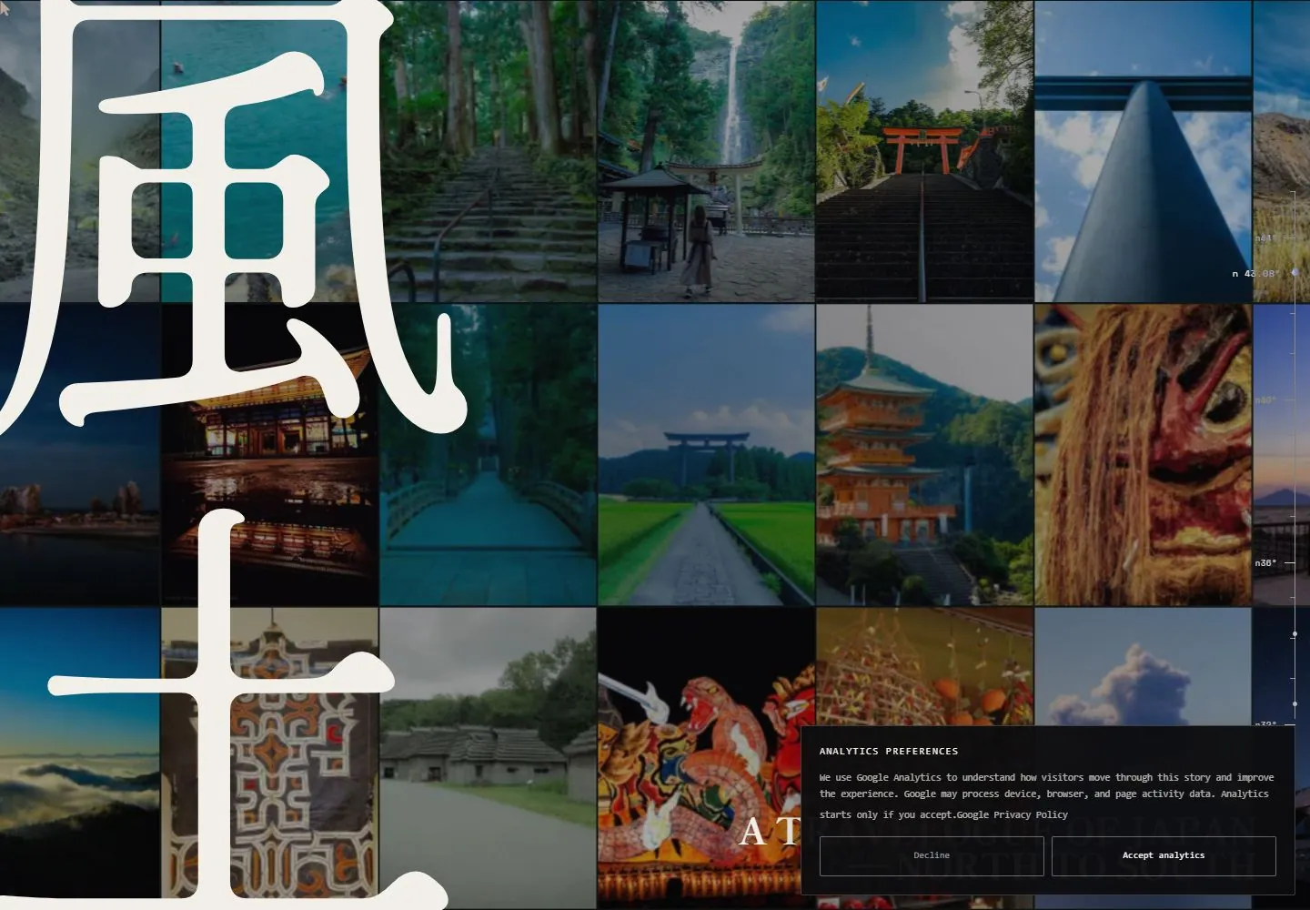
Live capture at 1440px, 2026-10-24
How it’s built
- Layout
- A darkened, tightly tiled mosaic of Japan travel photographs fills the frame. Multiple oversized white Japanese glyphs are stacked vertically at left and mask several tiles; a small white serif travelogue title sits at lower right, with fine coordinate-like labels along the right edge. This is the exact selected composition; whether it is a whole viewport or page section is unknown.
- Type
- Several oversized white Japanese display glyphs form a stacked vertical graphic at left; a compact high-contrast serif title anchors the lower right. Tiny right-edge labels are not reliably legible. Typeface and metrics unknown.
- Color and surface
- Darkened photographic mosaic with deep greens, blue sky/water, muted reds and amber architecture; white glyph and title. No visible card shadows.
- Components
- Darkened rectangular travel-photo mosaic, stacked oversized glyphs crossing the left tiles, compact lower-right serif title, fine right-edge coordinate labels.
What makes it work
- Darkened multi-row photo mosaic as the broad field.
- Multiple oversized glyphs stacked at left and crossing several photo tiles.
- Compact lower-right title remains secondary to the image field and glyphs.
On a new subjectFor an unrelated regional ecology guide, build an original darkened mosaic of locally relevant habitat photographs, stack several original oversized glyph-like forms down one side across the tiles, and keep a short serif guide title small in the opposite lower corner. Use the new region's imagery and identity.
Measured
Fonts loadedHina Mincho, Shippori Mincho, Shippori Mincho B1, Space Mono
H116px / 400
Body text16px
Page background#111013
Text color#000000
Page height26,828px
Computed CSS at 1440px, 2026-10-24.
Live behavior
- Today
- A darkened full-screen mosaic of Japanese landscape and cultural photographs forms a close grid behind monumental cream vertical Japanese characters cropped at the left and lower edges. A fine vertical latitude-like scale is visible at right. A black analytics-preferences panel with small monospaced copy and two outlined choices obscures the lower-right portion; the partially visible English title sits behind it.
- Responsive
- Tablet retains the mosaic and enlarged vertical characters with the preferences panel covering the lower right. Phone shows fewer, narrower image columns, a large cropped title and the preferences panel across most of the lower width. Overlay obscures underlying copy; three widths do not establish all breakpoints.
- Scroll
- At actual desktop scroll 750 the giant characters leave the visible frame and images appear separated into tall columns on a dark field; the preferences panel remains in the lower right. This single pair does not establish later sections or the precise scroll mechanism.


