
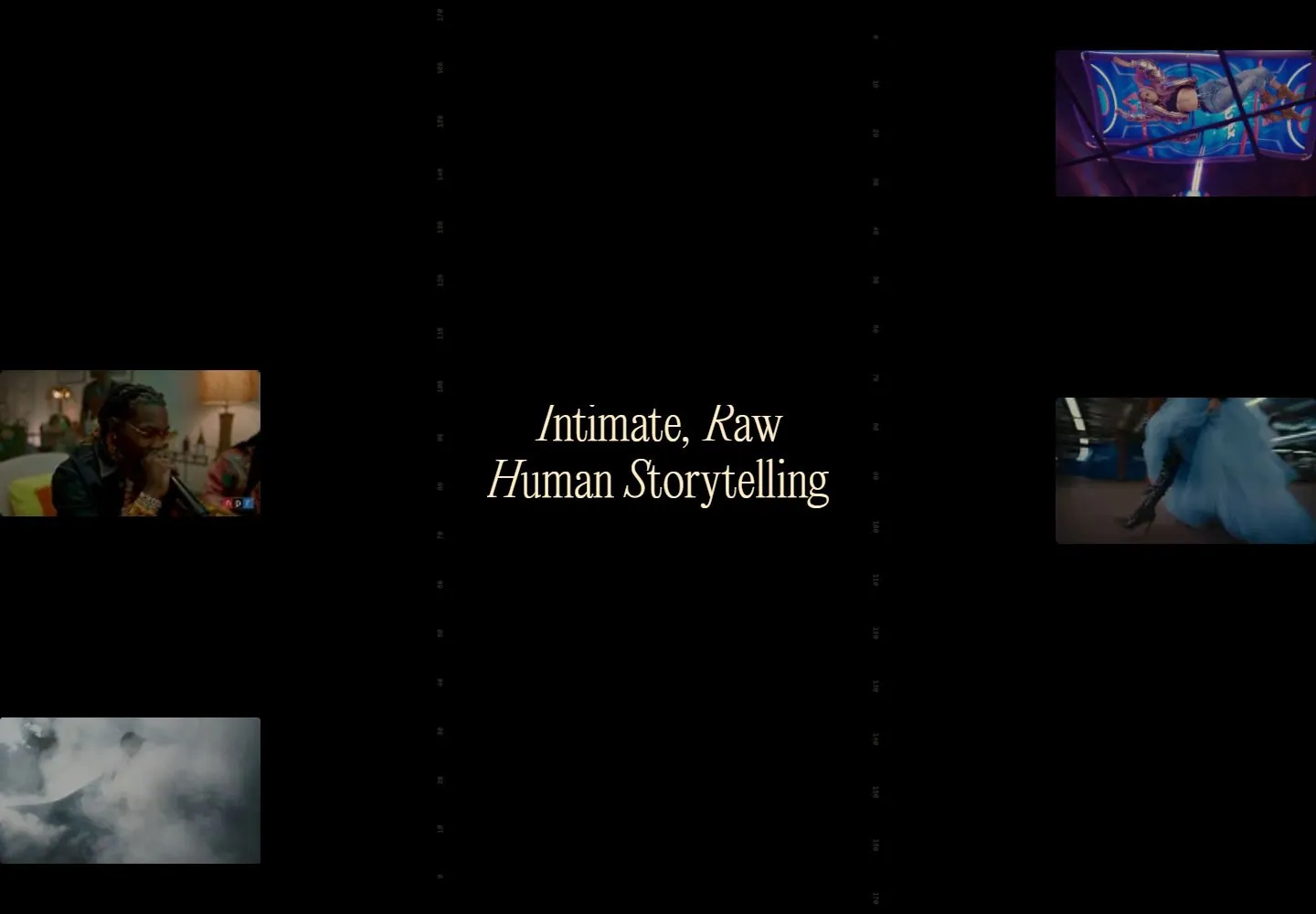
Live capture at 1440px, 2026-10-24
How it’s built
- Layout
- A dark muted photographic-looking face fills a bounded page. An inset horizontal crop sits at center, with a very large cream serif title with italic-leaning capitals and more upright thin lowercase split to its left and right; tiny technical metadata and corner navigation overlay the image.
- Type
- Large fine serif title with italic-leaning capitals and more upright thin lowercase; very small uppercase and monospaced-looking metadata. Exact font unknown.
- Color and surface
- Olive, brown and black image tones, cream text and thin light markings.
- Components
- A centered cropped image inset overlays a dark photographic-looking scene; a large cream serif title with italic-leaning capitals and more upright thin lowercase flanks it and tiny metadata sits around it.
What makes it work
- Dark photographic-looking full-field scene
- Central inset crop
- Large cream serif title with italic-leaning capitals and more upright thin lowercase flanking inset
- Tiny technical metadata and corner navigation
On a new subjectFor a public ocean-history archive, place a central inset crop over a dark photographic-looking ocean scene, flank it with a large cream serif title with italic-leaning capitals and more upright thin lowercase and add tiny metadata and corner navigation.
Measured
Fonts loadedEditorialnew, Monumentgrotesk, MonumentgroteskMono, Abcsimonmono, EditorialnewItalic, EditorialnewItalicRegular
Body text14px
Page background#1e1e1c
Text color#ffeec8
Page height1,077px
Computed CSS at 1440px, 2026-10-24.
Live behavior
- Today
- A dark cinematic portfolio uses cream italic serif titles split around a central framed image, with tiny navigation, category labels and faint vertical numeric guides. Small media thumbnails and a muted background occupy the field. The original desktop reference shows a centered introductory statement; the gallery reference shows another project in a browser-like frame.
- Responsive
- Tablet and phone replace the desktop link row with Menu and stack the project title above and below a central image frame. The fresh phone uses a single line for each title half while the ordinary phone wraps, a separate load and phase that is not a controlled breakpoint comparison.
- Scroll
- The desktop scroll attempt records actual scrollY 0 and retains the same project composition; it does not establish a later page section.


