
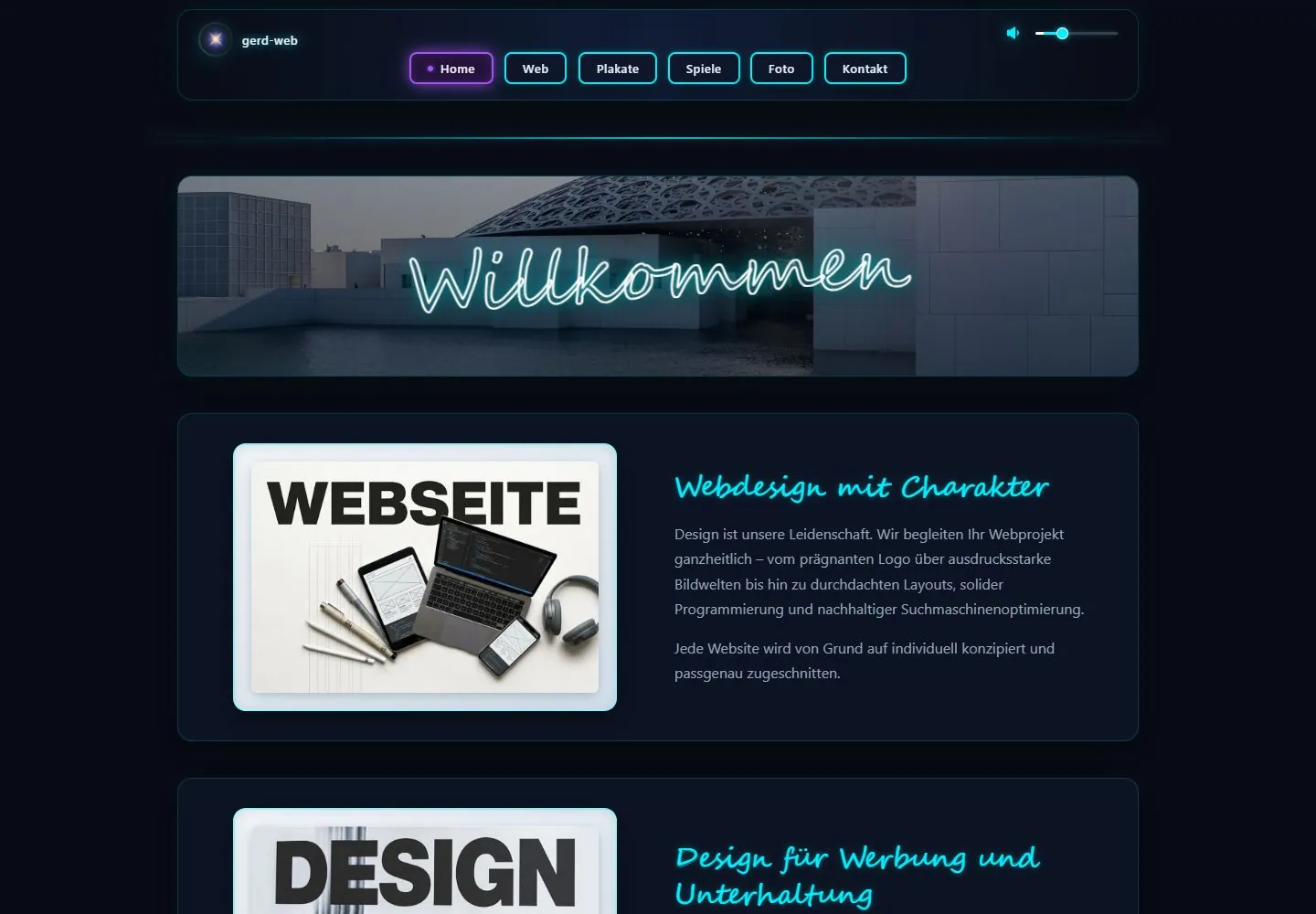
Live capture at 1440px, 2026-10-24
How it’s built
- Layout
- A dark navy page overview shows successive areas: a cyan connected-node diagram with labeled pills and a small volume control; a fine cyan divider; an architectural banner with glowing script identity; then a dark project area with colorful board-game image and adjacent description. The still does not establish transitions or interaction.
- Type
- Compact bold sans node labels, glowing handwritten banner title, cyan project heading and smaller gray sans paragraph. Exact font metrics unknown.
- Color and surface
- Deep navy/black panels with thin cyan lines/borders, cyan-white labels, purple game accents and gray architectural photography.
- Components
- Connected labeled node map, volume symbol/slider, cyan divider, architectural banner and dark image-plus-copy project panel.
What makes it work
- Deep navy/near-black field
- Thin cyan connector lines and bounded labeled nodes
- Differentiated content modules separated by a fine rule
- Dark project panel pairing image, concise title and copy
On a new subjectFor a university climate-learning portal, use a deep navy page with a thin cyan connected map of learning topics, then a field-research image and dark project panels pairing sourced data imagery with concise titles/copy. Tie varied modules with fine cyan rules; replace design-project/game content and test controls separately.
Measured
H230px / 400
Body text16px
Page background#080c16
Text color#e6edf8
Page height1,000px
Computed CSS at 1440px, 2026-10-24.
Live behavior
- Today
- Near-black navy field with centered rounded outlined panels. The header combines a glowing star identity, small cyan audio controls and a row of separately bordered navigation buttons; the current Home button is purple. A wide architectural photograph carries a large luminous cursive Willkommen. Subsequent navy panels pair a thick pale framed image with cyan script headings and muted gray sans paragraphs. Cyan light-like separators and soft outline glows connect the panels.
- Responsive
- Desktop header and article panel measure1052px wide; header corners16px and navigation buttons8px. At390px the header is358px wide with16px margins, and a54x35px cyan outlined hamburger replaces the link row. The hero image becomes356x158px. Article image moves above text and measures210x139.859px inside a234px-wide frame. Cursive article heading changes30px/40.5px to22.4px/30.24px; paragraph remains16px/27.2px. Tablet also uses the hamburger and stacked article layout.
- Scroll
- The desktop-scroll attempt remains at actual scrollY0 with document1440x1000 even though main-region geometry extends below the viewport. The screenshot retains the hero and first content panel. This attempt does not establish page scrolling, a sticky header, internal-scroll behavior or access to lower content.


