
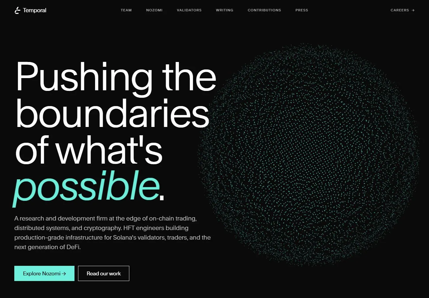
Live capture at 1440px, 2026-10-24
How it’s built
- Layout
- A black field uses sparse corner text and navigation around a faint central circular texture.
- Type
- Small regular light sans copy with no large display heading.
- Color and surface
- Black background, pale text and subdued speckled circle.
- Components
- Logo, introduction, vertical links, circular visual and footer links.
What makes it work
- Sparse peripheral text and a subdued textured circle on black.
On a new subjectFor an astronomy archive, surround a faint star-field circle with small navigation and introductory text.
Prompts
Create a visual direction for {{website_name}} in {{industry}} for {{audience}}, shaping {{content}} and supporting {{functionality}}.
COMPOSITION INVARIANTS: Compose an asymmetric dark hero with a large left-aligned statement and supporting paragraph on one side, balanced by a large rounded or spherical field of fine points on the other. Place two actions below the copy. Preserve the observed visual hierarchy and spacing relationships, not the source-specific object inventory.
TYPE: Use a thin oversized sans lead, a single italic or accent-colored phrase, small tracked navigation, and moderate gray paragraph text. Keep the action labels concise. Set a readable scale step between display text, supporting copy, captions, and utilities. Do not name a font family.
SURFACE AND COMPONENTS: Use a near-black field, white type, and one cool aqua accent. The point visualization may carry the accent but should remain distinct from the copy. Component roles: Top navigation, four-line-or-shorter statement, paragraph, paired actions, and one point-based visual mass. Keep controls visually distinct and subordinate to the main content.
IMAGE DIRECTION: Create a new data or concept visualization appropriate to {{industry}} and {{content}}; do not reproduce the exact point sphere. Proportion estimate from the selected still: Visual estimate: text and sphere each use roughly 47–48% of width; top nav under 7% height. Treat it as an estimate, not fixed CSS geometry.
VARIABLES: Adapt names, details, image subjects, palette accents, and working actions to {{website_name}}, {{industry}}, {{audience}}, {{content}}, and {{functionality}}.
PROHIBITIONS: Use original copy and assets. Do not reproduce the source brand, exact wording, photographs, illustrations, products, people, or signature artwork; source-specific objects and motifs are optional only when they genuinely fit the new subject.
CONTINUATION: Continue with clear content sections using the same dark surface and occasional point-detail motif, not a repeated giant visual.
RESPONSIVE PROPOSAL: Move the point visual below or behind the copy at reduced scale; preserve headline line breaks, paragraph width, and both reachable actions. These are design proposals, not observed mobile behavior. The selected still does not establish source fonts, CSS, implementation technology, motion, or control behavior. Do not present any of those as observed. Implement requested {{functionality}} as working new behavior without implying source validation.
Implement a responsive page for {{website_name}} in {{industry}} for {{audience}}, presenting {{content}} and working {{functionality}}.
INVARIANTS: Compose an asymmetric dark hero with a large left-aligned statement and supporting paragraph on one side, balanced by a large rounded or spherical field of fine points on the other. Place two actions below the copy. Keep the same relative prominence and spacing without requiring the same source objects.
TYPE AND SURFACES: Use a thin oversized sans lead, a single italic or accent-colored phrase, small tracked navigation, and moderate gray paragraph text. Keep the action labels concise. Use a near-black field, white type, and one cool aqua accent. The point visualization may carry the accent but should remain distinct from the copy. Maintain clear display/body/utility scale, readable line lengths, and sufficient contrast. Components: Top navigation, four-line-or-shorter statement, paragraph, paired actions, and one point-based visual mass.
IMAGERY AND SCALE: Create a new data or concept visualization appropriate to {{industry}} and {{content}}; do not reproduce the exact point sphere. Visual estimate only: Visual estimate: text and sphere each use roughly 47–48% of width; top nav under 7% height. Use flexible widths and content-led dimensions; do not copy this screenshot's coordinates as fixed values.
VARIABLES: Adapt names, details, image subjects, palette accents, and working actions to {{website_name}}, {{industry}}, {{audience}}, {{content}}, and {{functionality}}.
PROHIBITIONS: Use original copy and assets. Do not reproduce the source brand, exact wording, photographs, illustrations, products, people, or signature artwork; source-specific objects and motifs are optional only when they genuinely fit the new subject.
CONTINUATION: Continue with clear content sections using the same dark surface and occasional point-detail motif, not a repeated giant visual.
RESPONSIVE PROPOSAL: Move the point visual below or behind the copy at reduced scale; preserve headline line breaks, paragraph width, and both reachable actions. Use semantic content, keyboard-operable controls, visible focus, meaningful alt text, and no clipped content. The selected still does not establish source fonts, CSS, implementation technology, motion, or control behavior. Do not present any of those as observed. Implement requested {{functionality}} as working new behavior without implying source validation.
Measured
Fonts loadedrand, rand Fallback
H1129.6px / 400 / -4.536px
Body text16px
Page background#0a0a0a
Text color#ffffff
Page height4,298px
Computed CSS at 1440px, 2026-10-24.
Live behavior
- Today
- Temporal saved desktop pairs an oversized white upright sans statement with a mint italic emphasized word at left and a large mint particle-like spherical field at right on near-black. Restrained gray body copy, mint filled/white outlined rectangular actions and tiny uppercase navigation form the supporting hierarchy. A dark bordered code-like information panel appears lower in the page. Current version remains separately attributed from gallery images.
- Responsive
- At768px and390px the desktop navigation is replaced by a two-line menu cue, while the spherical particle field moves behind lower copy/actions. Tablet content begins much lower with broad dark space above, and its title uses three lines; mobile title starts near192px and wraps into four lines with mint emphasis last. Mobile actions stack, with the second partly below captured viewport. Exact breakpoints and menu opening untested.
- Scroll
- Actual desktop scroll750px in4360px document reveals a ruled mint/black product section: large white title with mint italic word at left, dark bordered code-like panel at right with small monospaced gray/mint content and subtle teal glow. Fixed navigation remains visible and overlaps departing hero copy at this sampled offset. Reveal timing and all subsequent sections not tested.


