
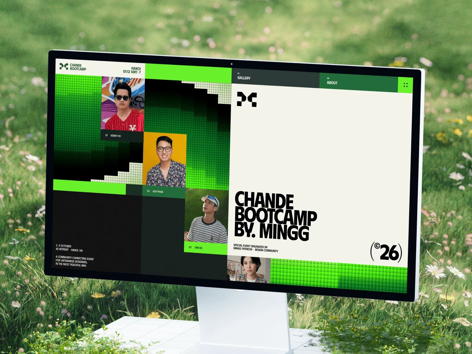
Gallery screenshot, saved 2026-10-24
How it’s built
- Layout
- The gallery image shows a desktop monitor standing in a grassy scene. Inside the tilted screen, a modular event page mixes a lime green/black tiled visual field and portrait cards at left with a large cream event-title panel at right; small schedule/event copy sits lower left and small navigation/status tabs run across the top. Monitor, stand and meadow are presentation framing.
- Type
- In-screen headline is very bold condensed uppercase sans; names and event details use tiny uppercase sans. No exact face/metrics available.
- Color and surface
- Screen design combines vivid lime green, black, deep green and cream panels, small portrait photos and white/black type. Outside the screen is a soft-focus meadow.
- Components
- In-screen event navigation/status rail; tiled color field; participant portraits and labels; oversized cream title panel; event information block.
What makes it work
- Distinct event-title region
- Participant imagery with compact labels
- Concise event details
- Strong contrasting color blocks
On a new subjectPresent an unrelated event with a clear title zone, a few representative participants/examples and concise logistics in a modular field. Replace identities and do not carry over the device/mockup scene.
Live behavior
- Today
- The live capture is a Chande Bootcamp event page. On desktop, a modular field of bright and dark green square tiles and portrait cards fills the left side, while an off-white right panel carries a small geometric mark, very large condensed black “CHANDE BOOTCAMP BY. MINGG” title and ©26 mark. Small labels identify Gallery, About, Hanoi and the event dates; a bright green nominee tab sits at the right edge. The separately selected gallery image is a monitor mockup on a meadow and shows another cropped composition of this page, not the saved live screenshot.
- Responsive
- The desktop state measures 1440×1000 with document height 21261; tablet is 768×1024 with document height 33336; phone is 390×844 with document height 19881. The phone and tablet captures show portrait tiles in two columns above the large title panel, with different visible participant sets in the ordinary phone, reduced-motion phone and tablet states. These isolated widths do not establish breakpoint thresholds or content order across the whole page.
- Scroll
- The desktop-scroll state records actual scrollY=750 in a 1440×21261 document. Its screenshot shows the large statement “AN EVENT FOR ALL DESIGNERS TO CONNECT. LISTEN & SHARE (THE LOVE)” beneath the portrait grid. This is evidence for the saved scrolled view only.


