
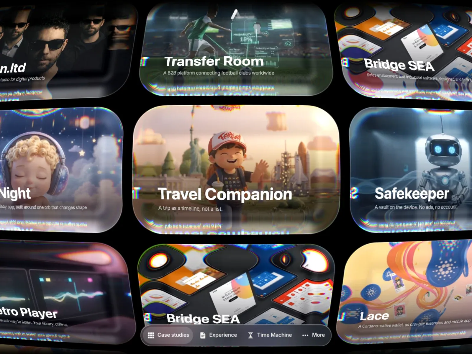
Gallery screenshot, saved 2026-10-24
How it’s built
- Layout
- Near-black canvas with a dense three-row field of large rounded project panels, several partly outside the image edges. Panels vary in scale and show different project imagery and short title/support combinations. Strong chromatic edge doubling/glitching appears around several panel boundaries. A translucent rounded dock with icon/text links sits across the lower center.
- Type
- Project titles are medium/large bold sans, descriptions smaller sans; type is embedded within each project panel. Exact family/metrics unknown.
- Color and surface
- Black ground, rounded panels with photographic, interface and illustration content, dark translucent dock and visible cyan/magenta/green edge fringing.
- Components
- Multi-row project-panel field, project title/description pairs and bottom-center dock with Case Studies, Experience, Time Machine and More.
What makes it work
- Dark open ground
- Several rounded project panels
- Project-specific labels
- Clear navigation dock
On a new subjectPresent unrelated projects in distinct rounded panels with concise labels on a dark field and provide a clear compact navigation dock. Replace project content and personal identity.
Live behavior
- Today
- The Allan Leone portfolio capture opens on a nearly black screen with a small centered white mark, a centered “Scroll or drag to explore” prompt and a rounded control bar near the bottom. The t2 and later gallery frames show numerous rounded case-study cards drifting across the black canvas, with photographic or rendered imagery, white titles such as “allan.ltd,” “Transfer Room,” “Bridge SEA,” “NightNight” and “Safekeeper,” and small chromatic/glitch-like accents along card edges. The separately selected gallery reference is a different project collage, not the exact saved live frame.
- Responsive
- Desktop, tablet and phone captures are 1440×1000, 768×1024 and 390×844, and each document equals its viewport with actual scrollY=0. The tablet shows a dense card field with a floating bottom control; the ordinary phone shows a cropped card grid and compact floating controls. The reduced-motion phone instead shows a vertically stacked set of individual case-study cards. These captures do not establish breakpoint thresholds or the complete page layout.
- Scroll
- The desktop-scroll state measures actual scrollY=0 in a 1440×1000 document. It shows the same card-gallery type of view as the later desktop frame rather than a confirmed scrolled section. No page-scroll response is established.


