
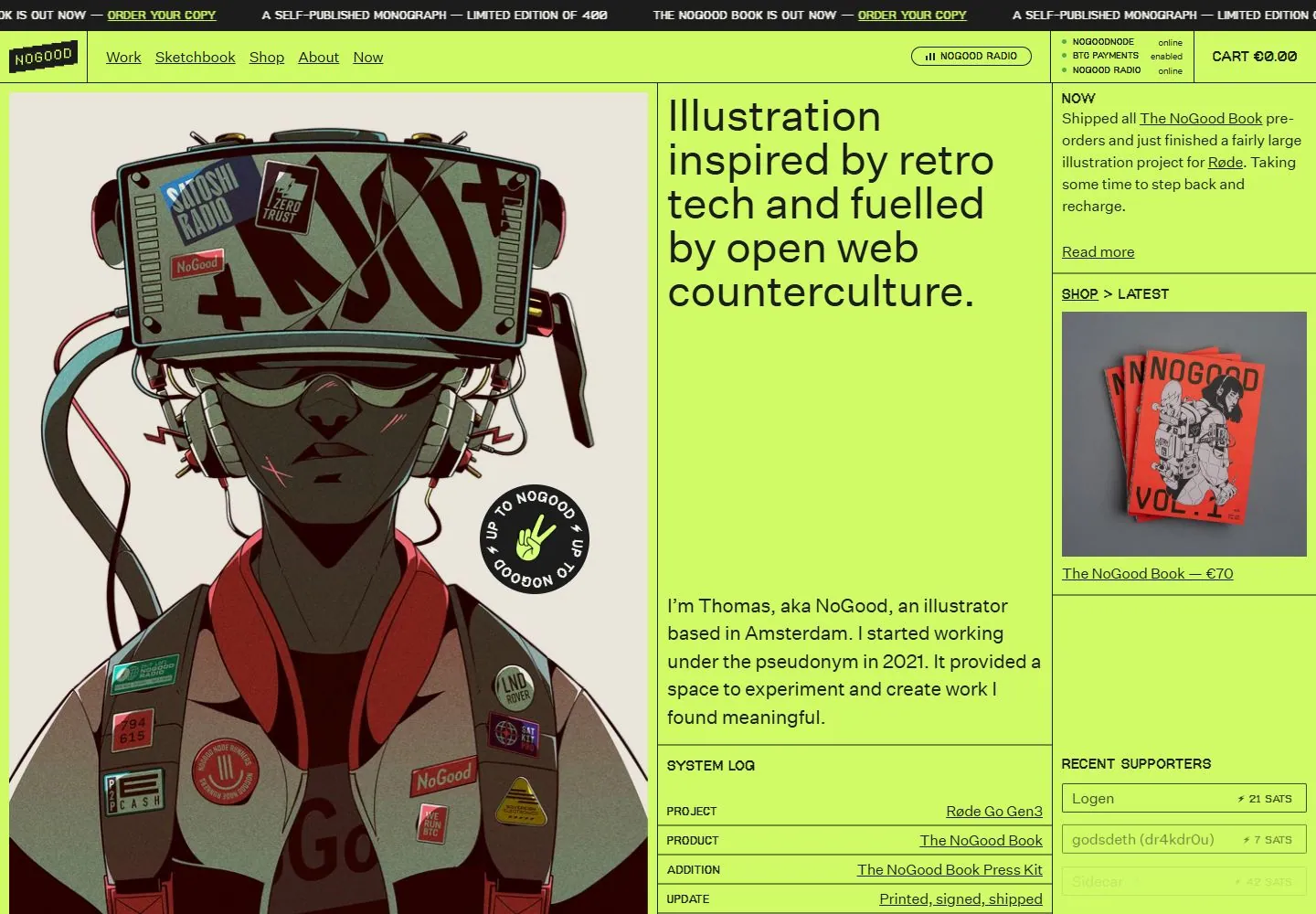
Live capture at 1440px, 2026-10-24
How it’s built
- Layout
- A vivid yellow-green page is divided by thin dark rules into a large left illustration, a middle oversized introduction and a narrow right news/shop column. Announcement and navigation/status bars fill the shallow top.
- Type
- Large regular black sans introduction, small plain sans navigation/body and tiny monospaced-looking status labels; image lettering is part of illustration/product artwork.
- Color and surface
- Flat acid yellow-green ground, black text/rules, muted cream/red/green illustration and a vivid red book image.
- Components
- Announcement, boxed navigation/status/cart areas, huge left image, middle statement, stacked right news/product cells and small rounded radio cue.
What makes it work
- An acid green ruled multi-column page mixing a dominant illustration, oversized plain introduction and dense narrow utility/content cells.
On a new subjectFor an urban farming cooperative, use an acid green ruled page with a large illustrated crop scene, oversized mission text and a narrow news/seed-shop column.
Measured
H148px / 400 / -0.48px
Body text16px
Page background#fbfaf3
Text color#1c1c1c
Page height6,884px
Computed CSS at 1440px, 2026-10-24.
Live behavior
- Today
- NoGood’s captured page has a vivid lime background, thin black grid lines and a narrow black ticker strip advertising a self-published monograph. A small NoGood mark and Work/Sketchbook/Shop/About/Now links sit at the top. The left column is dominated by an illustrated retro-tech character; the central column contains the headline “Illustration inspired by retro tech and fuelled by open web counterculture,” an introduction and a system log. The right column holds a “NOW” note, a NoGood Book shop card and recent supporter entries. Desktop t0, t2 and hover retain this broad layout, while some ticker/status text changes. At y=750, the frame shows the featured-work heading, more project tiles and supporters. Tablet and phone stack/crop the illustration with a compact menu. The selected gallery reference is a separate view with different introductory copy and shop/sidebar text.
- Responsive
- Desktop is 1440×1000 with a 1440×6884 document; desktop-scroll records actual y=750. Tablet is 768×1024 with a 768×10530 document. Ordinary phone is 390×844 with a 390×7547 document; reduced-motion phone has the same viewport but a 390×9487 document. Desktop states sample 25 animation entries; tablet and both phone states sample 14. The visible columns and navigation differ across sampled widths, but the captures do not establish breakpoints.
- Scroll
- The desktop-scroll frame records actual scrollY 750 in a 1440×6884 document. It shows the bottom of the large illustration, a “FEATURED WORK / ALL WORK” header, additional art tiles and project text, plus supporter entries at upper right. This saved position does not test project links.


