
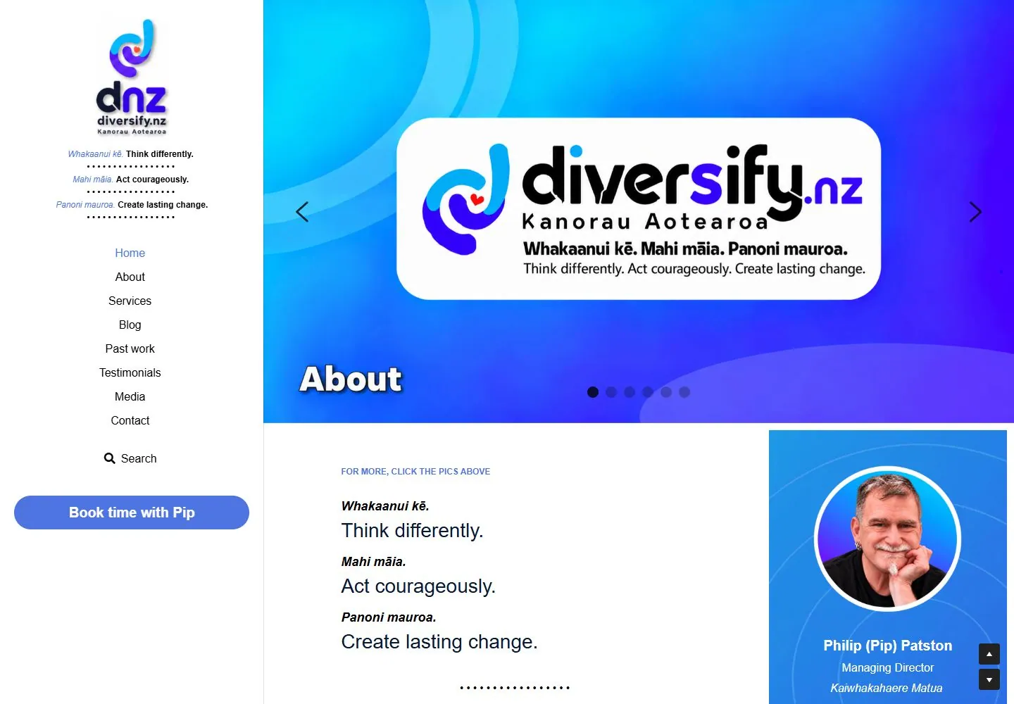
Live capture at 1440px, 2026-10-24
How it’s built
- Layout
- The 1440-by-1000 desktop screenshot shows a white left sidebar with logo, bilingual slogans, stacked navigation and blue rounded booking action. A large blue-to-violet hero at right contains a centered white rounded identity panel, arrows and dots; below it are bilingual copy and a blue portrait card.
- Type
- Sidebar uses compact sans navigation and italic bilingual lines; hero identity is large rounded black display lettering; lower copy mixes bold italic and regular sans. Exact painted font identity unknown.
- Color and surface
- White sidebar/content, vivid cyan-blue-violet hero, white panel, blue action and blue portrait card.
- Components
- Combine a white vertical sidebar with stacked navigation and rounded blue action beside a vivid blue-violet hero with a centered white rounded identity panel; continue below with bilingual copy and blue portrait card.
What makes it work
- White left sidebar with stacked navigation and rounded blue action
- Cyan-to-violet hero and centered white rounded identity panel
- Bilingual copy and blue portrait card below
- Large content area to the right
On a new subjectFor a public community music service, use a white left sidebar with stacked navigation and rounded blue action beside a cyan-violet banner with a central white identity panel, followed by bilingual information and a blue portrait card.
Measured
H228px / 400
Body text14px
Page backgroundtransparent
Text color#000000
Page height3,183px
Computed CSS at 1440px, 2026-10-24.
Live behavior
- Today
- A white left sidebar contains a tall multicolor identity, short bilingual value lines with dotted separators, a centered vertical navigation list and a large blue booking capsule. Main content starts with a blue/cyan/purple graphic banner, followed by generous white text column and a bright blue gradient portrait/profile panel at right. Main principles pair bold italic short labels with larger plain sans statements and use dotted text dividers. A later dark navy section has cyan small heading and white prose. This is a conventional content-led current page; the sidebar arrangement alone does not establish a distinctive final style category.
- Responsive
- Desktop fixed sidebar measures374.391px wide within1440 viewport, main banner starts at374.406 and is roughly1066x602px. Tablet sidebar narrows near215px while main retains text/profile columns; portrait IMG shrinks210.672px square to79.563px and profile copy wraps very tightly, including broken words. Treat that crowded right column as an observed weakness rather than a design invariant. Phone replaces sidebar with60px white top bar containing hamburger left and a30.172x50px centered identity IMG; a bottom icon navigation strip is visible. Banner becomes390x220px below the top bar, followed by single-column principles at about x74. Main28px/42px statements and18px/27px labels keep size and wrap more. Profile card is outside the phone viewport.
- Scroll
- Actual desktop scrollY750 keeps the left sidebar fixed while main banner scrolls out. Principles become clipped at the top; an introductory24px blue heading and prose appear with solid/outlined blue capsule actions. Right gradient profile panel continues with portrait, name/role and outline action. Dark navy full-main-width section begins near y693 with cyan small label and white two-column prose. The first principle is only partly visible at the viewport top. No later full-page sections or link targets were reviewed.


