
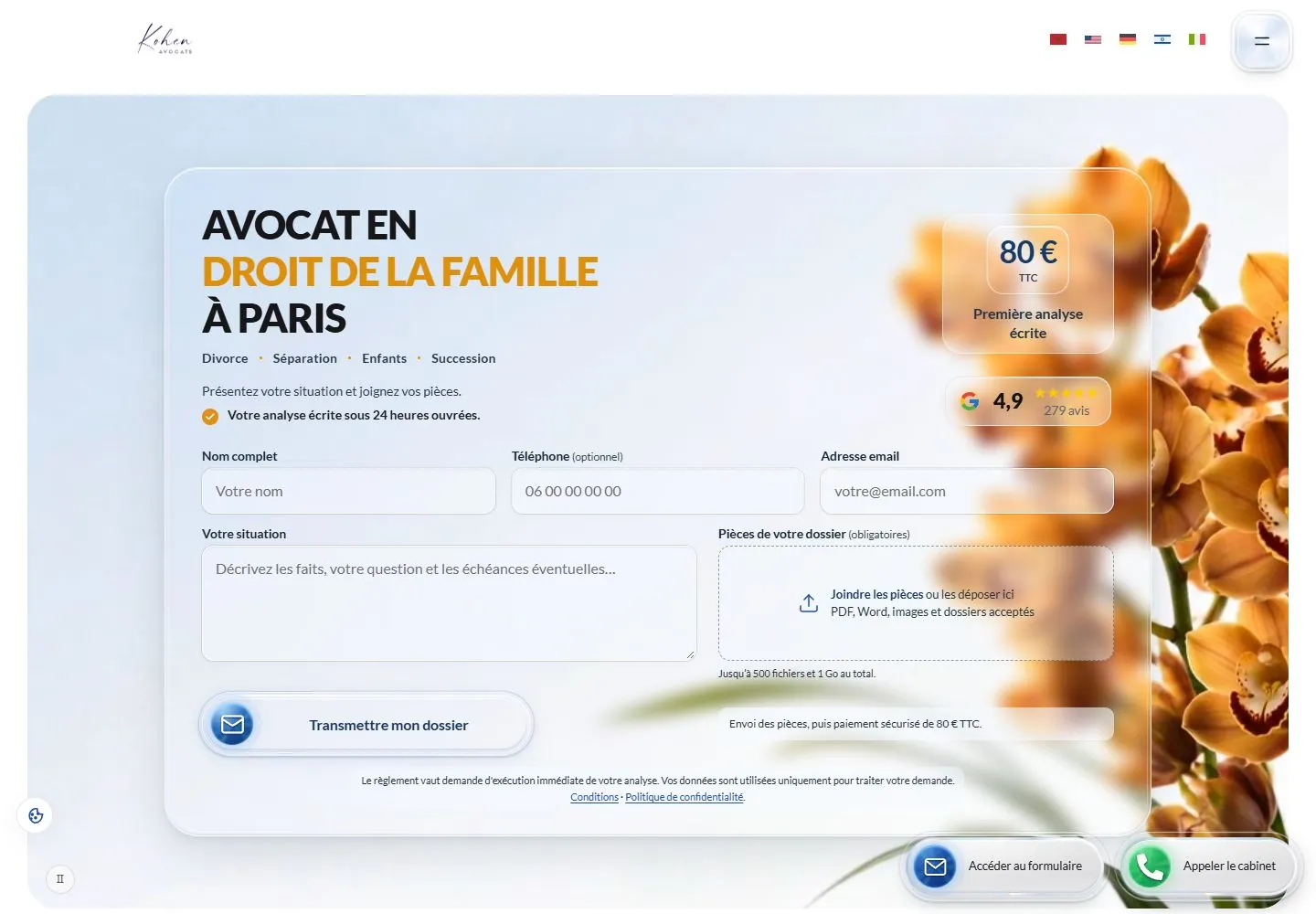
Live capture at 1440px, 2026-10-24
How it’s built
- Layout
- A large rounded hero image depicts orange flowers against a pale blue-white background. Centered bold uppercase black text has a mustard middle line, partially overlapping a white fade over flowers. A small script identity and language flags/menu sit in header; rating and call widgets occupy lower corners.
- Type
- Large bold uppercase sans centered in three lines, mustard emphasis; tiny script identity and compact utility labels. Exact font and metrics unknown.
- Color and surface
- White and pale blue field, warm orange flowers, black/mustard type and soft fade.
- Components
- Center bold uppercase black text with a mustard middle line over a softly faded pale flower photograph, with minimal header and compact corner widgets.
What makes it work
- Pale full-field flower photograph with soft white fade
- Centered bold uppercase headline with mustard emphasis
- Minimal header and compact corner widgets
On a new subjectFor a public garden education service, center a bold black uppercase invitation with a mustard middle line over an original softly faded warm flower photograph, with minimal header and compact corner information widgets.
Measured
H144px / 900 / -1.1px
Body text16px
Page background#ffffff
Text color#000000
Page height5,379px
Computed CSS at 1440px, 2026-10-24.
Live behavior
- Today
- A spacious white header with small script identity, language flags and a glossy rounded menu precedes a large pale blue rounded hero panel. Inside, a softly translucent outlined card overlays blurred orange floral photography. A bold three-line dark headline has one orange line; a compact price panel and rating badge sit alongside a dense multi-field form. Rounded translucent controls, white outlines and soft blue/gray shadows repeat through floating email and phone actions.
- Responsive
- Desktop places the form across three columns with price/rating at right. Tablet and phone stack price, rating and form fields in one column; phone shows centered flags and menu while the site identity is not visible in the captured header. The floating action overlaps lower form fields on narrow screens. The Lato headline declares 44px desktop, 36px tablet and 29px phone.
- Scroll
- At actual scrollY750 the hero bottom leaves view, then a press-logo row and centered editorial section appear; a pill tab row leads into a large pale bordered content card. Floating contact actions remain near the bottom and partially obscure text. Logos are third-party artwork, not measured typography or verified endorsement.


