
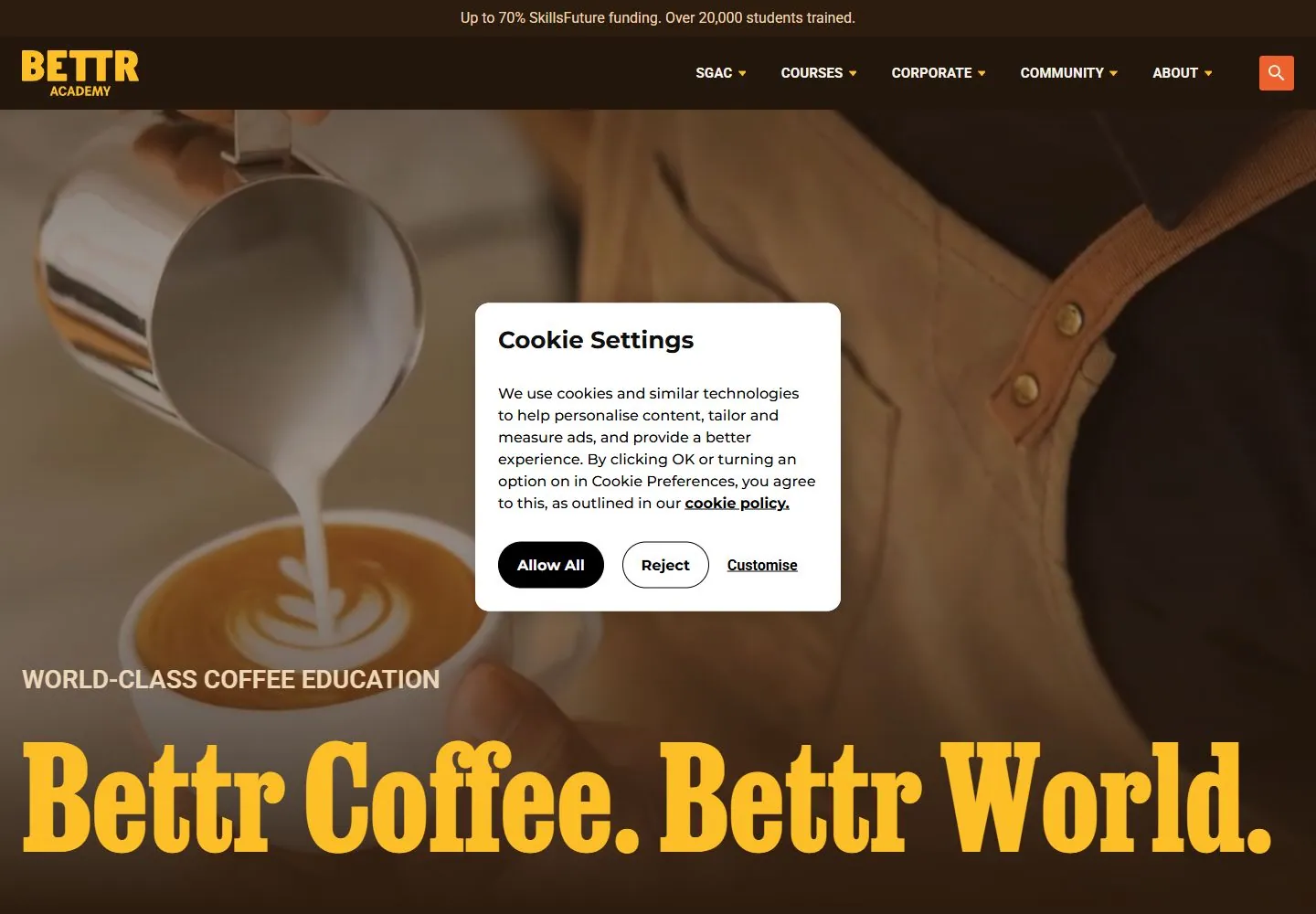
Live capture at 1440px, 2026-10-24
How it’s built
- Layout
- Inside the pictured laptop, a darkened documentary close-up fills the hero. Small white uppercase navigation and a mustard identity/action run across the top. A white kicker and enormous mustard condensed slab-serif slogan sit low over the image, with a small circular review seal to the right. A dark brown lower strip pairs a smaller matching display question with an orange action. Laptop, furniture and room are gallery staging.
- Type
- Heavy condensed slab-serif, slightly slanted-looking display slogan and strip question contrast with tiny plain uppercase sans navigation/actions and a small white kicker. Exact fonts/metrics unknown.
- Color and surface
- Warm grainy brown/green photography, dark lower shading, mustard display type, white utility text, olive proof seal and orange secondary action.
- Components
- Image hero, compact header, kicker/slogan, circular proof badge and lower question/action strip.
What makes it work
- Warm darkened documentary image field
- Oversized condensed slab-serif display in a warm high-contrast accent
- Small restrained light utility typography
- Dark lower strip repeating display hierarchy with a compact action
On a new subjectFor a public trail-maintenance volunteer collective, use original warm documentary volunteer photography beneath a huge mustard condensed slab-serif mission line. Keep tiny white navigation and a dark lower strip carrying a short recruitment question and orange sign-up action. Replace coffee education content and proof claims.
Measured
Fonts loadedJobclarendon, Montserrat
H1154.701px / 600
Body text16px
Page background#f7f4ed
Text color#2c1c0f
Page height8,353px
Computed CSS at 1440px, 2026-10-24.
Live behavior
- Today
- Warm near-black/brown navigation and surfaces, saturated golden-yellow display text, oversized tightly spaced slab-serif hero, small uppercase sans kicker and broad coffee-production imagery. A white rounded consent dialog with black controls covers the center; it is incidental interface, not the defining palette.
- Responsive
- Desktop has a long navigation row; tablet replaces it with search/menu icons and reduces the slab-serif title; phone retains the menu and a much smaller title behind a taller consent dialog. The phone dialog occupies most of the lower viewport, preventing full inspection of the page. These are saved states, not a complete breakpoint map.
- Scroll
- The recorded desktop scroll reaches750px; the navigation remains at the top, the original hero title is partly beneath it, and a brown section with three yellow illustrated panels follows. Consent obscures the middle panel and part of the section heading; the visible outer labels are Yourself and The World.


