
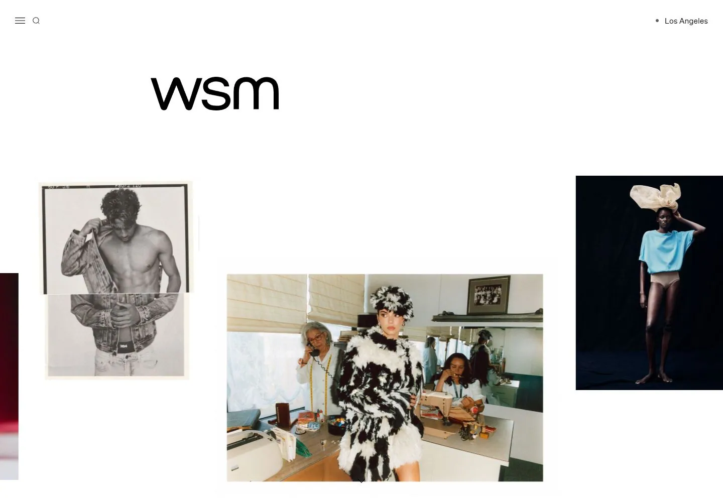
Live capture at 1440px, 2026-10-24
How it’s built
- Layout
- White field with abundant upper whitespace; large lowercase identity left of center, tiny top utilities/location, staggered tall colorful photography columns.
- Type
- Large regular lowercase black wordmark; tiny simple sans utilities and location label, with imagery carrying the rest of the hierarchy.
- Color and surface
- White field, black typography and colorful photography with unbordered square-edged crops.
- Components
- Small menu/search cues, location label, offset wordmark and staggered tall photographic columns.
What makes it work
- Sparse offset identity above staggered tall photographic columns on white.
On a new subjectFor an ethnographic textile archive, place a sparse offset collection name above staggered tall fabric and process photographs.
Measured
Fonts loadedBNY Universe, Untitled Sans
Body text15px
Page background#ffffff
Text color#000000
Page height4,546px
Computed CSS at 1440px, 2026-10-24.
Live behavior
- Today
- The current WSM portfolio uses a white canvas with minimal hamburger and search controls at upper left and a location label at upper right. A large lowercase WSM wordmark sits above a loose editorial collage: a monochrome fashion portrait left of a wider studio photograph, with other portrait and product images at the outer edges. Compact captions sit directly below selected images. At tablet and phone sizes the collage continues as overlapping, staggered image columns; the visible active photos differ by viewport and reload. No large body headline appears in the saved opening frame.
- Responsive
- The desktop captures use 1440×1000 viewports and a 4546px document; desktop-scroll is measured at scrollY 750. Tablet is 768×1024 with a 4768px document; both phone captures are 390×844 with document height equal to the viewport. Measured “Los Angeles” line height is 17.25px on desktop, 14.95px on tablet, and 13.8px on phone; the sampled font is Untitled Sans. These viewport samples do not establish breakpoints.
- Scroll
- The desktop-scroll image is measured at actual scrollY 750 in a 4546px document and shows a different portion of the image collage. The images also shift between desktop-t0 and desktop-t2 when both report scrollY 0, so these captures do not establish that every position change is user scrolling.


