
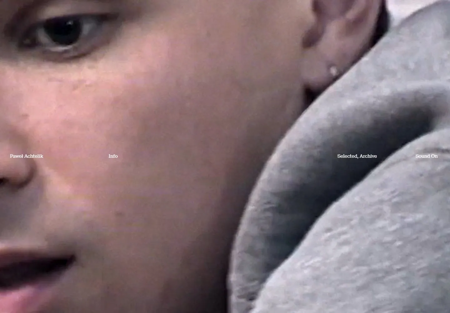
Live capture at 1440px, 2026-10-25
How it’s built
- Layout
- A warm yellow editorial page presents a wide image row broken into sections by thin black rules, with tiny title/client metadata and compact bottom biography text.
- Type
- Tiny black serif-like metadata and body.
- Color and surface
- Warm yellow field, black rules and colorful photographic-looking images.
- Components
- A wide photographic-looking image row is divided by thin rules and small metadata on a warm yellow field.
What makes it work
- Warm yellow field
- Wide segmented image row
- Fine black rules and tiny metadata
- Compact bottom text
On a new subjectFor a public theater archive, organize a wide segmented performance-image row with fine black rules, tiny metadata and compact bottom text on warm yellow.
Measured
Fonts loadedSuisseNeue
Body text15px
Page background#f7f3f2
Text color#ffffff
Page height1,000px
Computed CSS at 1440px, 2026-10-25.
Live behavior
- Today
- Full-viewport cinematic imagery carries a sparse horizontal row of small white type around mid-height: identity, information, project categories and sound control. Imagery changes from monochrome to color across frames, while the overlay remains restrained.
- Responsive
- Tablet and phone retain the three mid-height identity/navigation groups and move the sound control to the upper right. The visible text declares SuisseNeue at 15px across sampled widths; the parent category and child links overlap and are not independent labels.
- Scroll
- The scroll-labeled desktop capture records actual scrollY 0 and another image frame. It does not demonstrate a lower section or scroll transition.


