
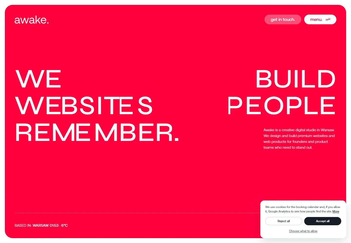
Live capture at 1440px, 2026-10-24
How it’s built
- Layout
- A bright red page uses a large white uppercase phrase split between left and right halves. Small white explanatory text sits below the right phrase. A row of dimensional round marked discs spans the lower area above a thin footer line; small rounded controls occupy upper right.
- Type
- Very large light regular uppercase sans, smaller regular explanatory text, compact utility labels. Exact font and metrics unknown.
- Color and surface
- Saturated red field, white text, pink/white/gray dimensional discs and rounded controls.
- Components
- Distribute large light white uppercase words across opposite sides of a saturated red field, with small right-side explanation and a low row of dimensional discs.
What makes it work
- Saturated red field
- Large light uppercase words split across left and right
- Small right-side explanation
- Low row of dimensional embossed discs
On a new subjectFor a public blood-donation campaign, split a large white uppercase invitation across a red field, add a small right-side explanation and a low row of original embossed circular donor tokens.
Measured
Fonts loadedaeonik, syne
H1110px / 500
Body text18px
Page background#ffffff
Text color#161d25
Page height10,915px
Computed CSS at 1440px, 2026-10-24.
Live behavior
- Today
- A saturated red-pink panel nearly fills the screen inside a white outer gutter, with large rounded corners. White uppercase sans words form an unusually wide, separated three-row statement: first and second rows split between left/right edges, third anchored left. A small white wordmark and two compact capsule controls sit at the top. A narrow right-side body paragraph sits beneath the headline. Large shaded circular tokens with a letter mark gather along the lower edge above a thin rule and small location/contact metadata. The next rounded light-gray panel reverses to a large centered dark statement over faint construction lines and curves.
- Responsive
- Desktop red panel is1400x960px at20,20 with32px corners. Tablet panel728x984px keeps20px outer gutter but20px corners. Phone panel366x820px at12,12 also uses20px corners. Heading changes110px/110px desktop to57.111px/57.111px tablet and27.167px/28.253px phone, retaining computed500. Wide separated words recompose into three contiguous left-aligned lines on phone. Get in touch disappears on phone, leaving wordmark and Menu capsule. Paragraph moves below heading and changes15px/24px to14px/22.4px. Tokens become smaller visually, but no individual token bounds are sampled. Consent covers the lower phone tokens and all location/contact metadata; those metadata strings are not visible phone content.
- Scroll
- Actual desktop scrollY750 leaves the bottom230px of the red panel with tokens, fine rule and both location/contact metadata above a20px white gap. The light panel begins at y250, with32px corners and rgb(241,241,243) surface. Its centered statement uses80px/80px Syne, weight500, surrounded by very faint construction axes/curve handles. Consent occludes the lower-right words; the full raw statement cannot be claimed visible. Header scrolls out of the saved viewport, and no persistent navigation is shown here.


