
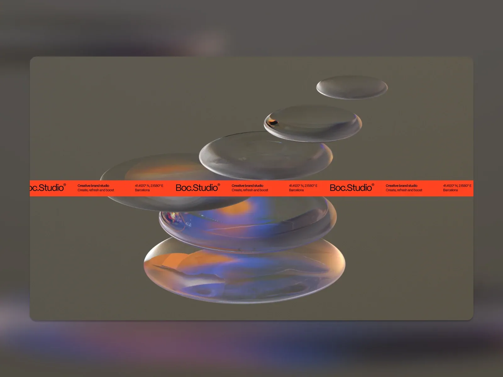
Screenshot from Awwwards, saved 2026-10-24
How it’s built
- Layout
- A pale gray-green rounded inset field sits inside a soft darker blurred surround. Several flattened translucent glass-like forms of different sizes stack at varying heights near center; warm orange and blue reflections tint their edges. A vivid orange-red horizontal strip crosses the forms and repeats the studio wordmark, short positioning text, geographic coordinates and city in successive compact groups. The image is static; movement is unknown.
- Type
- Small black clean sans wordmark, descriptor and location details repeated along one horizontal strip; no large headline. Exact font metrics unknown.
- Color and surface
- Muted gray/olive surface, translucent gray forms with blue/orange reflections, saturated orange-red band with black text.
- Components
- Quiet rounded inset field, translucent flattened forms stacked at varying scales, warm/blue reflected edges, and a repeated compact information stripe crossing the forms.
What makes it work
- Quiet rounded inset field.
- Several flattened translucent forms overlap/stack at varying scales.
- Repeated compact identity/information stripe crosses the forms horizontally.
On a new subjectFor an unrelated archaeological survey, layer original translucent flattened artifact-like forms at varied scales on a quiet rounded field and run a repeated compact archive/location strip across their middle. Use new colors, identity and content; preserve the crossing stripe and layered optical treatment without claiming animation.
Live behavior
- Today
- The saved Boc Studio desktop frames combine a deep blue field and large cropped condensed lettering with an off-white section of oversized navy text. A bright orange-red horizontal strip crosses the composition with repeated studio marks and short copy; a small cookie-language notice sits near the bottom edge. The selected gallery reference instead shows stacked luminous glass-like forms crossed by the same orange-red strip, so it is not a matched live frame.
- Responsive
- Desktop measures 1440×1000 with a 2267px document; tablet 768×1024 with a 768×2441px document; and both phone states 390×844 with 390×2436px documents. Desktop, tablet and phone screenshots show different crops and media frames. The ordinary and fresh reduced-motion phone captures are both at y=0; the set does not establish breakpoint behavior or explain the changing imagery.
- Scroll
- The desktop-scroll state records scrollY=750 in a 1440×1000 viewport and 2267px document. Its saved image shows a close-up dark teal and blue media frame crossed by the orange-red strip, with the small consent notice still near the bottom. This does not show what caused the media frame.


