
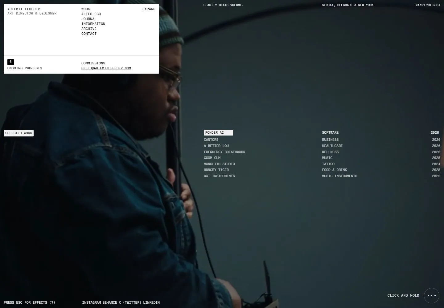
Live capture at 1440px, 2026-10-24
How it’s built
- Layout
- A glossy black sculptural chair and dark room frame a tilted screen. On that screen, a very dark portfolio page contains a compact white rectangular information/navigation panel near upper left, bright red segmented numbers within a dim project image; their numeric role is unknown, and a thin white project list crossing the center with tiny labels and years. The chair, room and screen angle are gallery presentation; this single image does not establish page behavior.
- Type
- Tiny black text inside a white panel, sparse micro-labels and a bright segmented red numeric image detail; exact fonts unknown.
- Color and surface
- Near-black page and room, white nav/list panel, muted blue-green background image and red digital numerals.
- Components
- Compact information/nav panel, red numeric detail within the project image and thin horizontal project list on a dark page.
What makes it work
- Near-black page field
- Small contrasting information/navigation panel
- Single vivid red numeric focal detail
- Thin horizontal text-led project list
On a new subjectFor a public astronomy observatory archive, use a near-black field with a small bright information panel and narrow text-led list of programs over a subdued night-sky image containing a red segmented numeric detail. The number is image content, with no live or time role implied.
Measured
Fonts loadedFragment Mono
H121.28px / 400 / -0.224px
Body text11.2px
Page background#0a0a0a
Text color#010101
Page height1,000px
Computed CSS at 1440px, 2026-10-24.
Live behavior
- Today
- A dark full-viewport film is overlaid with a white upper-left information panel, tiny uppercase monospaced utilities at the edges, and an eight-row project index across the middle-right. The panel combines identity, a vertical link list and an Expand label above a fine horizontal divider; the lower row pairs a small black project-count badge with commission/contact information. A pale Selected Work tag labels the project table. Names, sectors and years form separate aligned columns without cards or thumbnails. A narrow pale bar highlights the first project, while bottom-edge social links and a circular three-dot control keep the film exposed.
- Responsive
- Desktop panel measures504x227px at12,12, or35% of viewport width. Tablet panel becomes384x227px at the same inset, keeping the full vertical menu. At390px width it becomes377.219x129.281px at6.391,6.391; Menu replaces the vertical links, while identity, Expand, count and commission/contact remain. Table changes from a right-side block at approximately x660/y422 desktop to a full-width block below its label on tablet and phone. Phone label y460.734 precedes rows beginning near y533, with names at about x6, sectors x195 and years near x346. Upper location/time utilities and lower effects/hold controls are absent in phone pixels. Text stays very small: typical11.2px/11.2px desktop and11.04px/11.04px phone rather than a large heading hierarchy. Film remains viewport-sized with object-fit cover; different shots prevent a controlled same-frame crop comparison.
- Scroll
- The attempted desktop scroll leaves actual scrollY0 and document1440x1000. The same information-panel/index composition remains over a later film frame. This establishes only the saved non-scrolling state; it does not test possible wheel-based project switching or custom navigation. The lower project rows remain visible without any inferred hidden section.


