
Live capture at 1440px, 2026-10-24
How it’s built
- Layout
- A softly blurred dark-green surround appears around a large inset landscape rectangle. Inside, an abstract green-blue tunnel/radial image leaves a clear central opening. One horizontal line of white navigation crosses near mid-height: identity left, links left of center, agency descriptor right of center, contact at far right. Outer green surround may be gallery framing.
- Type
- Small white sans-serif navigation spread broadly across the inset; no prominent headline. Exact type metrics unknown.
- Color and surface
- Inset uses layered greens and teals around a blue-green opening, with white labels. Exterior field is defocused darker green and its relationship to the page is uncertain.
- Components
- In-panel abstract image, sparse horizontal navigation/identity row; uncertain outer blur.
What makes it work
- Dominant abstract image
- Open focal center
- Sparse navigation/identity row
- Low text density
On a new subjectUse an abstract image with a clear focal region and a few essential navigation labels; keep copy minimal and do not assume an extra blurred frame.
Measured
Fonts loadedGT Standard
H152.8px / 600 / -0.528px
Body text20px
Page background#000000
Text color#ffffff
Page height6,022px
Computed CSS at 1440px, 2026-10-24.
Live behavior
- Today
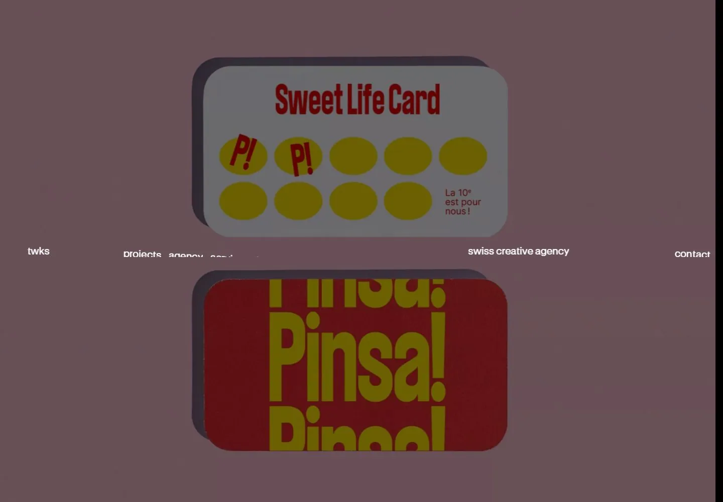
- TWKS has a black hero with a moving spatial-looking field of receding rectangular project imagery. Tiny white lowercase sans navigation spans the desktop midpoint: identity at left, project/agency/services/insights group left of center, agency descriptor toward right, contact at far right. The inspected hero media is VIDEO; the perspective appearance does not establish a 3D renderer or interactive scene. Following white editorial section uses large black tightly led prose with an inline smiley and a fine ruled split label/body row.
- Responsive
- At768px and390px the identity and contact move to the top with a two-line menu icon at right; the service links disappear from the visible header while a two-line agency descriptor remains near the middle-right. The media is viewport-height but its DOM width follows the document area753/375px rather than the nominal768/390 viewport. Fewer, larger or edge-cropped receding images occur in narrow frames, but image layout is also video-phase-dependent. No menu opening or downstream narrow scroll test.
- Scroll
- At actual scroll750 the navigation is at the top rather than mid-height; about250px of black hero remains above the white editorial section. Large black paragraph sits below with an inline smiley, then a rule and small left label/right explanatory column. Media DOM rect expands/offsets in this state, but timed content and scroll were not isolated enough to infer a complete transition mechanism. A1x1 semantic heading is not the visible paragraph box.


