
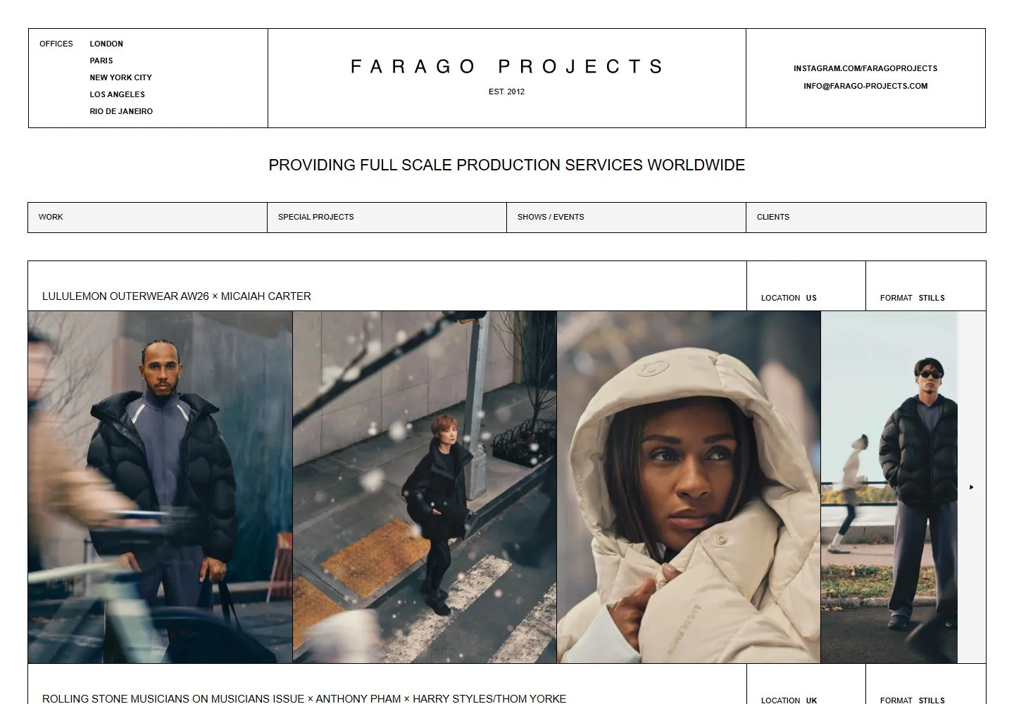
Live capture at 1440px, 2026-10-24
How it’s built
- Layout
- A pale editorial page is organized by crisp fine rules into broad horizontal bands and three vertical header cells. City addresses occupy the left, a widely letter-spaced centered identity sits in the middle, and contact/social details sit at right. A centered service statement separates the header from a four-part tab row. The project region begins with a wide title cell and two compact metadata cells, then four equal adjacent fashion photographs, divided by narrow straight gutters. The editorial word “Ease” appears inside the first photograph and belongs to the campaign image, not necessarily the site’s display type. The grid is strict and rectangular rather than freely scattered.
- Type
- Most interface text is compact, uppercase, regular sans, with the central identity widely tracked. Project name and metadata are small and align to the same grid; the large serif “Ease” is part of the image content. This is a useful typography distinction: the frame itself does not visibly use a large serif title. The type hierarchy is therefore driven more by spacing, capitalization, and grid placement than by large display text.
- Color and surface
- White background, thin gray-black borders, and black labels produce a low-color, print-like surface. Fashion images introduce skin, clothing, and warm leather color in the lower band. Rules are functional, with no card rounding, colored panels, or visible shadow treatment.
- Components
- Three-column organization/contact masthead, centered services statement, four-part section navigation, project-title/metadata rail, and a four-image row. The surrounding rules consistently align with the image and title cells; navigation is a visible tabular strip rather than floating links.
What makes it work
- Hairline dividers define hierarchy and alignment.
- Small metadata is grouped separately from the image row.
- Several images share equal widths within one continuous project module.
On a new subjectFor an architecture exhibition site, place venue/contact details around a centered exhibition identity, then set a concise program statement, small category tabs, and one project row with aligned title/date metadata and evenly sized photographs. Use project-specific records and imagery; do not reuse the fashion campaign or addresses.
Prompts
Create a visual direction for {{website_name}} in {{industry}} for {{audience}}, shaping {{content}} and supporting {{functionality}}.
COMPOSITION INVARIANTS: Organize a page with a ruled information masthead, centered service statement, segmented navigation, then a metadata band above a row of aligned project images. Keep rules thin and divisions purposeful. Preserve the observed visual hierarchy and spacing relationships, not the source-specific object inventory.
TYPE: Use compact plain sans labels and captions; reserve a more distinctive display voice for one title or project name. Set a readable scale step between display text, supporting copy, captions, and utilities. Do not name a font family.
SURFACE AND COMPONENTS: Use a pale ground, dark text/rules, and image-led color. Do not add colored UI surfaces unless the new subject needs them. Component roles: Contact/info cells, centered descriptor, segmented nav, project metadata and aligned image row. Keep controls visually distinct and subordinate to the main content.
IMAGE DIRECTION: Choose project/product imagery relevant to {{content}}; fashion photography is not required. Proportion estimate from the selected still: Visual estimate: masthead about 20% height; nav 5%; project info 10%; image columns fill most remaining frame. Treat it as an estimate, not fixed CSS geometry.
VARIABLES: Adapt names, details, image subjects, palette accents, and working actions to {{website_name}}, {{industry}}, {{audience}}, {{content}}, and {{functionality}}.
PROHIBITIONS: Use original copy and assets. Do not reproduce the source brand, exact wording, photographs, illustrations, products, people, or signature artwork; source-specific objects and motifs are optional only when they genuinely fit the new subject.
CONTINUATION: Continue with additional project rows using the same metadata-first and thin-rule structure.
RESPONSIVE PROPOSAL: Stack the information cells, wrap navigation, and place project images in a single column with their metadata attached. These are design proposals, not observed mobile behavior. The selected still does not establish source fonts, CSS, implementation technology, motion, or control behavior. Do not present any of those as observed. Implement requested {{functionality}} as working new behavior without implying source validation.
Implement a responsive page for {{website_name}} in {{industry}} for {{audience}}, presenting {{content}} and working {{functionality}}.
INVARIANTS: Organize a page with a ruled information masthead, centered service statement, segmented navigation, then a metadata band above a row of aligned project images. Keep rules thin and divisions purposeful. Keep the same relative prominence and spacing without requiring the same source objects.
TYPE AND SURFACES: Use compact plain sans labels and captions; reserve a more distinctive display voice for one title or project name. Use a pale ground, dark text/rules, and image-led color. Do not add colored UI surfaces unless the new subject needs them. Maintain clear display/body/utility scale, readable line lengths, and sufficient contrast. Components: Contact/info cells, centered descriptor, segmented nav, project metadata and aligned image row.
IMAGERY AND SCALE: Choose project/product imagery relevant to {{content}}; fashion photography is not required. Visual estimate only: Visual estimate: masthead about 20% height; nav 5%; project info 10%; image columns fill most remaining frame. Use flexible widths and content-led dimensions; do not copy this screenshot's coordinates as fixed values.
VARIABLES: Adapt names, details, image subjects, palette accents, and working actions to {{website_name}}, {{industry}}, {{audience}}, {{content}}, and {{functionality}}.
PROHIBITIONS: Use original copy and assets. Do not reproduce the source brand, exact wording, photographs, illustrations, products, people, or signature artwork; source-specific objects and motifs are optional only when they genuinely fit the new subject.
CONTINUATION: Continue with additional project rows using the same metadata-first and thin-rule structure.
RESPONSIVE PROPOSAL: Stack the information cells, wrap navigation, and place project images in a single column with their metadata attached. Use semantic content, keyboard-operable controls, visible focus, meaningful alt text, and no clipped content. The selected still does not establish source fonts, CSS, implementation technology, motion, or control behavior. Do not present any of those as observed. Implement requested {{functionality}} as working new behavior without implying source validation.
Measured
H211px / 400
Body text10px
Page backgroundtransparent
Text color#000000
Page height17,674px
Computed CSS at 1440px, 2026-10-24.
Live behavior
- Today
- Farago Projects opens on a white field with fine black rules dividing a three-part header: office cities at left, widely letter-spaced FARAGO PROJECTS and EST. 2012 in the center, and contact links at right. A centered full-scale-production tagline sits above a four-part navigation strip. The portfolio is organized into bordered project rows with a title and location/format metadata above large editorial photographs. At actual scrollY=750 the saved view shows later portfolio rows and the navigation strip at the top of the screenshot.
- Responsive
- At 1440×1000 the header and navigation span the page, with four adjacent project images in the first row. The 768×1024 tablet capture stacks the wordmark, cities/contact details, tagline and navigation above a single large project image. The 390×844 phone capture further condenses the navigation and shows the first project title, its metadata and a centered portrait image. Document heights measure 17674px desktop, 26694px tablet, and 15586px for both ordinary and reduced-motion phone loads; these samples do not establish breakpoints or explain the height differences.
- Scroll
- The desktop-scroll capture is measured at actual scrollY=750 in a 1440×17674 document. It shows the navigation strip at the top and the later Rolling Stone and Gucci project rows. This single frame does not establish whether navigation is sticky or what caused the view.


