
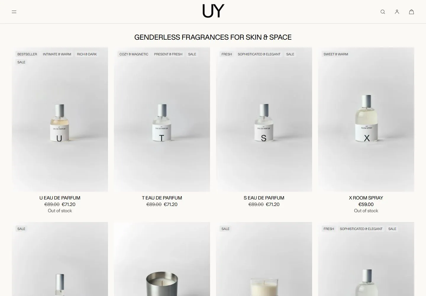
Live capture at 1440px, 2026-10-24
How it’s built
- Layout
- Pale green-gray catalog page with thin ruled grid of large centered dark products, tiny captions and compact header above.
- Type
- Regular black sans category title; tiny uppercase product captions and navigation.
- Color and surface
- Pale green-gray field, fine dark rules and mostly black object imagery.
- Components
- Ruled product grid, small captions, compact header and centered title.
What makes it work
- Thin ruled grid
- large isolated object images
- tiny captions
- pale green-gray field
On a new subjectFor a public tool library, arrange large isolated tool images in a thin ruled pale grid with tiny captions.
Prompts
Create an original visual direction for {{website_name}} in {{industry}}, for {{audience}}, presenting {{content}} and supporting {{functionality}}. Composition invariant: Use a thin utility header, centered category heading and a row of equal tall image panels. Keep each featured item modest and centered within a pale panel, with short descriptors at the top and aligned labels below. Typography: Use a clean light sans voice for identity and category title, with much smaller concise tags, names and prices/details. Palette and contrast: Keep the page warm and light, panels slightly cooler or darker than the ground, and type near-black; choose accents to match the target rather than the source products. Image and component hierarchy: Select new subject-appropriate items, objects or examples from {{content}}; use consistent scale and soft, unobtrusive treatment without requiring fragrances or bottles. Visual estimate from the supplied reference, not measured CSS: Visual estimate: header under 9% height; panels about 23% width; bottles around 20% panel height. Adjust this relationship to content and screen size; do not copy pixels. Variables: replace the source name, writing, industry-specific objects, people, images, colors and controls with original material for {{website_name}}, {{industry}}, {{audience}}, {{content}} and {{functionality}}. Keep the composition rule, not the source's identity or subject matter. Never make a source logo, product, person, artwork or exact text essential to either the image or page. Do not infer a font family, software framework, CSS value, motion or tested control behavior from a still. Continue the system into appropriate sections using the new content's real hierarchy rather than adding unrelated decoration. Change the four-up row to two or one columns while keeping image, tag and caption together and utility actions reachable.
Implement a responsive page for {{website_name}} in {{industry}} for {{audience}}, with real {{content}} and working {{functionality}}. Wide-screen structure: Use a thin utility header, centered category heading and a row of equal tall image panels. Keep each featured item modest and centered within a pale panel, with short descriptors at the top and aligned labels below. Type hierarchy: Use a clean light sans voice for identity and category title, with much smaller concise tags, names and prices/details. Surface treatment: Keep the page warm and light, panels slightly cooler or darker than the ground, and type near-black; choose accents to match the target rather than the source products. Component and image roles: Select new subject-appropriate items, objects or examples from {{content}}; use consistent scale and soft, unobtrusive treatment without requiring fragrances or bottles. Visual estimate from the supplied reference, not measured CSS: Visual estimate: header under 9% height; panels about 23% width; bottles around 20% panel height. Adjust this relationship to content and screen size; do not copy pixels. Variables: replace the source name, writing, industry-specific objects, people, images, colors and controls with original material for {{website_name}}, {{industry}}, {{audience}}, {{content}} and {{functionality}}. Keep the composition rule, not the source's identity or subject matter. Never make a source logo, product, person, artwork or exact text essential to either the image or page. Do not infer a font family, software framework, CSS value, motion or tested control behavior from a still. Continue the system into appropriate sections using the new content's real hierarchy rather than adding unrelated decoration. Change the four-up row to two or one columns while keeping image, tag and caption together and utility actions reachable. Use semantic text and meaningful image descriptions. Keep each item label with its item, and give interactive controls clear accessible names, keyboard operation and visible focus. Build the requested functionality as working new behavior; static reference controls remain unverified.
Measured
Fonts loadedGerstner Programm, GTStandard-M
H124px / 400
Body text16px
Page background#fbf9f6
Text color#000000
Page height6,963px
Computed CSS at 1440px, 2026-10-24.


