
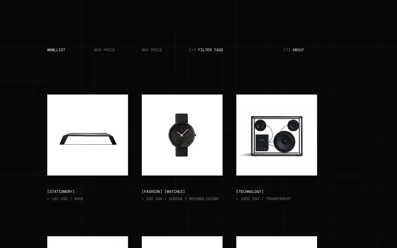
Screenshot from Httpster, saved 2026-10-24
How it’s built
- Layout
- A dark near-black catalogue uses faint full-width grid lines to structure a large empty upper area and repeated three-column object listings. Each listing has a bright white square image panel containing one isolated product; below it, compact bracketed category/brand and price text aligns to the same left edge. At the top, five utility labels—identity, price bounds, tag filter, and about—sit in separated grid positions. The image row has generous gutters and generous vertical spacing; tiles are not surfaced as rounded cards.
- Type
- Small monospaced-looking uppercase labels and bracketed metadata give the interface a restrained inventory/specimen voice. The image occupies far more area than each label. Heading/filters are similarly compact and low contrast; selected labels are brighter than secondary price hints. No promotional display headline or large type appears. Font family cannot be named from appearance.
- Color and surface
- Black background with subtly lighter graphite grid rules, white specimen panels, mostly grayscale product imagery, and medium-gray metadata. Contrast stays low in the surrounding grid but the product panels stand out sharply. There are no colored badges, shadows, or visible card borders.
- Components
- Sparse top filter/navigation rail, three-column product grid, square product imagery, and concise category/price/brand metadata beneath each specimen. Filter labels look interactive but no filter state or behavior is established by the still.
What makes it work
- Repeated image-plus-metadata units.
- Strong visual contrast between product grounds and page field.
- Small factual labels remain subordinate to objects.
On a new subjectFor a rare book inventory, place each cover on a consistent light ground within a dark catalogue, align a compact author/category/price record below it, and use subdued grid lines to guide scanning. Use real book-specific metadata and avoid reproducing the source’s product mix or bracket labels.
Prompts
Create an original visual direction for {{website_name}} in {{industry}}, for {{audience}}, presenting {{content}} and supporting {{functionality}}. Composition invariant: Create a dark index over a subtle fine-line grid. Align compact utility labels across the top; repeat bright image fields in even columns and place category/secondary metadata directly below each field. Typography: Use small uppercase technical-feeling labels and a clear distinction between primary item names and subdued details; do not name a font. Palette and contrast: Use near-black ground, low-contrast rules, bright image fields and high-contrast primary text; keep secondary text quieter but legible. Image and component hierarchy: Fill the repeated fields with new subject-appropriate catalog entries or specimens; use neutral image grounds only where they clarify the content. Visual estimate from the supplied reference, not measured CSS: Visual estimate: each visible image tile about 20% width and 32% height; grid fills frame; three columns centered. Adjust this relationship to content and screen size; do not copy pixels. Variables: replace the source name, writing, industry-specific objects, people, images, colors and controls with original material for {{website_name}}, {{industry}}, {{audience}}, {{content}} and {{functionality}}. Keep the composition rule, not the source's identity or subject matter. Never make a source logo, product, person, artwork or exact text essential to either the image or page. Do not infer a font family, software framework, CSS value, motion or tested control behavior from a still. Continue the system into appropriate sections using the new content's real hierarchy rather than adding unrelated decoration. Preserve the dark index language in a one-column reading order, and keep each image adjacent to its category and details.
Implement a responsive page for {{website_name}} in {{industry}} for {{audience}}, with real {{content}} and working {{functionality}}. Wide-screen structure: Create a dark index over a subtle fine-line grid. Align compact utility labels across the top; repeat bright image fields in even columns and place category/secondary metadata directly below each field. Type hierarchy: Use small uppercase technical-feeling labels and a clear distinction between primary item names and subdued details; do not name a font. Surface treatment: Use near-black ground, low-contrast rules, bright image fields and high-contrast primary text; keep secondary text quieter but legible. Component and image roles: Fill the repeated fields with new subject-appropriate catalog entries or specimens; use neutral image grounds only where they clarify the content. Visual estimate from the supplied reference, not measured CSS: Visual estimate: each visible image tile about 20% width and 32% height; grid fills frame; three columns centered. Adjust this relationship to content and screen size; do not copy pixels. Variables: replace the source name, writing, industry-specific objects, people, images, colors and controls with original material for {{website_name}}, {{industry}}, {{audience}}, {{content}} and {{functionality}}. Keep the composition rule, not the source's identity or subject matter. Never make a source logo, product, person, artwork or exact text essential to either the image or page. Do not infer a font family, software framework, CSS value, motion or tested control behavior from a still. Continue the system into appropriate sections using the new content's real hierarchy rather than adding unrelated decoration. Preserve the dark index language in a one-column reading order, and keep each image adjacent to its category and details. Use semantic text and meaningful image descriptions. Keep each item label with its item, and give interactive controls clear accessible names, keyboard operation and visible focus. Build the requested functionality as working new behavior; static reference controls remain unverified.
Live behavior
- Today
- No current-site visual state was captured. The original URL attempt did not render in the dated pass; see evidence_gap and the directly bound zero-state log.
- Responsive
- Not assessed: the original URL did not render from this capture environment on 2026-11-02.
- Scroll
- Not assessed: no current-site scroll state was captured.


