
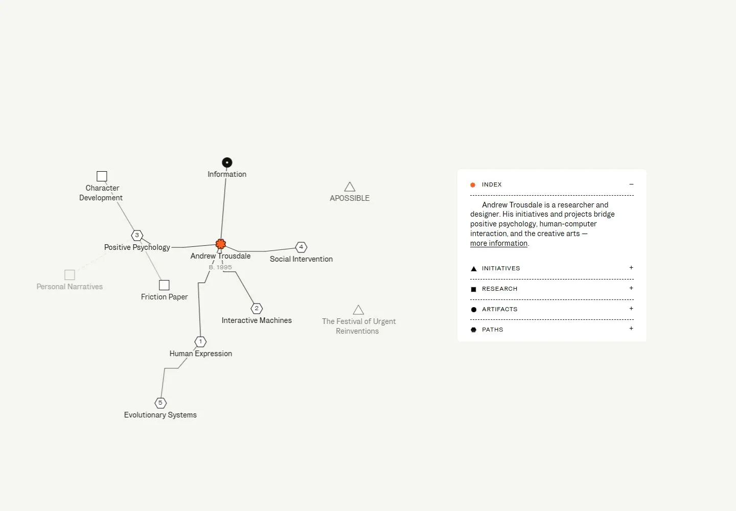
Live capture at 1440px, 2026-10-25
How it’s built
- Layout
- Pale page shows a central node-and-connector diagram at left and a compact white information panel with ruled expandable-looking rows at right.
- Type
- Tiny black sans labels and compact panel text.
- Color and surface
- Pale gray field, white panel, black lines and orange accent.
- Components
- A fine node-and-connector map faces a compact white ruled information panel on pale gray.
What makes it work
- Pale field
- Labeled node-and-connector map
- Compact white ruled information panel
On a new subjectFor a public ecology archive, map original subject categories as labeled nodes and connectors beside a compact white ruled information panel on pale gray.
Prompts
Design a spacious knowledge-map homepage for {{website_name}} in {{industry}} serving {{audience}}. Invariants: Represent {{content}} as a visually legible relationship map, with a concise way to access {{functionality}}. Composition invariant: place a small central identity node inside a wide pale field; use hairline gray connectors to an irregular constellation of labeled concepts; reserve a separate right-side white index/details panel. Visual estimate from the selected 1440x1000 screenshot: the network occupies roughly 55% of width and 70% of height, the panel roughly a quarter of width, with generous unfilled margins. The matching live DOM capture measures the visible concept labels around 13px and supplemental category labels around 11px; read research/evidence/div2-0007/measurements-desktop.json for corresponding computed values. Typography invariant: compact neutral sans labels remain attached to geometric nodes and subordinate to the network. Use simple squares, circles, triangles, or numbered markers only when they encode real categories. Palette invariant: near-white, gray lines, dark labels, and one restrained warm accent; no images, cards, shadows, or gradients dominate. Variables: choose new topics, node groups, labels, accent, panel sections, and any controls for {{website_name}}, {{industry}}, {{audience}}, {{content}}, and {{functionality}}, while preserving center-to-network-to-panel hierarchy. Prohibitions: no source biography, node wording, topology, or flower mark; do not state that expansion, animation, or selection was observed. Responsive proposal: on narrow screens show the central node, then a scrollable or stacked relationship list and detail panel; keep connector meaning and label reading order clear.
LATER LIVE EVIDENCE AND PROPOSED ADAPTATION: Later limited live inspection at 390×844 showed the graph absent from the visible mobile opening, replaced by a centered white index card with stacked information rows. Transfer this desktop-map/mobile-index relationship as the responsive proposal; row activation was not tested. The single hovered information link showed no visible change, which does not establish absence of other hover feedback.
Build a responsive relationship-map page for {{website_name}} in {{industry}} for {{audience}}, organizing {{content}} and supporting useful {{functionality}}. Invariants: Keep the key geometry: a small center identity, thin connectors reaching into an asymmetrical network across the main field, and a distinct right-side explanatory/index panel. Use compact sans labels near their nodes, generous white space, light gray links, and a restrained accent on the center or active category; avoid turning the graph into a dashboard-card layout. Visual proportions are estimates from the selected capture. The matching live DOM/computed-CSS measurements list concept labels at about 13px and category labels at about 11px; see research/evidence/div2-0007/measurements-desktop.json. Those sizes describe the current capture, not a universal target. Preserve readable scale and node association as the content changes for {{website_name}}, {{industry}}, {{audience}}, {{content}}, and {{functionality}}. The graph may use implemented click/tap actions to reveal relevant new-subject details, but the source interactions were not tested, so do not describe any source behavior as observed. Choose an appropriate implementation method without claiming the reference uses it. Variables: replace nodes, relationships, center identity, side-panel copy, and controls while retaining the asymmetric network. Prohibitions: do not reproduce source names, nodes, biography, or icon artwork, and do not claim source interactions as observed. Responsive proposal: On mobile, replace spatial links with a clear stacked or scrollable relationship view while retaining hierarchy and connections. Use semantic labels, keyboard-operable controls, visible focus, adequate contrast, and an accessible reading order; do not reproduce the original names, nodes, biography, or icon artwork.
LATER LIVE EVIDENCE AND PROPOSED ADAPTATION: Later limited live inspection at 390×844 showed the graph absent from the visible mobile opening, replaced by a centered white index card with stacked information rows. Transfer this desktop-map/mobile-index relationship as the responsive proposal; row activation was not tested. The single hovered information link showed no visible change, which does not establish absence of other hover feedback.
Measured
Fonts loadedBrunswick Grotesque
H213px / 400 / -0.13px
Body text16px
Page background#f5f6f2
Text color#111111
Page height1,000px
Computed CSS at 1440px, 2026-10-25.
Live behavior
- Today
- On a pale gray field, a sparse network diagram fills the left side: thin solid and dashed connectors join labeled themes and projects around an orange flower-like author marker, with small outlined geometric symbols and numbered nodes. A rounded white INDEX card sits at right, with a short biography followed by four compact category rows separated by dashed rules. Typography is small, plain sans serif; the category labels are uppercase.
- Responsive
- At the captured 768px tablet and 390px phone widths, the screenshot shows the white INDEX card centered on the pale field; the desktop network diagram is not visible in those captures. The biography wraps across the card, and INITIATIVES, RESEARCH and ARTIFACTS appear as stacked rows; PATHS appears in the fresh reduced-motion phone state but not in the ordinary phone screenshot. The card measures about 730×373px at tablet and 371×396px at ordinary phone; these samples establish only those viewport layouts, not whether the diagram is absent elsewhere in the document.
- Scroll
- The desktop scroll-labeled state records scrollY 0 in a 1000px document and visually remains on the same map-and-card composition. It does not establish a scroll response or later section.


