
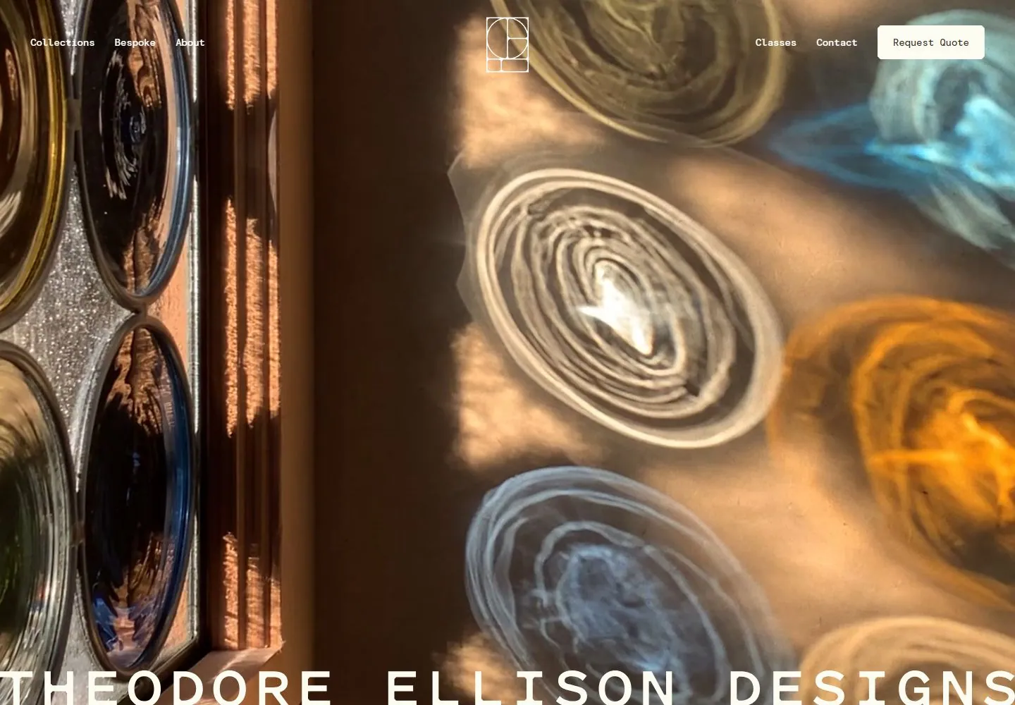
Live capture at 1440px, 2026-10-24
How it’s built
- Layout
- Warm full-field close-up of circular glass-like forms and reflected light has tiny white top navigation and huge widely spaced white identity at the bottom edge.
- Type
- Huge widely spaced white uppercase sans identity; tiny white monospaced-looking navigation.
- Color and surface
- Warm brown, amber, blue and clear reflective surfaces with white type.
- Components
- Full-field reflective close-up, tiny top navigation and huge bottom identity.
What makes it work
- Warm reflective close-up with circular forms
- tiny white navigation
- huge spaced white bottom identity
On a new subjectFor a public mineral collection, use a warm reflective close-up of circular polished samples behind tiny white navigation and a huge spaced white bottom identity.
Measured
Fonts loadedModernEra-Regular, ModernEraMono-Medium, ModernEraMono-Regular
H140px / 500
Body text16px
Page background#fdfcf2
Text color#272729
Page height6,255px
Computed CSS at 1440px, 2026-10-24.
Live behavior
- Today
- The desktop capture for Theodore Ellison Designs uses a full-bleed close-up image of colored glass with small navigation at the top, a centered geometric monogram, and a large widely spaced “THEODORE ELLISON DESIGNS” wordmark along the bottom edge. The saved desktop-scroll frame at y=750 shows a dark brown “Glass and Light” section with centered explanatory copy and a Learn more button. Tablet and phone frames use the glass image with a compact monogram and Menu control. The selected gallery image is a different crop of the same glass artwork.
- Responsive
- Desktop measures 1440×1000 with a 6255px document; tablet is 768×1024 with a 6483px document; ordinary and reduced-motion phones are 390×844 with 5056px documents. At tablet and phone widths the full desktop navigation is replaced by the geometric mark and Menu label; the large wordmark remains low in the image crop. The tablet and phone captures show the hero rather than desktop navigation. These samples do not establish breakpoints.
- Scroll
- The desktop-scroll frame measures y=750 in a 6255px document and shows the “Glass and Light” heading, a paragraph about daily changes in light, and a Learn more button on a dark brown field, with the large wordmark partly above the section.


