
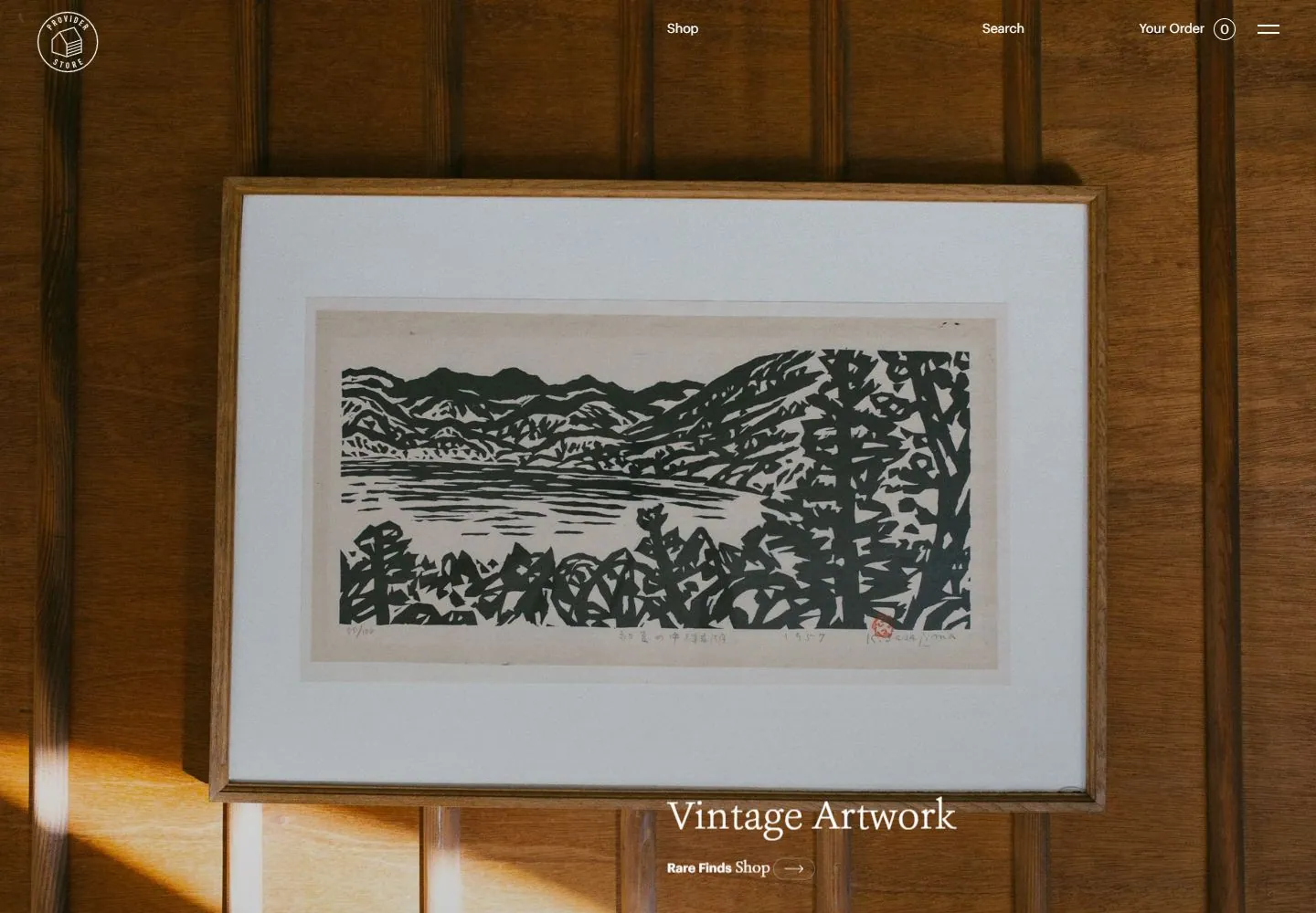
Live capture at 1440px, 2026-10-24
How it’s built
- Layout
- Full-bleed close-up photograph of two handmade ceramic cups against a dark gray backdrop. Small white circular store mark sits upper left; sparse shop/search/order/menu items are spread across top edge. A large white serif statement and smaller maker credit overlay the lower-right area; a small Shop All link sits near bottom center.
- Type
- Large elegant white serif title over the photo; small white sans utilities and maker credit; compact button-like Shop all link. Exact metrics unknown.
- Color and surface
- Charcoal background with off-white handmade ceramics and rust-speckled glaze; white text. The photograph supplies all texture; no cards or visible image frame.
- Components
- Circular mark, minimal top navigation, full-bleed product photo, lower-right editorial title, maker caption and shop link.
What makes it work
- One dominant product photograph
- Sparse edge navigation
- Small title/credit over photo
On a new subjectFeature one carefully composed object or subject photograph, with a concise title and attribution placed in a quiet region. Replace the ceramics with relevant work.
Prompts
Create an original website image for {{website_name}} in {{industry}}, serving {{audience}}, presenting {{content}} and making {{functionality}} apparent.
INVARIANTS: Let a close still-life pair dominate a nearly full-field scene; small commerce labels sit high while a short quiet title and credit remain near lower edges.
TYPOGRAPHY: Small light utility labels contrast with a modest serif title; avoid oversized promotional type.
COLORS AND SURFACES: Soft neutral gray/cream or other muted material tones with gentle contact shadows and little opaque chrome.
IMAGERY: Stage two original related tactile objects at slightly different heights and angles; ceramic cups are source variables, while physical material and contact with a surface matter.
VARIABLES: Supply original identity, writing, imagery, accent hues and tasks for {{website_name}}, {{industry}}, {{audience}}, {{content}} and {{functionality}}.
PROHIBITIONS: Do not copy source branding, wording, photographs or signature artwork. Do not turn privacy notices, submission frames or cut-off essential text into style rules. Avoid generic card stacks, extra decorative panels or an unrelated large hero heading when they erase the specified hierarchy.
CONTINUATION: Translate the same relative type scale, alignment and image treatment into the next real content section; give that section a clear purpose rather than duplicating the hero.
RESPONSIVE PROPOSAL: Crop or restage the pair so both objects remain legible, then move small labels into reachable rails and retain the modest title scale. Render clear, readable original text and subject-appropriate controls with consistent spacing. These proportions are visual reproduction targets, not common measured CSS. The selected still does not establish source fonts, technology, motion, hover or responsive behavior. Preserve those evidence limits; this prompt remains unvalidated.
Build a functioning responsive website for {{website_name}} in {{industry}} for {{audience}}, using {{content}} and working {{functionality}}.
INVARIANTS: Let a close still-life pair dominate a nearly full-field scene; small commerce labels sit high while a short quiet title and credit remain near lower edges.
TYPOGRAPHY: Small light utility labels contrast with a modest serif title; avoid oversized promotional type.
COLORS AND SURFACES: Soft neutral gray/cream or other muted material tones with gentle contact shadows and little opaque chrome.
IMAGERY: Stage two original related tactile objects at slightly different heights and angles; ceramic cups are source variables, while physical material and contact with a surface matter.
VARIABLES: Supply original identity, writing, imagery, accent hues and tasks for {{website_name}}, {{industry}}, {{audience}}, {{content}} and {{functionality}}.
PROHIBITIONS: Do not copy source branding, wording, photographs or signature artwork. Do not turn privacy notices, submission frames or cut-off essential text into style rules. Avoid generic card stacks, extra decorative panels or an unrelated large hero heading when they erase the specified hierarchy.
CONTINUATION: Carry the relative type scale, alignment and image treatment into appropriate content sections without repeating the hero or inventing irrelevant features.
RESPONSIVE PROPOSAL: Crop or restage the pair so both objects remain legible, then move small labels into reachable rails and retain the modest title scale. Use semantic reading order, meaningful image descriptions, keyboard-operable controls and visible focus. Check display text bounds after the chosen fonts load at desktop and phone widths; keep complete essential text inside its container. Verify the actual requested actions rather than styling inert controls. Respect reduced-motion preferences if new motion is added. These proportions are visual reproduction targets, not common measured CSS. The selected still does not establish source fonts, technology, motion, hover or responsive behavior. Preserve those evidence limits; this prompt remains unvalidated.
Measured
Fonts loadedAshbury, Graphik
H224px / 400
Body text16px
Page backgroundtransparent
Text color#313942
Page height8,094px
Computed CSS at 1440px, 2026-10-24.


