
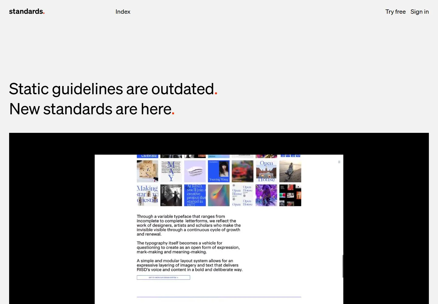
Live capture at 1440px, 2026-10-24
How it’s built
- Layout
- A dense mosaic of unequal rectangular interface and typography images fills the screen, separated by narrow black gutters.
- Type
- Mixed type appears within the images; interface typography cannot be independently identified.
- Color and surface
- Black gutters with vivid red, blue, white and multicolored screenshot content.
- Components
- Varied screenshot tiles arranged in a tight mosaic.
What makes it work
- Dense mosaic of unequal interface-image tiles separated by black gutters.
On a new subjectFor a museum archive, assemble varied exhibition-poster fragments in a dense mosaic with black gutters.
Live behavior
- Today
- The desktop opening has a pale gray field, a sparse header with identity and text navigation, and two left-aligned black sans headline lines with small red punctuation. A wide rectangular media area below displays product-interface imagery. Its content is media imagery, not evidence of interactive controls on the page itself.
- Responsive
- Tablet keeps the spread header and left-aligned two-line headline above a large media panel. Phone replaces the spread links with a Menu label and scales the headline and panel to the narrower width. These sampled widths do not establish an exact breakpoint.
- Scroll
- At actual desktop scrollY 750 a large media panel occupies the upper area and a later section shows a large left statement, a right category label and a row of logo tiles. The header remains visible in this saved frame; one position does not prove its behavior across the entire page.


