
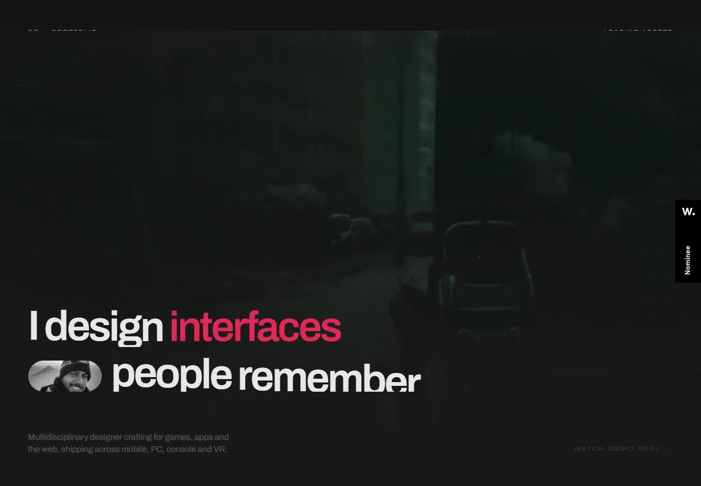
Live capture at 1440px, 2026-10-24
How it’s built
- Layout
- A dark cinematic still fills the page, with small designer identity upper left and six numbered links across top. An enormous two-line white statement anchors lower left; “games” and final punctuation are magenta, and a small grayscale portrait is embedded inline between lines. Muted support sits below; tracked reel action near lower right.
- Type
- Heavy large sans headline, magenta word/mark, small tracked numbered links and compact gray support; exact font unknown.
- Color and surface
- Near-black green-gray scene, white type, magenta accent and desaturated portrait.
- Components
- Small identity, numbered links, large mixed-color statement, inline portrait, lower support and corner action.
What makes it work
- Dark cinematic image field
- Oversized statement with vivid word/mark accent
- Small portrait embedded in headline block
- Compact peripheral identity/navigation/support
On a new subjectFor a public wildfire evacuation office, set a large two-line readiness message over a dark landscape, accent one key word and punctuation in magenta and embed a small emergency-coordinator portrait in the headline. Keep nav/support compact; replace designer/game content.
Measured
Fonts loadedArchivo Variable
H186.4px / 600 / -4.32px
Body text16px
Page background#141414
Text color#ffffff
Page height8,922px
Computed CSS at 1440px, 2026-10-24.
Live behavior
- Today
- Dark full-viewport moving project footage under a subdued overlay with fine horizontal scanline-like texture. Large off-white tightly tracked sans text is anchored low left, with a rotating magenta word and terminal dot. A small grayscale portrait capsule interrupts the second line. Header combines S/G identity and tiny numbered navigation; a widely tracked demo-reel link sits at lower right. The next dark regions use hairline dividers, gray client marks and large low-contrast prose.
- Responsive
- Desktop display letters declare86.4px/86.4px, weight600, tracking-4.32px. Tablet changes to72.192px and phone36.66px, with rotating word on its own line and portrait preceding the final line. Desktop portrait IMG bounds151.188x63.922px become93.844x44.75px tablet and47.656x22.719px phone. Header switches from numbered link row to S/G plus two-line menu, with72px height on narrow screens. Demo-reel link moves below the supporting paragraph on narrow layouts. Video remains full viewport at1440x1000,768x1024 and390x844, with different cropped scenes.
- Scroll
- At actual scrollY750, header remains near top and height reduces80px to64px; visible identity condenses to S/G. The supporting paragraph and reel link move near the top above a ruled client-mark strip. Below,51.84px low-contrast word spans begin a long statement, partly cut by the viewport bottom. A VIDEO sample scales to1526.4x1060px with shifted viewport geometry; one frame is insufficient to establish the trajectory or implementation of that transformation.


