
Live capture at 1440px, 2026-10-24
How it’s built
- Layout
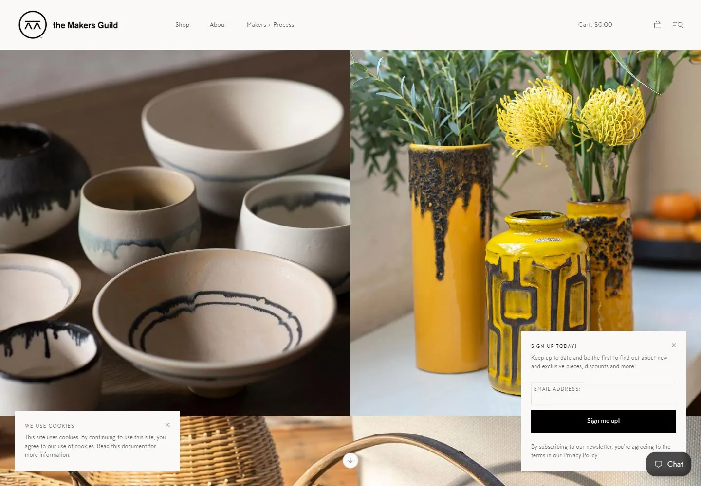
- Black announcement strip and white navigation sit above two adjacent large images of pale and colorful ceramic objects.
- Type
- Small regular black sans navigation and light announcement text.
- Color and surface
- White and black header, muted pale left image and warm brown right image.
- Components
- Announcement strip, white header and paired large object images.
What makes it work
- Black announcement strip
- white header
- adjacent large pale and warm object images
On a new subjectFor a public mineral archive, pair large images of pale and warm mineral samples beneath a black announcement strip and white navigation.
Measured
Fonts loadedmtt-milano-reg
H122px / 400 / 0.506001px
Body text13px
Page background#faf9f8
Text color#5c5c5c
Page height2,448px
Computed CSS at 1440px, 2026-10-24.
Live behavior
- Today
- A slim pale shopping header sits above large side-by-side photographs of ceramic vessels and yellow flowers; further imagery begins below. A cookie prompt overlays lower-left and newsletter prompt/chat control overlays lower-right. t0 and t2 are alike. At y=750, a wicker basket photograph and the following image row fill the frame while header and overlays persist. Tablet retains the two-image row; mobile shows one large bowl image, its title/link, and a signup panel covering the next photo.
- Responsive
- At 1440x1000, paired large images fill the first row; at 768x1024, paired images remain side-by-side with following row visible; at 390x844, content becomes a single-column photo/title sequence under compact header. Document heights 2448, 1548, and 2579 CSS px (capture-specific DOM values).
- Scroll
- At y=750, a woven basket / homewares photograph occupies most of the view; the top navigation and cookie/newsletter overlays remain visible.


