
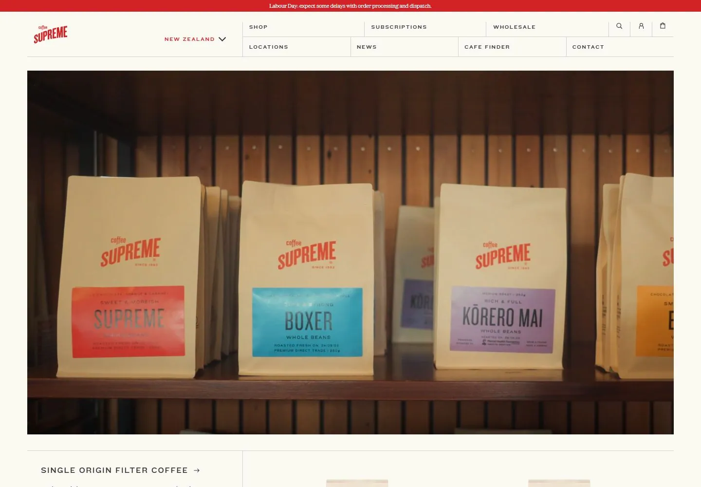
Live capture at 1440px, 2026-10-24
How it’s built
- Layout
- Cream storefront with a small red brand mark at upper left. A shallow two-row navigation matrix spans the upper band, with fine rules separating categories and utility icons. Large rectangular photographic hero shows boxes at a red doorway. A red plus control is at lower left of hero. Below, a ruled content region has one introductory text column and three product-pack images.
- Type
- Small uppercase tracked sans in navigation; hero has no prominent headline. Below, compact sans heading and paragraph are left aligned. Product packaging includes its own labels.
- Color and surface
- Cream background and rules, brick red/orange door and red logo/plus, neutral pavement and packaging. Flat unboxed structure apart from separators and inset hero margins.
- Components
- Brand mark, two-row shop/subscription/locations/etc navigation, search/account/bag utilities, campaign image with plus glyph, product introduction and three product images.
What makes it work
- Structured utility navigation
- Large product photograph
- Lower copy-plus-product region
- Thin rules separating content areas
On a new subjectPresent a relevant large contextual image, then a short explanation and a small set of related items, using fine dividers to organize navigation and content.
Prompts
Create an original website image for {{website_name}} in {{industry}}, serving {{audience}}, presenting {{content}} and making {{functionality}} apparent.
INVARIANTS: Use a shallow two-row fine-rule navigation above a wide staged-object photograph, followed by the beginning of a ruled editorial/product section; objects stay small within their physical setting.
TYPOGRAPHY: Small tracked uppercase navigation and compact serif/sans content labels; no giant hero slogan.
COLORS AND SURFACES: Cream structural ground with warmer photographic color and natural shadow; exact red doorway and kraft hues are variables.
IMAGERY: Stage new original objects within a textured physical environment, not as floating cutouts; coffee packs, brick and doorway are optional.
VARIABLES: Supply original identity, writing, imagery, accent hues and tasks for {{website_name}}, {{industry}}, {{audience}}, {{content}} and {{functionality}}.
PROHIBITIONS: Do not copy source branding, wording, photographs or signature artwork. Do not turn privacy notices, submission frames or cut-off essential text into style rules. Avoid generic card stacks, extra decorative panels or an unrelated large hero heading when they erase the specified hierarchy.
CONTINUATION: Translate the same relative type scale, alignment and image treatment into the next real content section; give that section a clear purpose rather than duplicating the hero.
RESPONSIVE PROPOSAL: Simplify the navigation rows, preserve enough setting to show the objects contact surfaces, and let the ruled content section follow in a readable single-column sequence. Render clear, readable original text and subject-appropriate controls with consistent spacing. These proportions are visual reproduction targets, not common measured CSS. The selected still does not establish source fonts, technology, motion, hover or responsive behavior. Preserve those evidence limits; this prompt remains unvalidated.
Build a functioning responsive website for {{website_name}} in {{industry}} for {{audience}}, using {{content}} and working {{functionality}}.
INVARIANTS: Use a shallow two-row fine-rule navigation above a wide staged-object photograph, followed by the beginning of a ruled editorial/product section; objects stay small within their physical setting.
TYPOGRAPHY: Small tracked uppercase navigation and compact serif/sans content labels; no giant hero slogan.
COLORS AND SURFACES: Cream structural ground with warmer photographic color and natural shadow; exact red doorway and kraft hues are variables.
IMAGERY: Stage new original objects within a textured physical environment, not as floating cutouts; coffee packs, brick and doorway are optional.
VARIABLES: Supply original identity, writing, imagery, accent hues and tasks for {{website_name}}, {{industry}}, {{audience}}, {{content}} and {{functionality}}.
PROHIBITIONS: Do not copy source branding, wording, photographs or signature artwork. Do not turn privacy notices, submission frames or cut-off essential text into style rules. Avoid generic card stacks, extra decorative panels or an unrelated large hero heading when they erase the specified hierarchy.
CONTINUATION: Carry the relative type scale, alignment and image treatment into appropriate content sections without repeating the hero or inventing irrelevant features.
RESPONSIVE PROPOSAL: Simplify the navigation rows, preserve enough setting to show the objects contact surfaces, and let the ruled content section follow in a readable single-column sequence. Use semantic reading order, meaningful image descriptions, keyboard-operable controls and visible focus. Check display text bounds after the chosen fonts load at desktop and phone widths; keep complete essential text inside its container. Verify the actual requested actions rather than styling inert controls. Respect reduced-motion preferences if new motion is added. These proportions are visual reproduction targets, not common measured CSS. The selected still does not establish source fonts, technology, motion, hover or responsive behavior. Preserve those evidence limits; this prompt remains unvalidated.
Measured
Fonts loadedDomainetext, Knockout 27, Knockout 33
H135px / 400
Body text14px
Page background#fafaf3
Text color#333333
Page height6,177px
Computed CSS at 1440px, 2026-10-24.


