
Live capture at 1440px, 2026-10-24
How it’s built
- Layout
- Black field with a dim gray tablet-like device centered, small white and gray serif identity upper left and outlined pill navigation upper right.
- Type
- Small refined serif identity and compact white sans pill labels.
- Color and surface
- Black field, dim slate-gray device and thin pale outlines.
- Components
- Centered rounded device with dotted surface, sparse identity and outlined navigation pills.
What makes it work
- Black field
- centered dim rounded device with dotted surface
- serif identity
- outlined navigation pills
On a new subjectFor a museum of scientific instruments, isolate a dim rounded instrument with dotted surface on black, with small serif identity and outlined navigation pills.
Measured
Fonts loaded__PlusJakartaSans_717481, __PlusJakartaSans_Fallback_717481
H115px / 600
Body text15px
Page background#f8f8f8
Text color#000000
Page height12,460px
Computed CSS at 1440px, 2026-10-24.
Live behavior
- Today
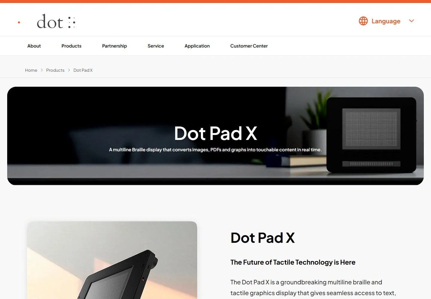
- Dot Pad X uses a pale gray product-page surface under a two-tier white header. The upper tier has a large dot wordmark and orange language control; the lower tier distributes About, Products, Partnership, Service, Application and Customer Center links. A breadcrumb precedes a wide dark rounded hero with centered white Dot Pad X title and explanatory line over a device photograph. Below, a large product image sits beside a title, subheading, descriptive copy and orange/gray pill actions.
- Responsive
- At 1440×1000 the hero is a broad rounded banner below the breadcrumb, followed by a two-column image-and-copy section. Tablet and phone measurements show the content reflowing into narrower layouts; on phone the hero image carries a white title/copy overlay and the product image and descriptive section stack below. Measured document heights are 12460px desktop, 17946px tablet and 17758px phone. These are sampled widths, not proof of breakpoint thresholds or every lower-page section.
- Scroll
- At actual desktop scrollY=750 in a 1440×12460 document, the view shows the product detail image and text/actions, with a dark product banner lower in the captured view. The two-tier header remains at the viewport top in the screenshot and measurement. This one position does not establish behavior elsewhere; no action was activated.


