
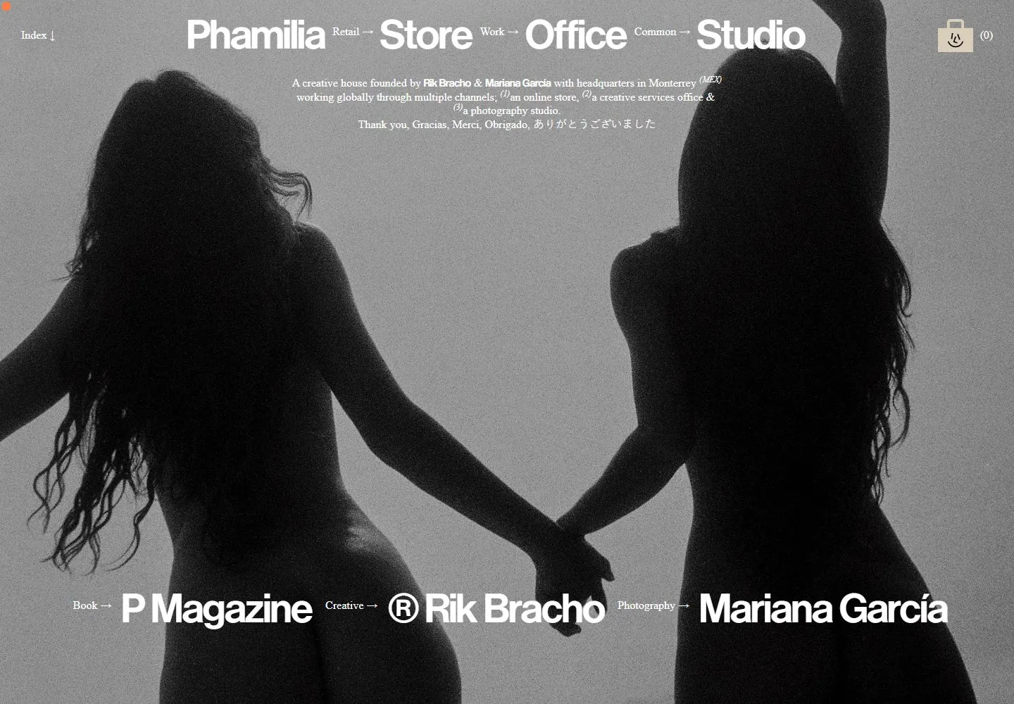
Live capture at 1440px, 2026-10-24
How it’s built
- Layout
- Full-field close-up face carries centered white heading and small serif copy at top and a second group of large white names near the bottom.
- Type
- Large white sans names paired with tiny white serif descriptors and copy.
- Color and surface
- Warm close-up portrait tones and white text.
- Components
- Full-frame portrait with centered top identity/copy and lower names with tiny labels.
What makes it work
- Warm full-frame portrait
- large white identity and grouped lower names
- tiny serif descriptors
On a new subjectFor a public poetry collective, overlay a large white identity and grouped lower poet names with tiny serif descriptors on a warm full-frame portrait.
Measured
Fonts loadedNimbus Sans P OT, IBM Plex Mono
Body text16px
Page background#ffffff
Text color#000000
Page height1,015px
Computed CSS at 1440px, 2026-10-24.
Live behavior
- Today
- The Phamilia desktop capture places oversized sans-serif brand and category links across the top of a grainy monochrome photograph of two figures holding hands. A short centered studio description sits beneath, with large links to P Magazine, Rik Bracho and Mariana García across the lower image. A compact index and empty-cart control sit in opposite top corners. The selected gallery image is a separate close-up portrait with different category labels.
- Responsive
- Desktop measures 1440×1000 with a 1440×1015 document; tablet is 768×1024 with a 768×1039 document; ordinary and reduced-motion phones are both 390×844 with viewport-height documents. The tablet compresses the top links and description, while phone frames stack the category names and keep the photographic background and lower creator links. The actual desktop-scroll position is y=15, not a deep page section. These samples do not establish breakpoint thresholds.
- Scroll
- The desktop-scroll capture measures y=15 in a 1015px document and appears nearly aligned with desktop t0. It does not expose a distinct lower-page section.


