
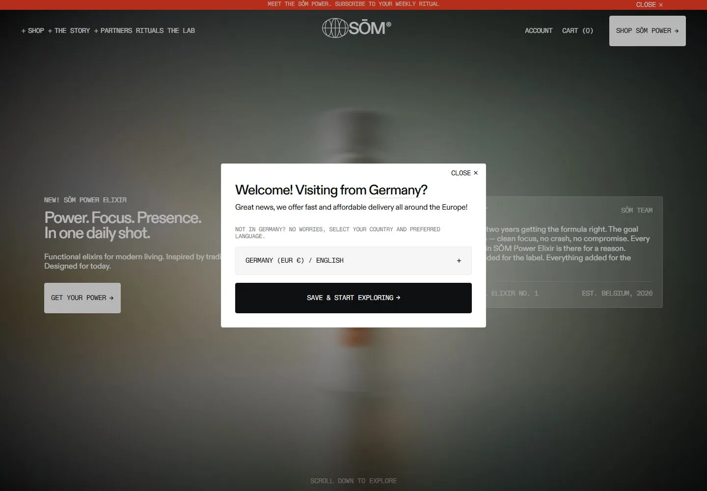
Live capture at 1440px, 2026-10-24
How it’s built
- Layout
- An orange illuminated field contains a dark back-facing human silhouette with a white product tube angled over its center. Small white monospaced-like copy clusters occupy left, right and lower center, with compact identities top and white action upper right. Faint radial markings surround the figure.
- Type
- Small uppercase monospaced-looking white labels; bold condensed red type on the white object. Exact painted font identity unknown.
- Color and surface
- Luminous orange/yellow haze, dark red silhouette, white object and red lettering.
- Components
- Place a white narrow cylindrical object diagonally over a dark human silhouette on luminous orange, with tiny white mono-like copy at the edges and faint radial markings.
What makes it work
- Luminous orange field and dark human silhouette
- Diagonal white narrow cylindrical object
- Tiny white mono-like copy clusters
- Faint radial markings
On a new subjectFor a public sun-safety exhibit, place an original white narrow cylindrical sunscreen container diagonally over a dark silhouette on radiant orange, with tiny white informational labels and faint radial marks.
Measured
Fonts loadedABC Diatype, ABC Diatype Mono
H133.12px / 500 / -1.76px
Body text16px
Page background#ffffff
Text color#0e0f11
Page height8,353px
Computed CSS at 1440px, 2026-10-24.
Live behavior
- Today
- A red announcement strip and compact utility navigation frame a darkened photographic commerce hero, with light sans headline and monospaced-looking labels. A central white country/language modal dominates every captured state: its black sans heading and paragraph sit above a pale selector and a wide black action. Behind it, the desktop hero shows product photography and partially obscured text; a scrolled view reveals product packaging and subscription controls under the same dim layer.
- Responsive
- Desktop uses a wide navigation row and a roughly 540px modal; tablet and phone place the logo, cart and menu in a boxed two-row header. On the 390px phone the modal spans most of the viewport, the heading wraps and a close link moves below the action. The modal heading declares ABC Diatype 28px desktop/tablet and 24px phone; utilities declare ABC Diatype Mono, generally 14px.
- Scroll
- Actual desktop scrollY733 reveals a product purchase area while the modal remains fixed in front. Some product copy and controls are visible through the dim backdrop but central content is occluded. No purchase, price accuracy, reviews or claims have been verified.


