
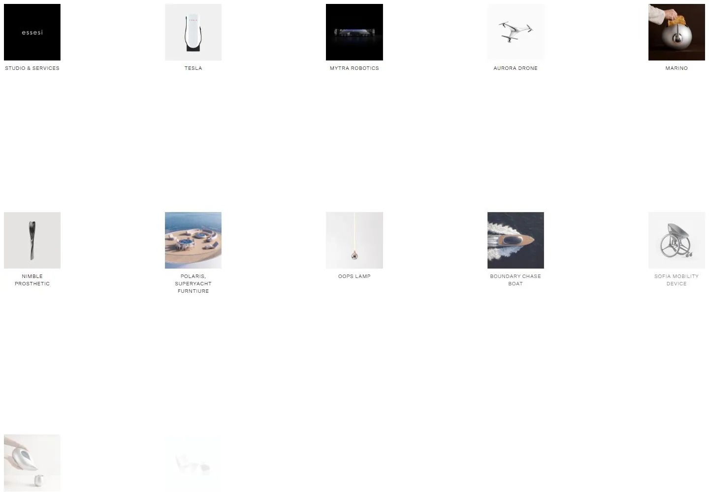
Live capture at 1440px, 2026-10-25
How it’s built
- Layout
- A white field holds two widely separated rows of small square product images with tiny captions underneath.
- Type
- Tiny regular black captions subordinate to the images.
- Color and surface
- White field with softly colored product images and dark labels.
- Components
- Small square image tiles in sparse rows with compact labels below.
What makes it work
- Small square tiles
- tiny captions below
- generous white space
On a new subjectFor a seed library, show small square botanical specimens in sparse rows with tiny captions and generous white space.
Measured
Fonts loadedScto Grotesk A
Body text10px
Page backgroundtransparent
Text color#211e1e
Page height2,358px
Computed CSS at 1440px, 2026-10-25.
Live behavior
- Today
- The Essesi desktop opening is a spacious white portfolio grid with five evenly distributed columns. Each item pairs a square product or project image with a small centered uppercase label; the images alternate between pale product photography and black-backed imagery. The 1440px scrolled capture shows later rows while retaining the same five-column spacing. At 768px the grid is three columns, and at 390px it is also three columns with narrower image tiles and multi-line labels.
- Responsive
- The saved 1440×1000 opening shows five columns, the 768×1024 tablet shows three, and the 390×844 phone shows three narrower columns. At phone width some labels wrap to two or three lines. The measured viewport widths are respectively 1440, 768, and 390px; these captures do not identify exact breakpoints or smaller-width behavior.
- Scroll
- The saved desktop-scroll image shows later portfolio entries, including Vida Water Pitcher, M-Raya Lounge Chair, Fallen Tree House, Ghost Collection, and Incense Cube. The screenshot is visibly a later grid region, but this summary does not claim a fixed header, a particular scroll offset, or automatic loading behavior.


