
Live capture at 1440px, 2026-10-24
How it’s built
- Layout
- Saturated orange field with tiny dotted circular identity at upper left, ruled navigation columns at upper right and enormous heavy lowercase black word across the lower half.
- Type
- Extra-heavy lowercase black sans display and smaller bold navigation.
- Color and surface
- A saturated flat-looking orange field contrasts with solid black typography, fine rules and dotted circular mark.
- Components
- Dotted identity, ruled navigation and gigantic lower word with small statement above.
What makes it work
- Orange field
- giant heavy lowercase black word
- dotted identity
- ruled upper navigation
On a new subjectFor a public recycling initiative, place a giant heavy lowercase black name low on orange beneath a dotted identity and ruled upper navigation.
Measured
Fonts loadedwebflow-icons, Gt Alpina Condensed, Barlow Condensed, MJXZERO, MJXTEX, MJXTEX-I
H224px / 400
Body text16px
Page background#ffffff
Text color#000000
Page height8,157px
Computed CSS at 1440px, 2026-10-24.
Live behavior
- Today
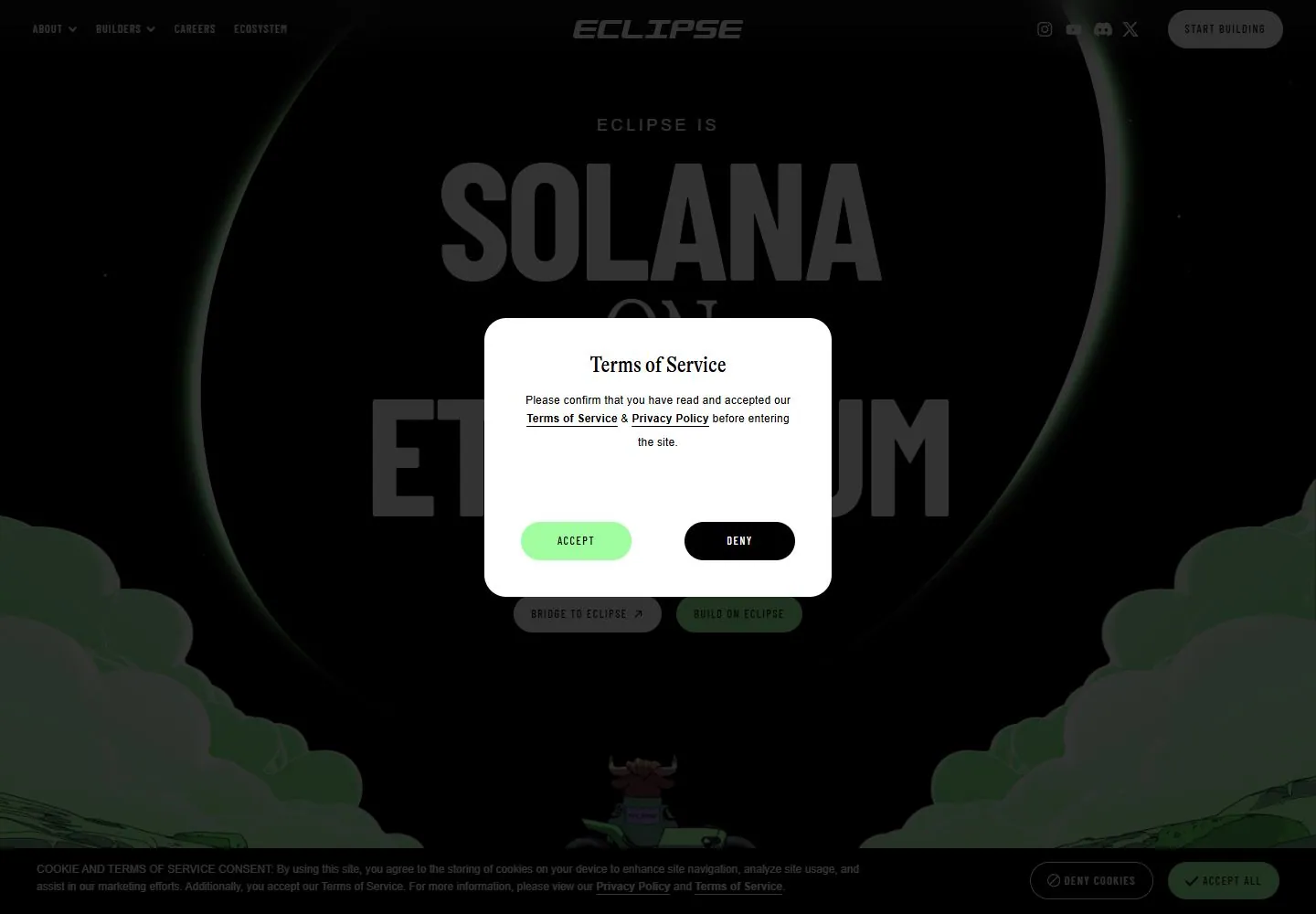
- Eclipse opens on a very dark illustrated scene with a large thin green oval around the central “Solana on Ethereum” headline, cloud-like green forms along the lower sides, and small navigation/social controls at the top. A centered white Terms of Service dialog with Accept and Deny buttons dims the opening desktop image; a separate cookie-consent strip is visible near the bottom. In the t2 screenshot the white dialog is absent while the dimmed hero and cookie strip remain. The desktop-scroll frame shows a ticker and a dark video-like panel with a large play icon. Tablet and phone captures show the Terms dialog over the same dark hero.
- Responsive
- The 1440×1000 desktop screenshot shows small navigation across the top and a centered Terms dialog. Tablet and phone images retain the dark hero and dialog, with controls arranged for narrower screens. However, raw measurements report document widths of 28416px at desktop, 28420px at tablet, and 2037px at phone, versus viewport widths of 1440, 768, and 390px. These unusually wide measured extents indicate substantial horizontal overflow in the capture; the visible screenshots show only the viewport slice and do not establish a successful responsive layout.
- Scroll
- The desktop-scroll measurement records scrollY=750 in a document measured at 28416×8157px. The screenshot shows a wide “Ethereum’s fastest layer 2” ticker and a dark video-like panel with a large play icon behind the still-visible cookie consent layer. The large measured document width also indicates horizontal overflow; this one viewport image does not establish sticky behavior or the wider page layout.


