
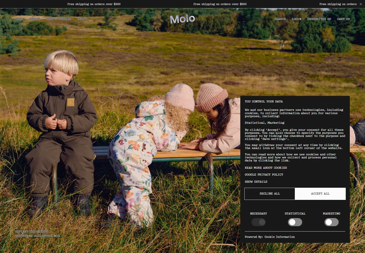
Live capture at 1440px, 2026-10-24
How it’s built
- Layout
- Two full-height lifestyle/product photographs meet at the frame midpoint. A small central identity crosses the top seam, tiny dark serif utilities line the top, and small links appear at mid-height on opposite sides.
- Type
- Tiny uppercase serif navigation and exploration labels, with a larger contrasting rounded sans identity.
- Color and surface
- Muted cream and earth-tone photography with pale colorful garment details, dark utility type and a small blue/black identity accent.
- Components
- Equal photographic halves, centered identity, distributed commerce links, mid-height exploration cues and tiny lower-right count/arrows.
What makes it work
- Two equal full-height muted photographs with tiny dark serif utilities and a small identity centered over the seam.
On a new subjectFor a community garden archive, pair a full-height volunteer portrait with a seed specimen in its habitat, framed by tiny dark serif index links and a small central identity.
Measured
Fonts loadedtext, display, simon
H211px / 400 / -0.11px
Body text14px
Page backgroundtransparent
Text color#181818
Page height1,000px
Computed CSS at 1440px, 2026-10-24.
Live behavior
- Today
- Molo’s captured storefront uses a pale gray background, a repeating “Free shipping on orders over $200” ticker and a centered Molo wordmark. Desktop t0 shows a full-width campaign photo of children with a large black “YOU CONTROL YOUR DATA” cookie panel over the right side; the sale caption appears near the lower-left of the photo. Desktop t2 and the desktop-scroll-labeled image show a mostly blank pale field with the ticker and close control, without the hero photograph or cookie panel. Tablet shows the sale photo cropped vertically behind the cookie panel, with a line about the Mid-Season Sale visible below; ordinary phone shows only a narrow strip of campaign imagery above the consent panel. The fresh reduced-motion phone capture is nearly blank pale gray except for the top ticker/close control. The selected gallery reference shows a different split campaign image with children and a shirt.
- Responsive
- All six captures use viewport-sized documents and actual scrollY=0: desktop 1440×1000, tablet 768×1024, phone 390×844. The cookie panel dominates the desktop/tablet/phone views where it appears; the reduced-motion phone screenshot contains only the ticker/close control over a pale field. All measurements report two sampled animation entries. These captured differences do not establish breakpoints or a preference effect.
- Scroll
- The desktop-scroll screenshot records actual scrollY=0 in a viewport-sized 1440×1000 document and appears materially like desktop t2: a pale blank field with the shipping ticker/header and no visible lower section. It does not establish scroll behavior.


