
Live capture at 1440px, 2026-10-24
How it’s built
- Layout
- Pale page with a thin top rule and compact heading; three columns of numbered chapter headings and bulleted entries fill the page.
- Type
- Pixel-like uppercase chapter labels contrast small serif item text.
- Color and surface
- White, black and very light gray rules.
- Components
- Table-of-contents header, three columns, bullet lists and fine guide lines.
What makes it work
- Three-column contents list with pixel-like chapter headings and small serif entries.
On a new subjectFor a local history archive, organize topics in three columns with pixel-like section labels and serif entries.
Live behavior
- Today
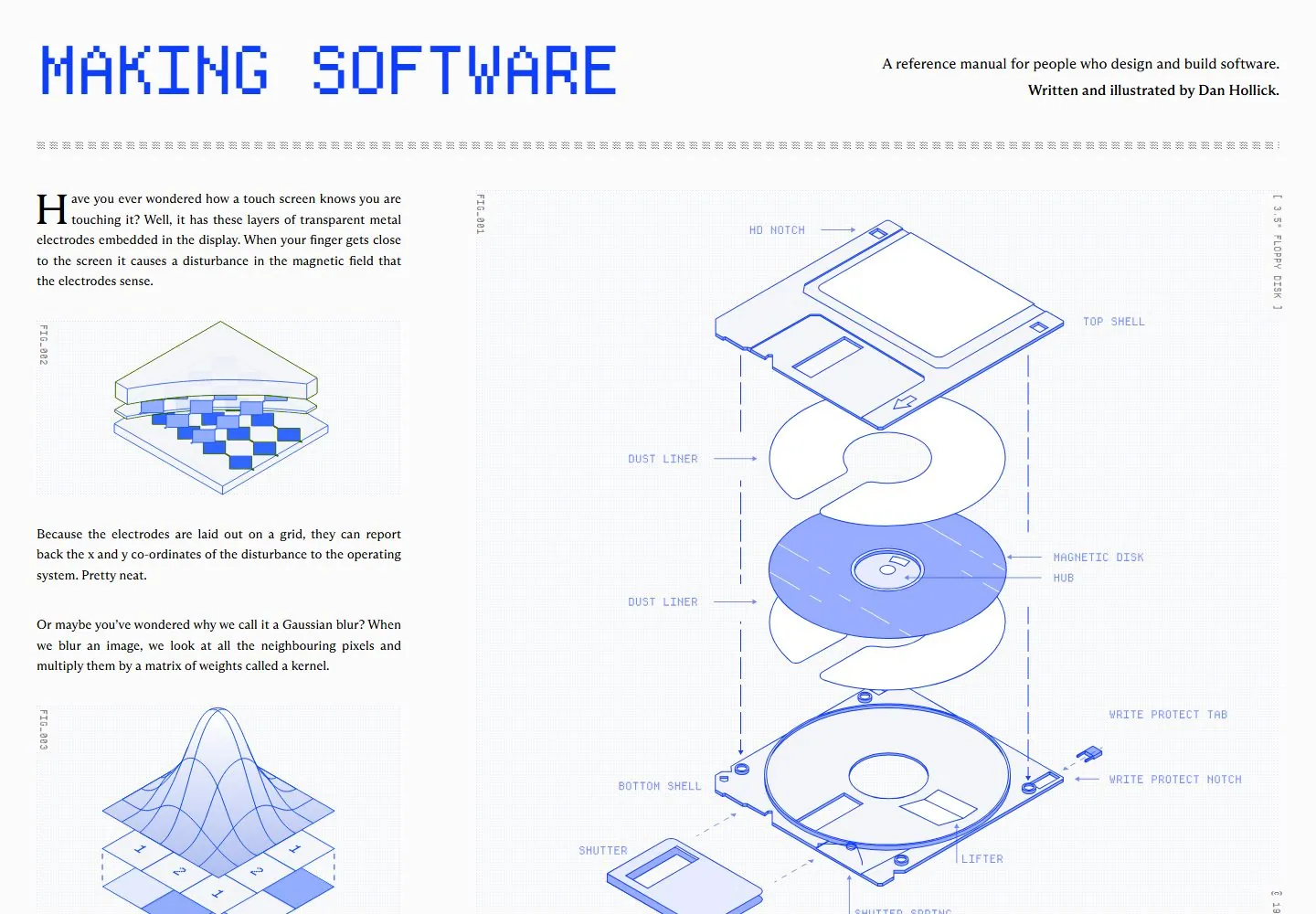
- The desktop view uses a pale paper-like field with a large blue pixel-style title, a small right-aligned serif introduction and a repeated character divider. Below, a narrow left column alternates serif paragraphs and small technical diagrams while a much larger blue exploded illustration fills the right. Diagram labels and fine dotted backgrounds suggest a printed technical manual.
- Responsive
- Tablet places the large illustration above a two-column text area; phone places the introduction, large illustration and body content in a single vertical sequence. The pixel-style title scales to the available width. Sampled widths do not establish precise breakpoints.
- Scroll
- At actual desktop scrollY 750, the screenshot shows multiple text columns interspersed with blue technical illustrations and a character-based divider. One position does not establish the whole page or interaction sequence.


