
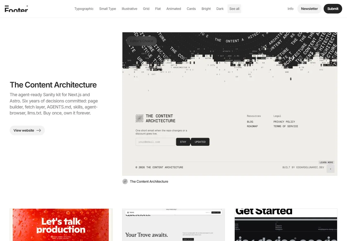
Live capture at 1440px, 2026-10-24
How it’s built
- Layout
- Charcoal gallery page with a small top category bar; left description and button face a large screenshot preview at right, with more tiles beginning below.
- Type
- White and gray sans text; larger bold title.
- Color and surface
- Charcoal, near-black, white and pale green within preview.
- Components
- Category navigation, descriptive column, button and large preview.
What makes it work
- Dark gallery with left project description and large right screenshot preview.
On a new subjectFor a public exhibition index, pair a description with a large exhibit preview on charcoal.
Live behavior
- Today
- Desktop shows a white gallery with a compact header, centered category links and rounded utility actions. The featured area pairs a left title, gray description and pill action with a much larger screenshot on the right; a small attribution sits underneath. A three-column grid of screenshot cards begins below. Screenshot contents belong to the featured sites, not the gallery interface.
- Responsive
- Tablet keeps the featured text and image side by side and shows a two-column card grid. Phone places the featured image and attribution above the text, moves the category links to a second row and retains header actions. These sampled widths do not establish exact breakpoints.
- Scroll
- At actual desktop scrollY 750 the header remains visible above a three-column screenshot grid with small attribution labels. This single frame does not establish the header behavior throughout the page.


