
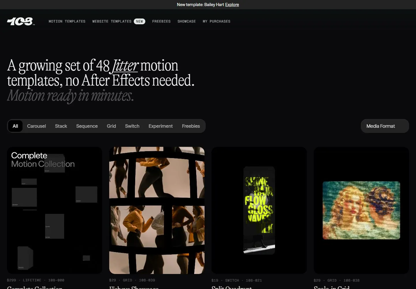
Live capture at 1440px, 2026-10-24
How it’s built
- Layout
- Black field; fine cream serif multi-line introduction with italic phrases and muted final line, compact mixed-action buttons, long rounded filter row and rounded visual cards.
- Type
- Fine high-contrast cream serif introduction with italic phrases; muted italic last line and small mono-like utility labels.
- Color and surface
- Near-black page, cream/gray type, dark rounded filter bars and colorful rounded image cards.
- Components
- Compact top navigation, left editorial introduction, paired actions, long category filter and image-card row.
What makes it work
- Cream serif editorial introduction and rounded dark filtering surfaces over a black image catalog.
On a new subjectFor a botanical illustration library, use a fine cream serif introduction and dark rounded filters above colorful specimen-image cards.
Measured
Fonts loadedSeason Sans, Geist Mono, Gt Alpina Condensed
H156px / 500 / -2px
Body text16px
Page background#0a0a0c
Text color#eff1f0
Page height5,036px
Computed CSS at 1440px, 2026-10-24.
Live behavior
- Today
- The live page uses a black background, a small white 108 logo, a thin promotional line across the top, compact uppercase navigation, and a large high-contrast serif headline about a growing set of Jitter motion templates. A muted italic “Motion ready in minutes.” line follows. Rounded category and media-format controls sit above a dense grid of dark product cards with vivid motion thumbnails, template names, aspect ratios, and prices. At actual desktop scrollY 750, collection headings and additional cards fill the view. Tablet and phone show the headline, filters, and card grid in narrower arrangements.
- Responsive
- Desktop is 1440×1000 with a 1440×5036 document; tablet is 768×1024 with a 768×5301 document; phone and fresh reduced-motion phone are 390×844 with 390×5916 documents. Desktop t0/t2/hover and tablet sample zero animation entries; ordinary phone samples zero and reduced-motion phone samples six. These raw counts do not describe what moves or establish a preference effect. The captures do not establish breakpoints.
- Scroll
- The desktop-scroll image is measured at actual scrollY 750 in a 1440×5036 document. It shows the collection heading “Complete Collection / All templates. Forever.”, category controls, and a multi-column template grid. The screenshot documents this position only and does not establish sticky navigation or how scrolling was triggered.


