
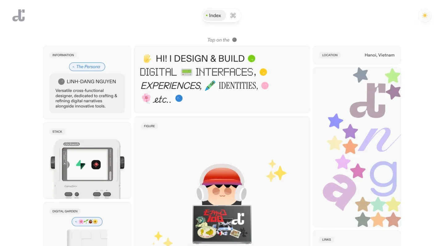
Screenshot from Minimal Gallery, saved 2026-10-24
How it’s built
- Layout
- A light page is assembled from a modular grid of rounded white panels with faint borders and soft shadows. A small logo sits upper left; a centered floating Index/keyboard-shortcut capsule and a circular sun control sit near the top. The main grid has a profile/information card, a large central text introduction and illustrated figure panel, a right location card and tall playful typographic display, with more content panels continuing below the crop.
- Type
- Clean dark sans-serif text and compact uppercase panel labels; the central introduction mixes uppercase sans with stylized outlined/monospaced display lettering and emoji-like graphics. No precise font family is claimed.
- Color and surface
- White and very pale gray panel surfaces on a pale background, fine gray borders, subtle shadows, and playful lavender, blue, green, orange and yellow illustrations. Rounded cards create a soft modular appearance.
- Components
- Small logo, index/shortcut capsule, theme control, profile/information card, central introduction, device illustration, location card, decorative display panel and additional lower cards.
What makes it work
- Light modular panel grid
- Several distinct information roles
- Varied panel sizes
- Consistent soft surface framing
On a new subjectPlace unrelated profile, location, explanation and examples in a small set of distinct but coordinated panels. Replace the personal details and decorative graphics with subject-relevant content.
Prompts
Create an original visual direction for {{website_name}} in {{industry}}, for {{audience}}, presenting {{content}} and supporting {{functionality}}. Composition invariant: Use three unequal columns of soft pale cards: compact identity/context and support pieces at one side, a broad central lead with one featured panel, and secondary context/examples at the other. Keep the central statement visually dominant. Typography: Give the central greeting or lead the largest expressive type; use smaller simple labels and concise body copy in the supporting cards. Palette and contrast: Use a light neutral canvas and soft card surfaces; pastel details may act as accents but should suit the new subject and maintain contrast. Image and component hierarchy: Choose useful subject-specific examples for side cards and one central visual for {{content}}; do not require a person illustration, device, location label or specimen art. Visual estimate from the supplied reference, not measured CSS: Visual estimate: central column about 40% width; sides about 25% each; central figure extends through lower half. Scale the relationships to the target content and viewport. Variables: replace source identity, wording, industry-specific objects, people, imagery, exact colors and controls with original material for {{website_name}}, {{industry}}, {{audience}}, {{content}} and {{functionality}}. Retain only the composition and hierarchy described above. No source logo, product, person, artwork or exact phrase is a required asset. Do not infer typeface, framework, CSS values, motion or tested behavior from a static image. Continue the visual system using relevant content sections, keeping the same relative spacing and contrast without adding generic cards or decoration where none are described. Reflow cards to lead with the main message, followed by context and supporting examples; remove column constraints and preserve readable labels.
Implement a responsive page for {{website_name}} in {{industry}} for {{audience}}, with real {{content}} and working {{functionality}}. Wide-screen structure: Use three unequal columns of soft pale cards: compact identity/context and support pieces at one side, a broad central lead with one featured panel, and secondary context/examples at the other. Keep the central statement visually dominant. Type hierarchy: Give the central greeting or lead the largest expressive type; use smaller simple labels and concise body copy in the supporting cards. Surface treatment: Use a light neutral canvas and soft card surfaces; pastel details may act as accents but should suit the new subject and maintain contrast. Component and image roles: Choose useful subject-specific examples for side cards and one central visual for {{content}}; do not require a person illustration, device, location label or specimen art. Visual estimate from the supplied reference, not measured CSS: Visual estimate: central column about 40% width; sides about 25% each; central figure extends through lower half. Scale the relationships to the target content and viewport. Variables: replace source identity, wording, industry-specific objects, people, imagery, exact colors and controls with original material for {{website_name}}, {{industry}}, {{audience}}, {{content}} and {{functionality}}. Retain only the composition and hierarchy described above. No source logo, product, person, artwork or exact phrase is a required asset. Do not infer typeface, framework, CSS values, motion or tested behavior from a static image. Continue the visual system using relevant content sections, keeping the same relative spacing and contrast without adding generic cards or decoration where none are described. Reflow cards to lead with the main message, followed by context and supporting examples; remove column constraints and preserve readable labels. Use semantic content and meaningful image descriptions. Keep each label with its image or list item, and make any new controls named, keyboard-operable and visibly focused. Implement requested functionality as new working behavior; the static reference does not verify source controls.
Live behavior
- Today
- No current-site visual state was captured. The original URL attempt did not render in the dated pass; see evidence_gap and the directly bound zero-state log.
- Responsive
- Not assessed: the original URL did not render from this capture environment on 2026-11-02.
- Scroll
- Not assessed: no current-site scroll state was captured.


