
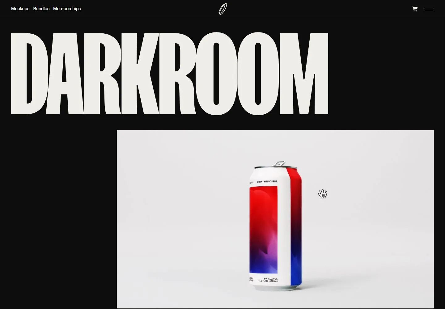
Live capture at 1440px, 2026-10-24
How it’s built
- Layout
- Near-black field with giant tightly spaced cream condensed uppercase title above a large pale rectangular product image set toward the right; small header labels and centered mark.
- Type
- Extra-heavy condensed cream uppercase title; tiny white sans navigation.
- Color and surface
- Near-black, cream and pale gray image.
- Components
- Small header, massive condensed title and large offset pale image.
What makes it work
- Near-black field
- massive cream condensed uppercase title
- offset pale image
- tiny header
On a new subjectFor a museum of material science, use a massive cream condensed title above an offset pale specimen image on near-black.
Measured
Fonts loadedSuisseintl Webs, Suisseintlmono Webs
H140px / 400
Body text20px
Page background#0d0d0d
Text color#faf9f5
Page height5,580px
Computed CSS at 1440px, 2026-10-24.
Live behavior
- Today
- Darkroom opens on a nearly black page with a small top navigation for Mockups, Bundles and Memberships, a thin outlined central mark, and cart/menu icons. An oversized condensed “DARKROOM” wordmark spans most of the width. Beneath it, a large pale product panel presents several beverage-can and bottle mockups under “Select your size.” The t2 frame centers a single can with neighboring products cropped at the edges. At actual scrollY=750 the next section reads “Next-gen Photoshop mockups built for complete control,” with a blue “Shop mockups” button and the beginning of a Featured product grid.
- Responsive
- At 1440×1000 the opening uses a full-width wordmark above a broad product panel. At 768×1024 and 390×844 the header and wordmark become more compact, a single product mockup is centered in a wide pale panel, and the short shop heading and Featured section begin below. The phone image shows one large product tile entering the frame; the separate reduced-motion capture shows a different product/crop. Measurements report document heights of 5580px desktop, 5517px tablet, and 3986px for both phone loads. These samples do not establish breakpoints or explain the separate-load difference.
- Scroll
- At actual scrollY=750 the desktop image shows the mockup panel ending above “Next-gen Photoshop mockups built for complete control,” a blue “Shop mockups” button, then a Featured heading with large product cards and a “Browse All” button. This is one saved scrolled frame; it does not establish sticky behavior or button function.


