
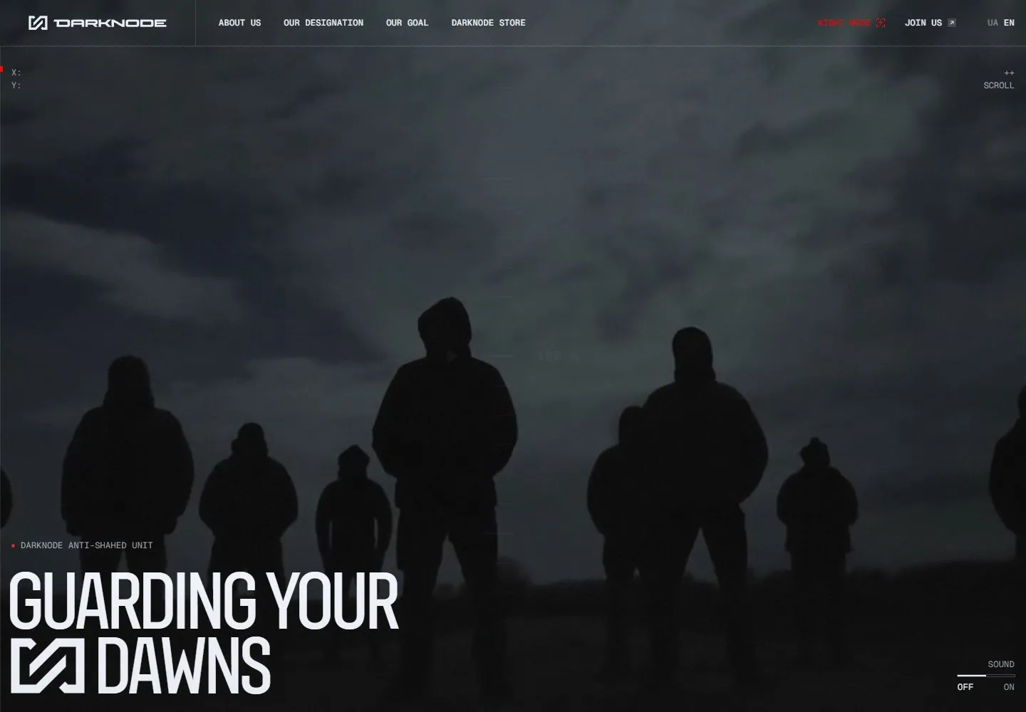
Live capture at 1440px, 2026-10-24
How it’s built
- Layout
- A monitor shows a dark blue-gray image of several silhouetted figures beneath a textured sky. Large condensed white title is lower left with a geometric symbol, thin guides and tiny technical labels scattered over the field; header is small. The red room and monitor are staging.
- Type
- Large tall condensed white uppercase headline, tiny monospaced-looking technical header and labels. Exact font and metrics unknown.
- Color and surface
- Dark blue-gray image, black silhouettes, white text and tiny red accent.
- Components
- Use a dark blue-gray silhouetted group under a textured sky, a large condensed white lower-left statement and sparse fine guides with tiny technical labels.
What makes it work
- Dark silhouetted group under textured blue-gray sky
- Large condensed white lower-left title and geometric symbol
- Fine guide lines and tiny technical labels
- Small header
On a new subjectFor a public night-sky education program, use original silhouettes of observers under a textured blue-gray sky, a condensed white lower-left title, fine guides and tiny technical labels.
Measured
Fonts loadedUafsans Cond, Geist Mono
H2112.003px / 600 / -5.6px
Body text14px
Page background#0f1318
Text color#333333
Page height21,385px
Computed CSS at 1440px, 2026-10-24.
Live behavior
- Today
- A dark atmospheric hero with silhouetted figures uses a thin ruled interface grid, small monospaced uppercase navigation and utility markers, sparse red accents and a large pale condensed headline anchored at lower left. The brand mark is incorporated beside the second headline line. Scroll reveals a dark charcoal section with fine concentric crosshair-like lines, tiny bracketed section label and a large central uppercase statement with one red word.
- Responsive
- Tablet retains the wide header but its right-side items overlap or clip; that collision is an observed limitation, not a responsive rule. Phone replaces the desktop navigation with a menu and small mark, moves headline to the middle with join beneath, and retains a right-bottom sound control. Headline declares Uafsans Cond 112.003px desktop, 59.735px tablet and 48px phone; utilities declare Geist Mono 12px.
- Scroll
- At scrollY750 the screenshot shows the central statement and fine circular guide lines on charcoal; the prior hero headline and sound controls have in-frame DOM bounds but are not visible in this capture. Exclude them from painted measurements. The red word is part of the one statement, not a separate heading.


