
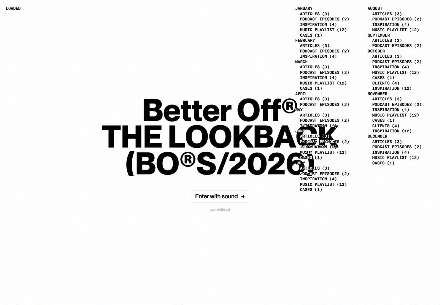
Live capture at 1440px, 2026-10-24
How it’s built
- Layout
- White page has enormous centered heavy black title at top, a wide band of five varied photographs staggered vertically across the lower middle, and a thin tick-mark timeline along the bottom. Small navigation left and compact music-like label right.
- Type
- Huge heavy black sans headline with tight stacked leading; tiny sans navigation and timeline labels. Exact font and metrics unknown.
- Color and surface
- White field, black type, full-color photographs and pale gray ticks.
- Components
- Place an enormous centered heavy black stacked headline high on white, with a horizontally spread band of varied photos at different heights and a fine tick-mark timeline below.
What makes it work
- White field and enormous centered stacked black headline
- Horizontally spread varied photographs staggered in height
- Fine bottom timeline with ticks
- Small edge navigation
On a new subjectFor a public library history project, place an enormous centered black stacked title above staggered original archive photographs and a fine tick-mark timeline on white.
Measured
Fonts loadedsans, mono
Body text19.2px
Page backgroundtransparent
Text color#000000
Page height1,000px
Computed CSS at 1440px, 2026-10-24.
Live behavior
- Today
- A nearly white, lightly textured entry screen centers a heavy black three-line headline over a small outlined enter-with-sound button and faint secondary option. On desktop a dense two-column month/category index sits at upper right and collides visually with the right edge of the headline; tiny navigation appears at upper left after the initial captured phase. This overlap is recorded as observed, not as a recommended design principle.
- Responsive
- The tablet keeps the centered three-line headline, index and tiny upper-left navigation. Phone presents the title and a bottom row of small outlined buttons; the ordinary image shows large white space and no index. The fresh phone image places the title near the top, shows two surf photographs, a fine horizontal timeline and the same bottom controls. It is a different load/phase and must not be read as a controlled breakpoint comparison. Headline character declarations use generic sans 101.088px desktop, 53.9136px tablet, 46.8px phone; generic declaration does not identify the rendered font.
- Scroll
- Attempted desktop scroll leaves actual scrollY0 and document height equal to viewport; the later screenshot retains the title, index and entry action. It does not show successful scroll or the post-entry experience.


