
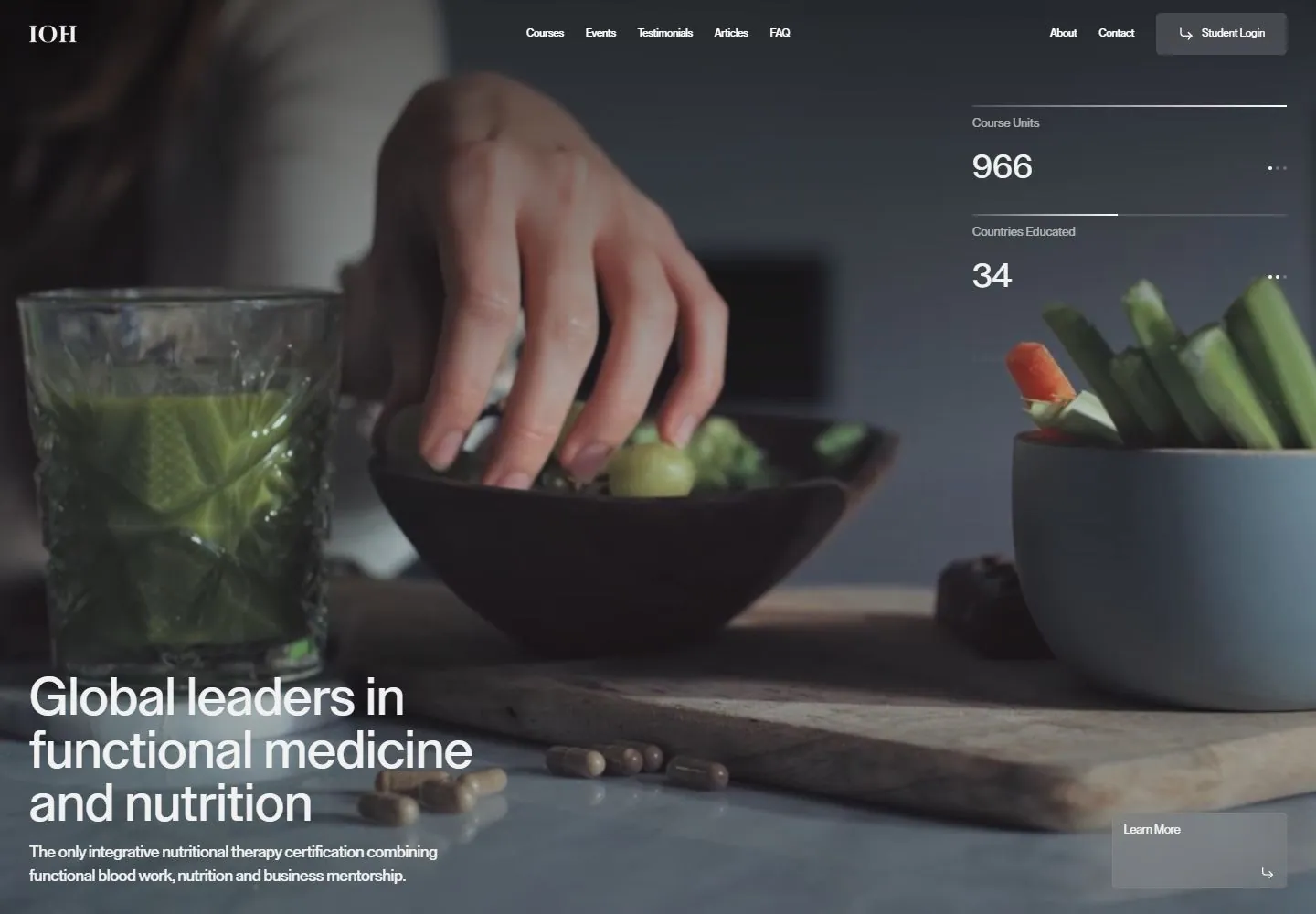
Live capture at 1440px, 2026-10-24
How it’s built
- Layout
- Darkened full-frame food photograph; white slim top navigation, large lower-left sans statement/support, three stacked ruled statistics at right and low link.
- Type
- Large regular white sans low-left heading, smaller white support and compact right statistic labels/numbers.
- Color and surface
- Darkened blue-gray food photograph with white type, thin pale rules and a translucent gray header action.
- Components
- Slim navigation, low-left introduction, three stacked ruled statistics at right and a small low link.
What makes it work
- Low-left white introduction and stacked ruled side statistics over a dark full-frame photograph.
On a new subjectFor a wildlife rehabilitation center, overlay a low-left white mission and three stacked ruled service metrics on a darkened habitat photograph.
Measured
Fonts loadedLay Grotesk
H157.6px / 500 / -0.216px
Body text14.4px
Page background#e6e6e6
Text color#242424
Page height12,402px
Computed CSS at 1440px, 2026-10-24.
Live behavior
- Today
- Institute of Health’s captured hero layers white copy and course metrics over full-bleed lifestyle/health video. A small IOH mark sits at upper left; course navigation and Student Login span the top. At desktop, “Global leaders in functional medicine and nutrition” and a short certification description sit at lower left, while Course Units, Countries Educated and Laboratory Tests metrics occupy the right. Desktop t0/t2/hover show different video frames while retaining the copy and metrics; desktop-scroll at y=750 moves into a light course-card section headed “Comprehensive, evidence-based education across the full spectrum of health conditions.” Tablet and phone rearrange the overlay. The phone measurement text contains additional metric labels and values, but their screenshot text overlaps and is not legible as separate metrics. The selected gallery image is a separate food-preparation video frame from the same page.
- Responsive
- Desktop measures 1440×12402; tablet 768×11138; phone and reduced-motion phone 390×11131. Desktop uses a full-width video hero with lower-left title/description and right-side metrics. Tablet and phone place the title and supporting copy lower over the video; phone uses a compact menu and a wide Learn More panel. The desktop-scroll state at y=750 exposes the next course catalog section. These snapshots do not establish breakpoints or the complete page flow.
- Scroll
- The desktop-scroll state records actual scrollY=750 in a 1440×12402 document. It shows the lower portion of the video hero above a light course catalog, the headline “Comprehensive, evidence-based education across the full spectrum of health conditions,” an All Courses button, a Seminars count and course cards including Advanced Blood Work and Autoimmunity. No course or login action was tested.


