
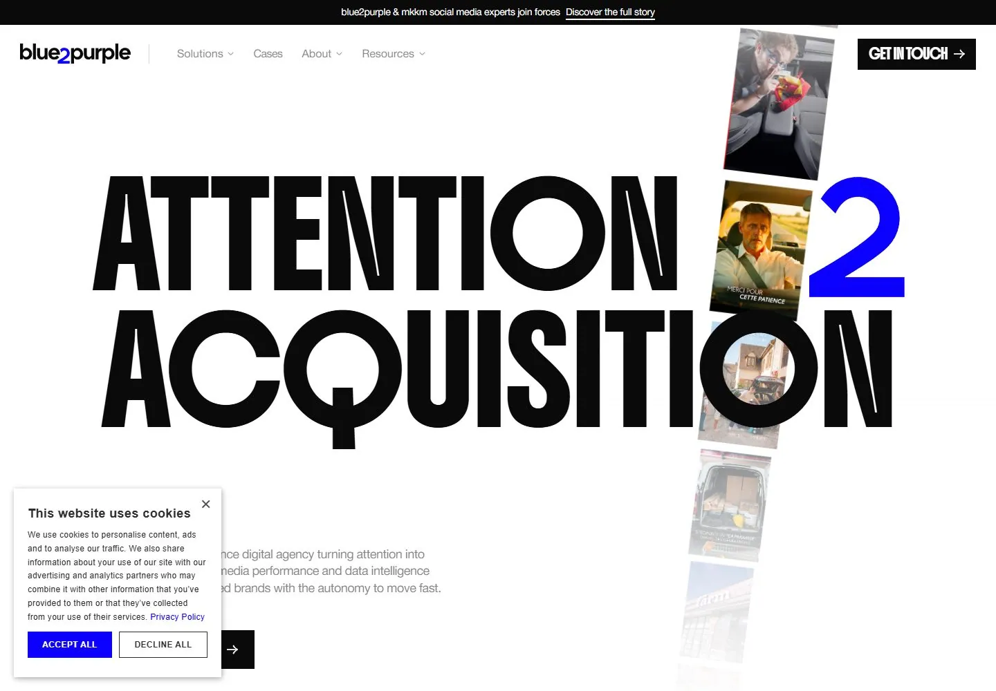
Live capture at 1440px, 2026-10-24
How it’s built
- Layout
- The reference composes two pale website views and a laptop mockup on a gray studio field. Across the in-page views, oversized condensed black campaign language uses magenta/violet emphasis, small explanatory copy/actions and narrow project imagery. Device, gray environment and simultaneous placement are presentation framing.
- Type
- Oversized bold condensed uppercase sans headlines, small clean sans support copy and compact navigation; selective magenta/violet highlight. Exact metrics unknown.
- Color and surface
- Pale gray-white page surfaces, black headlines, isolated magenta/violet accents and small varied project images; outer gray is staging.
- Components
- Minimal page navigation/contact, large campaign headline, compact explanatory action and project thumbnails.
What makes it work
- Pale neutral web-page surface
- Oversized condensed black uppercase headline
- Selective bright emphasis within type or a narrow image strip
- Small supporting copy/action and project imagery
On a new subjectFor a municipal energy-saving campaign, use a pale page with a huge condensed uppercase message, emphasize one key word or annual target in magenta, and add concise action copy with a narrow strip of home-efficiency images. Replace agency claims; present directly without device framing.
Measured
Fonts loadedHelvetica Neue, Ppneuemontreal Book, Boldonse
H1141.773px / 500 / -2.83545px
Body text18px
Page background#ffffff
Text color#0a0a0a
Page height9,610px
Computed CSS at 1440px, 2026-10-24.
Live behavior
- Today
- White background with enormous two-line black uppercase display forms, a single electric-blue numeral-like identity accent, small gray utility copy and hard black rectangular actions. On desktop a tilted vertical strip of portrait media passes behind the display text and fades toward the lower edge. A black announcement bar sits above the identity/navigation row. The next section is saturated blue with a fine square-dot pattern, large white display words and a magenta action. Consent overlays the lower left.
- Responsive
- Desktop display samples measure141.773px Acquisition and137.636px Attention, weight500 with about-2.83545px tracking. Tablet uses75.9091px/106.273px; phone38.8608px/54.4051px. The media strip changes from a narrow tilted vertical desktop arrangement to a broad horizontal card row under the headline on narrow screens. Tablet retains a compact link row; phone uses a black square hamburger. Consent becomes a full-width phone panel and covers lower actions/section text.
- Scroll
- At actual scrollY750 the announcement/navigation stays at top, a remaining black hero action appears above the blue patterned section, and a large centered uppercase statement appears on blue. Its word samples are69.5273px/104.291px. The magenta action is visible below. Consent still obscures the lower-left area; the raw introductory paragraph now lies behind navigation and is not claimed visible.


