
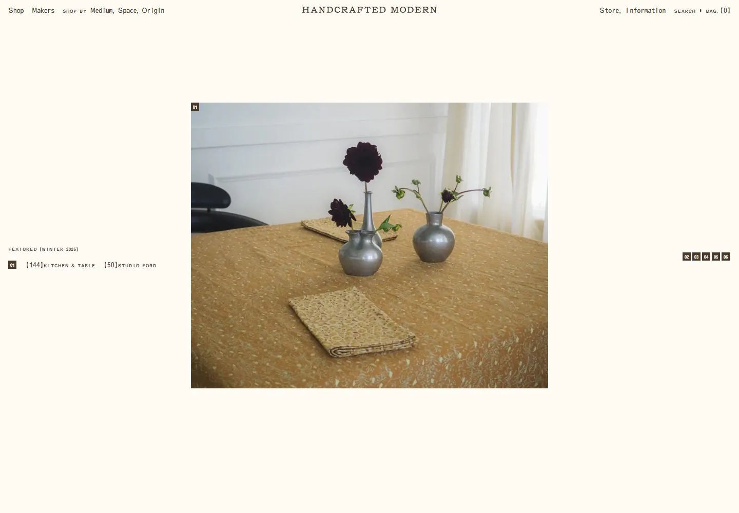
Live capture at 1440px, 2026-10-24
How it’s built
- Layout
- Cream page with slim centered identity and distributed tiny navigation; a large centered object image sits below generous whitespace, with small left index and another image entering below.
- Type
- Small spaced serif identity and tiny mono-like navigation and index.
- Color and surface
- Cream, black and muted brown object imagery.
- Components
- Header, centered images and small side index.
What makes it work
- Centered large object image with tiny side index on a spacious cream field.
On a new subjectFor a geological archive, center a specimen image with a tiny index on cream.
Live behavior
- Today
- A warm ivory field holds a centered, letterspaced serif wordmark, tiny dark utility navigation along the top, and a centered rectangular editorial product photograph. Small numbered square tags and compact feature metadata sit at the image edge and far sides, leaving generous open space. The selected gallery reference uses a different photograph within a similar framework.
- Responsive
- At tablet and phone widths the full desktop navigation becomes a menu icon, centered identity and bag count. Images form a narrow centered vertical sequence with number tags; the phone places feature metadata near the bottom of the captured viewport. Viewport samples do not establish exact breakpoints.
- Scroll
- At desktop scrollY 750 the header and side feature metadata remain at similar screen positions while subsequent differently sized photographs occupy the center. This suggests a persistent frame around a scrolling image sequence, but the screenshots do not establish implementation.


